Rethinking the pixel
2012
-
Link
Photographs Recreated Using Crayons →
-
Link
App for choosing paths less traveled →
Not out yet, but could be a fun one when it does
-
Link
Why Amanda Cox should be in charge of audio →
Process for finding the right sound just for a few seconds of audio
-
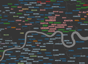
Most common London surnames mapped →
James Cheshire, a geography lecturer at the University College London, mapped common surnames…
-
Link
Soccer data →
“every ‘on the ball’ event for every Premier League player in every match from the entire 2011-12 Premier League season”
-
Link
10 critical packages on CRAN →
Statisticians should have these installed already
-
Link
ProjectTemplate →
Automate the drudge work for an analysis project in R
-
Link
Where to start with text mining →
Detailed article if you want to learn to analyze words
-
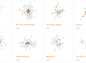
Character social networks in movies
We’ve seen a lot of network charts for Twitter, Facebook, and real people.…
-
Link
Closed-Source Software →
SAS clinging on as free and often better alternatives take marketshare [via]
-
Link
Clockwork Raven →
Open source Mechanical Turk application by Twitter engineering that lets you easily submit data for review
-
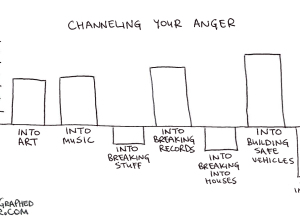
Coolness graphed
Along the same lines as Jessica Hagy’s indexed charts, Coolness Graphed charts only…
-
Link
csvjson →
Converts a CSV file into JSON or GeoJSON [via]
-
Link
The Subway Map That Rattled New Yorkers →
It’s not geographically accurate, but it wasn’t meant to be
-
Link
Hand-crafted data →
Data Stories has Stefanie Posavec on as guest; she makes intricate pieces without code
-
Disney Research makes plants interactive
Botanicus Interacticus from Disney Research turns plants into multi-touch surfaces, simply by placing…
-
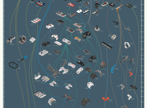
Evolution of video game controllers →
From the department of old-but-new-to-me, Pop Chart Lab charted the evolution of video…
-
Link
Statisticians need better marketing →
So much hype and funding for big data, but statistics as a field of study seems to be lost
-
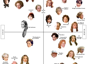
Meryl Streep scatterplot →
Vulture plotted Meryl Streep’s character faces on a cold-warm, frivolous-serious scatterplot. Sure, why…
-
Link
Visualizing Hadoop →
Twitter releases HDFS-DU to explore what’s going on in your clusters
Recently for Members
Second Edition
 Visualize This: The FlowingData Guide to Design, Visualization, and Statistics (2nd Edition)
 Visualize This: The FlowingData Guide to Design, Visualization, and Statistics (2nd Edition)
New tools, refined process.
Browse by Chart Type See All →


