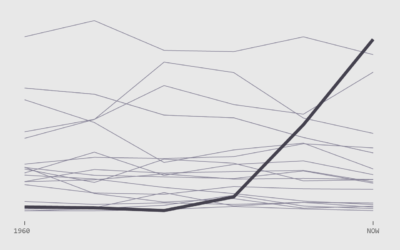
How the Average Working Adult Spends Days
There were some graphics going around that showed the total amount of time spent during an average person’s lifetime doing things. The numbers were pretty rough though.
For example, to calculate the number of days spent sleeping during a lifetime, it was assumed that the average person sleeps eight hours per day, and then estimates just extrapolated for life expectancy. But sleep patterns change as you age. You start to sleep less as you get older.
So I tried taking this into account using data from the American Time Use Survey. I still used averages, but I calculated averages for each year of life and then aggregated. Here’s what I got for adulthood (18 and older) — the time you’re presumably making your own choices. Employment and retirement are assumed.
Again, these are still averages for an adult who works and then retires around 65 years, so the same caveats apply as usual. Everyone’s own totals will be a bit different, especially as you compare across groups. For example, the time distribution for parents looks different from the distribution for those who never have kids. Similarly, some never enter the labor force whereas others work full-time.
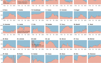
 A Day in the Life of Americans
I used similar data to simulate an average day for 1,000 Americans.
 Most Common Activities
See the half-hour breakdowns for a day, by sex and age group.
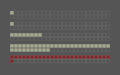
 How to Make Square Pie Charts in R
I used a modified version of this tutorial to make the graphic above.
The data is from the American Time Use Survey, which is made more easily available from IPUMS. After downloading data for 2011 through 2015, I tabulated and charted in R. Also, maybe you noticed that the number of squares doesn’t quite add up to 22,573. This is due to rounding, which offset the total above by three days.
Chart Type Used

Become a member. Support an independent site. Get extra visualization goodness.
See What You Get