Data and visualization year in review, 2013

Visualization continues to mature and focus more on the data first than on novel designs and size. People improved on existing forms and got better at analysis. Readerships seemed to be more ready and eager to explore more data at a time. Fewer spam graphics landed in my inbox.
So all in all, 2013 was a pretty good year for data and visualization. Let’s have a look back.
There were several themes throughout the year, but the most important was the strengthened connection between data and reality. During some phases, when so much news was based on speculation and opinion, data was a way to form our own opinions and to view a subject more objectively. But not in that cold, robotic sort of way and more in the warm, human-like way.
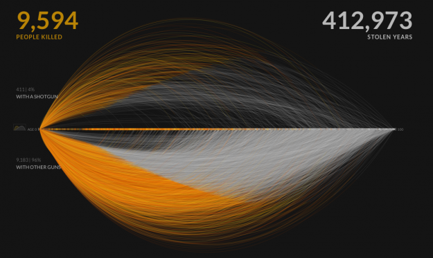
For example, not long after the shootings in Newtown, Periscopic shed light on U.S. gun deaths with an interactive animation. We saw plenty of charts that showed annual aggregates, but Periscopic brought the individual lives and what was lost back into the picture.
Pitch Interactive took a similar individual-to-trend approach when they explored drone attacks in Pakistan, which helped many understand an otherwise cryptic topic.
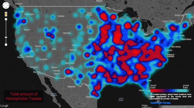
In May, Floating Sheep explored hateful tweets across the United States as an extension of a map they made last year that showed negative sentiments towards the reelection of Barack Obama. This time Floating Sheep, an academic research group, also looked at tweets against gays, the disabled, and other races.
The takeaway from these projects, and I’ve said this many times, is that even though data can be considered an objective and factual medium, its connection to the real world is what makes it worthwhile.
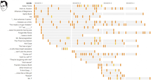
Of course, it wasn’t all serious matters in 2013. Josh Orter made stupid calculations, Beutler Ink and Red Edge explored recurring jokes on Arrested Development (as did NPR, with a detailed joke guide), Dirk Loechel compared the sizes of science fiction spaceships, and Jonathon Green created an expansive timeline of slang for genitalia.
One of my favorites came from statistics PhD student Joshua Katz. He mapped vernacular across America, such as words used to address a group of people, and followed up with a dialect quiz that gave you a probability that someone in an area of the United States would understand your local tongue.
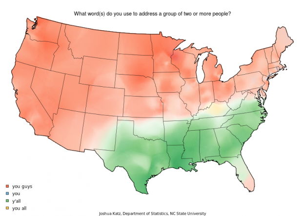
Unfortunately the quiz isn’t online as of this writing, but the original summary maps are. There was a lot of interest in the interactive, and it speaks well to the willingness of a general audience to engage with data (from a survey conducted 10 years ago).
News organizations totally ran with this. Well, they have for a long time, but stories and information graphics assumed a new role and layout this year. The success of Snow Fall by The New York Times last year seemed to provide graphics departments with more flexibility and space, so charts — static and interactive — weren’t restricted to the top of the fold.
This meant data inline with text or multiple graphics on a page instead of attempts to squeeze as much as possible in a 900 by 600 pixels rectangle. It’s like the internet remembered that we can scroll down to something else other than spam and nasty comments, which brought an interesting mix of media in a single story. Sure, there was over-designing at times as people played with their new toys, but the novelty will settle. It already did a bit.
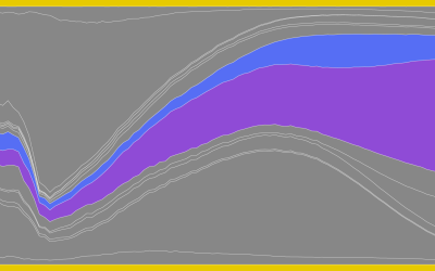
The feature by The New York Times on climbing the income ladder and how location matters is a fine example. A set of three interactives are part of the story and help to explain somewhat complex relationships for a general audience.
And while we’re on the subject of income, this explainer video of wealth distribution in America by an anonymous person who goes by Politizane was also really good.
But back to the long-form. The Guardian piece on NSA files engaged with what many might consider to be a dry topic and Planet Money and NPR told the story of a t-shirt. Read/watch both of them.
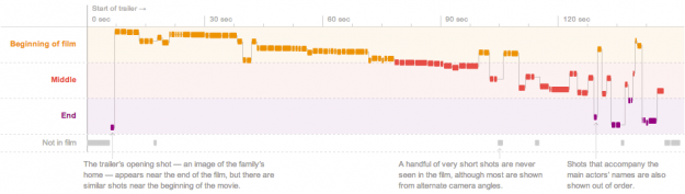
Not surprisingly, I gravitate towards the more data-centric features, so I really liked the dissection of movie trailers by Shan Carter, Amanda Cox, and Mike Bostock.
The D.C. building heights study from Emily Chow and Gene Thorp of The Washington Post was another good one. And Kepler’s Tally of Planets by Jonathan Corum.
On the less visual and more data-ish front, data privacy became an actual issue that people cared about this year due to Edward Snowden. It’s a constant concern in academic circles, but those who don’t know much about data or those with a “so what” attitude looked closer, so regardless of whether you think what Snowden did was right or wrong, it’s at least a good thing that more people give a crap.
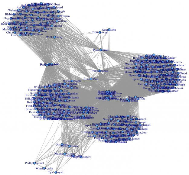
I still think Kieran Healy deserves bonus points for approaching the issue with a metadata analysis to sniff out Paul Revere, from the point of view of an 18th century analyst.
2013 was an especially eventful year — maybe the most — for me personally. My son was born, which was the most emotional moment of my life, and I finished my PhD, which was a huge point of relief worthy of loud music blasting in the car on my drive home. (See my PhD reflection/survival guide for more.) My second book, Data Points, was icing on the cake.
The completion of my PhD meant that 2013 was the first year of FlowingData that I didn’t have to work on a dissertation. No dissertation meant more time to play with other datasets. It meant the revival of Data Underload, which I started years ago mostly as a comic to amuse myself. This time around, I went a little deeper, and these posts were the most popular on FlowingData by far.
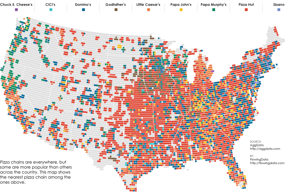
The two most popular posts this year on FlowingData speak highly about America’s interests, I think. The first looked at pizza chains across the country. The second looked at porn searches by state. Go America!
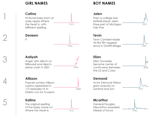
My favorites, which were also in the top ten of most visited posts, described the history of names in the United States. The process of exploring the data from the Social Security Administration was special to me, because I was on the search for my son’s name. Graphics and posts about the results were a byproduct.
Hilary Parker’s analysis for the most poisoned name got me started. That led me to the most trendy, then the most unisex, and then region-specific names. I still don’t know where the trendy Deneen came from in 1964.
What’s in store for data and visualization next year is anyone’s guess, but my bet is more rigorous analysis in the mainstream and a heightened data literacy among the general public.
In 2011, I chose Mike Bostock’s Data-Driven Documents as the best data visualization project of the year, because it felt like a big step in web evolution was in the works, but now it feels like the tech is there and people can spend more time getting to know their data and in turn, explain it better to others.
By the way, Data-Driven Documents continues to thrive. Forget all those lists about 100 JavaScript libraries for data visualization and just go with the Bostock.
Nate Silver, now with ESPN, will probably come into play when FiveThirtyEight starts up again. A lot of (data) people were frustrated by Silver’s move to sports, but I’m sure the same people will sing his praises soon enough.
The hype around big data should settle soon, but it’ll probably be at least an additional year before we get to call big data just data again.
Data science versus statistics? That’s going to continue. The good news is that it affects almost no one from a practical sense, so I leave that argument to others.
As for FlowingData, I see no signs of wear. It’s still as fun as it was years ago, and you can expect more Data Underload, tutorials, and pointers to others’ fine projects. I’m thankful every day that this is what I get to do, so thanks a lot for reading, sharing, buying books, and to all the members who have supported FlowingData and continue to.
Have a happy holiday season filled with friends and family, good times, and hopefully plenty of food and high-quality beer.
Become a member. Support an independent site. Get extra visualization goodness.
See What You Get