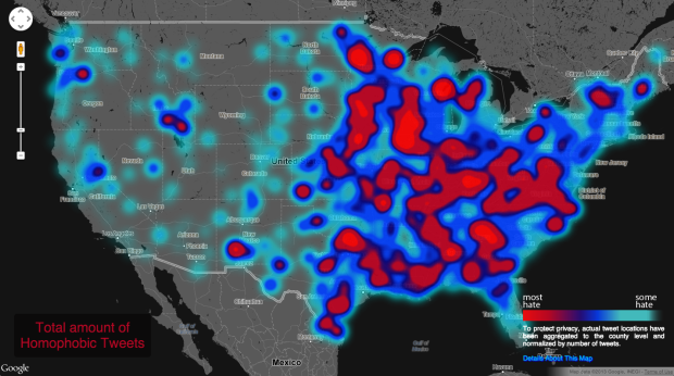
In a follow-up to their map of racist tweets towards Barack Obama, the folks at Floating Sheep took a more rigorous route to get around the challenges of sentiment analysis. Over 150,000 geotagged tweets against races, sexuality, and disabled were manually classified and mapped.
All together, the students determined over 150,000 geotagged tweets with a hateful slur to be negative. Hateful tweets were aggregated to the county level and then normalized by the total number of tweets in each county. This then shows a comparison of places with disproportionately high amounts of a particular hate word relative to all tweeting activity. For example, Orange County, California has the highest absolute number of tweets mentioning many of the slurs, but because of its significant overall Twitter activity, such hateful tweets are less prominent and therefore do not appear as prominently on our map. So when viewing the map at a broad scale, it’s best not to be covered with the blue smog of hate, as even the lower end of the scale includes the presence of hateful tweeting activity.
Hard to believe this stuff is still around. It looks like I might want to stay clear of some parts of Virginia. (The aggregation at the national level seems a bit aggressive. When you zoom in on the map, the polarity between the east and west doesn’t seem so strong.)
Update: Be sure to read the FAQ before making snap judgements.
 Visualize This: The FlowingData Guide to Design, Visualization, and Statistics (2nd Edition)