
This graphic from The New York Times kind of caught me off guard. I guess we’re starting to gain a bit more faith in the public’s ability to understand visualization (yay). The graphic was created by the usual suspects — Matthew Bloch, Shan Carter and Amanda Cox — and as usual, great work.
Some Thoughts
It’s an attractive, interactive visualization showing the patterns of money racked up at the box office over time. You can see Oscar contenders attract a smaller audience than the holiday and summer blockbusters and kind of slowly build an audience.
I’m not sure if there’s any significance in the placement of movies on top and on bottom other than for aesthetic reasons. If you do see some significance, please do enlighten in the comments.
You might also have noticed that the flows get a lot bigger as you move forward in time, even though the numbers are adjusted for inflation. Strange. I wonder why that is. The actual numbers, however, aren’t really the point of interest though. It’s the patterns, uh, ebb and flow that are important which is made evident by the exclusion of concrete figures for each movie.
If you’d like to play with the data yourself, you should be able to find most of the figures at Box Office Mojo.
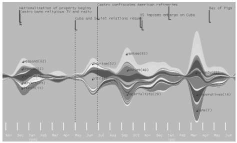
UPDATE: I was trying to think of the paper I read that covered something similar to this. I just remembered — ThemeRiver: In Search of Trends, Patterns, and Relationships by Susan Havre et. al.
[Welcome to FlowingData, Boing Boing readers]

 Visualize This: The FlowingData Guide to Design, Visualization, and Statistics (2nd Edition)
Sure it’s a pretty graph and depicts a few trends.
The good…
— the difference between shapes tells you if a movie was an ‘instant hit’ or it took time before it gained momentum.
— by scrolling fast through time you can sense that more movies make more money per week in the later years than the early. (not sure how much inflation is over 12 years, but isolated to movie tickets, I am guessing 150%)
— great data intensity. (does colored shapes count against you in ink/data ratio?)
— excellent legend (that tells you Titanic or Pirates make a whooping 862 million USD in their opening week, even that they break the frame)
The less good…
— If the point of the graph is to show shapes, why does mouse-over highlight not show the complete shape? Hit movies are shadowing less successful movies. I would suggest the highlighting to display the shape, not the difference in shape to an arbitrary other movie.
— The details about each movie (after a click) shows only a tagline. I would like to see details like ‘total revenue’, ‘opening day’ and longevity. In a sense just showing the raw numerical data for a movie, not some arbitrary other information (tagline, actors, etc…).
What if…
— each movies weekly revenue was shown as a part of the total weekly revenue for all movies. You could then get a feeling about the ‘seasoness’ of total spending at the box office. (though it would require some serious sorting to figure out the order of each shape).
Uhh.. and by the way FIRST!, couldn’y help it
@Mads,
I could be wrong, but I don’t believe the shapes overlap each other — this means those *are* the actual shapes/areas, the overall weekly sales *are* reflected, and it *did* indeed require some sorting to make sure movie trails didn’t cross each other as they dwindled into nothingness. It’s a brilliant piece of work.
Yeah, there doesn’t seem to be any overlap, kind of like a stacked graph, so the flow actually does give you a sense of the the entire sales for a give point in time.
I do wish that there was a little bit more information for each movie though. I kind of almost expected to see the box office total when I clicked on a movie, and in turn, felt a little confused when I didn’t.
I’m fairly sure the reason for the growth-over-time of the box office receipts (even after adjusting for inflation) can be explained by adjusting for population and theatrical saturation. Adjusting for ticket price doesn’t account for the fact that the population of the US has grown by 25% since 1986, which means more tickets sold.
Additionally, I remember the 90s as a period in which big movie theaters (especially chain movie theaters) seemed to be opening every few months. I suspect a lot of suburban areas got their first multiplex theaters during this period, as strip malls popped up everywhere. Being chain theaters, the 12 screens would still be showing the same 8 movies, which also helps explain the heavy skew toward a handful of blockbusters, with smaller and independent movies showing considerably less growth by comparison.
does anyone know what this type of graph is called, or a program that can create them?
a similar, if less elegant visualization demonstrating frequency of baby names:
http://babynamewizard.com/namevoyager/lnv0105.html
I haven’t seen any other formal naming of the chart other than ThemeRiver in the paper linked in the post… the baby name wizard, however, is known as a stack graph.
>>> You might also have noticed that the flows get a lot bigger as you move forward in time, even though the numbers are adjusted for inflation. Strange. I wonder why that is. <<<
Interesting question. Ticket sales did rise through the 1980s, but sales have basically been flat since 1998 (see, http://www.the-numbers.com/market/ and http://www.natoonline.org/statisticsadmissions.htm), so the apparent growth could stem from a number of factors.
1. Maybe the figures are adjusted for retail inflation, not ticket price inflation (which has been slightly steeper over the years, I believe)? It’s not clear from the description, but given that the top-grossing movie in their chart made an inflation-adjusted $862 million, and my numbers have Titanic making $863 million ( http://www.the-numbers.com/movies/records/inflation.php ), I think they probably are using ticket prices.
2. Maybe the growth really occurs between 1986 and 1998, and it’s actually pretty flat from then onwards.
3. It still looks to me as though there’s growth after 1998, and I think that’s because the studios have concentrated more of their resources at key times of the year — the Christmas Holidays, and Summer Holidays in particular. So the peaks are higher on the graph, the troughs are a little lower.
One criticism of the chart is that it’s hard to actually measure these peaks and troughs. It would be nice if they provided a background scale.
Regarding the placement of each movie (top or bottom), it looks to me as though they place each new movie on which side of the graph is smaller at the time it was released. That’s probably the simplest rule to keep everything in balance.
Nice site, by the way!
Bruce
It’s interesting that you can almost see that the post peak slopes are sharper starting in the 90’s when the average run in a theater got much shorter.
It’s pretty, but I’m not sure it’s not too pretty. One thing
which surprises me is that it seems to show a film as
peaking some time after it opens, and not on the first
weekend.
It’s possible this is just an artifact of the smooth spline
they used, but still it’s misleading and therefore a bad
visualization. But really I think it’s wrong. Look at that
last big movie on there, National Treasure. It’s biggest
daily gross is on opening day (Friday 12/21). The graph clearly
doesn’t read that way. The label “Dec” is clearly centered
on the month, so the “e” is about on the 15th, so that peak
is probably on the 21st. So why the smooth ramp up which is
at least a week long, if not longer if you count the hidden
bit. Only sampling on weekends and then fitting a smooth
spline is a BAD visualization!
It doesn’t help that when you mouse over a film you don’t
see the whole “shape” of that film, as previously noted.
nick: it’s basically a stacked area chart, with some smoothing of the raw data. i don’t think the horizontal position is that important, i suspect it would be easier to read (but not as pretty) with a flat baseline.
Visually this reminds me most of Lee Byron’s piece which shows listening histories for individuals from last.fm. See http://www.megamu.com/lastfm/
@egg syntax: definitely right on that one! the lastfm stuff was the inspiration for the graphic: http://www.portfolio.com/views/blogs/odd-numbers/2008/02/26/q-amp-a-anatomy-of-a-graphic
Ha! I’m pleased. I think I get some sort of points. “VisPoints”? “Data Points”? ;)
Lee Byron, AFAIK, studies with Ben Fry at CMU, and I definitely see Fry’s influence in this work.
Here is another variant of the visualization principle I did for my master’s thesis:
Emerging topics