The arguments over pie charts dates back to 1914.
Resource Links
-
Ye Olde Pie Chart Debate →
-
What Makes Software Good? →
Thoughtfulness in design from d3.js maker Mike Bostock. One of the main reasons I go with d3.js over other libraries.
-
Perceptual Scaling of Map Symbols →
Scale circles by area or by how they are actually perceived?
-
How do you learn d3.js? →
Small projects. Decide what you want to make first, and then figure out how to do it.
-
Yahoo News feed dataset for researchers →
A big ol’ dataset on interaction with the list of news items on the homepage.
-
Grid map showdown →
A quantitative look at which US grid layout is best.
-
Little boxes →
It must be that time of year again when practitioners try to define visualization. It’s a medium. It’s continuous.
-
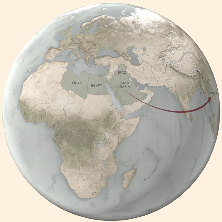
Experimentation with globes in Blender 3D →
There’s also a collection of video tutorials on how to use QGIS to greater effect.
-
Colors from images in R →
A how-to to break down images into just their colors.
-
geomnet →
An R package for “Network visualization in the ‘ggplot2’ framework” by the folks at Iowa State.
-
The most misleading charts of 2015, fixed →
Suggestions. Not just snark.
-
Squaire.js →
JavaScript library from Wall Street Journal to make the now popular square state grid.
-
k-means + d3.js →
The simple clustering technique implemented with d3.js.
-
Do Visual Stories Make People Care? →
The NPR Visuals team tracked user activity on their visual stories to see how people read or didn’t.
-
Hexagonal Grids →
More than you ever thought you wanted to know about hexagonal grids.
-
rchess →
An R package for chess move generation and validation.
-
tigris →
A package to help you download and map TIGER shapefiles in R.
-
What to do with small data →
When the algorithms and methods for big data don’t work.
-
NFL play-by-play data →
Download play-by-play and standings data scraped from the NFL site, dating as far back as 1920.
-
Seaborn →
A Python library for visualization. Surprised I just heard of it.


 Visualize This: The FlowingData Guide to Design, Visualization, and Statistics (2nd Edition)


