Mapping data over time can be challenging, especially when you have a lot of data to load in the beginning. Torque, the new open source project by CartoDB, is a step towards making the process easier.
Torque allows you to create beautiful visualizations with big temporal datasets by bundling HTML5 browser rendering technologies with a generic and efficient temporal data transfer format created using the CartoDB SQL API. Torque visualisations work on desktop and ipads, and work well on temporal datasets with hundreds of thousands or even millions of datapoints.
It’s still in the early stages but should be one to keep an eye on.
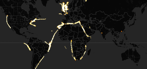
Check out this map for a sense of what Torque can help you do. The map animates historical edits to OpenStreetMap in Madrid. Also this. [Thanks, Carlos]


 Visualize This: The FlowingData Guide to Design, Visualization, and Statistics (2nd Edition)


