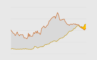
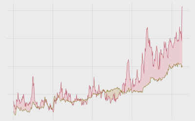
Difference Chart
Fill the space between lines to highlight the greater-than and less-than differences over time.
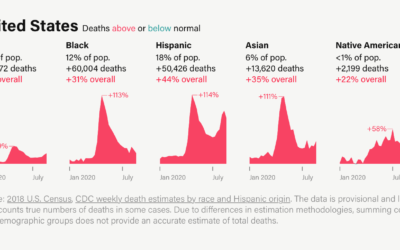
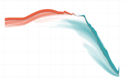
Excess deaths, by race
It’s clear that Covid-19 has affected groups differently across the United States. By…
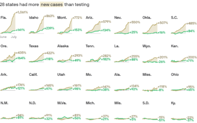
Cases vs. testing
There have been assertions that increased case counts are all from increased testing.…
How to Make Difference Charts in Excel
Also known as a bivariate area chart, the plot type focuses on the comparison between two time series.
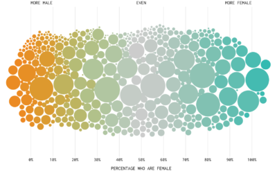
The Most Gender-Switched Names in US History
We use some names mostly for boys and some mostly for girls, but then there is a small percentage that, over time, switched from one gender to another. Which names made the biggest switch?
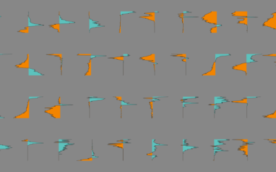
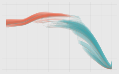
How I Made That: Animated Difference Charts in R
A combination of a bivariate area chart, animation, and a population pyramid, with a sprinkling of detail and annotation.
Ask the Question, Visualize the Answer
Let's work through a practical example to see how asking and answering questions helps guide you towards more focused data graphics.
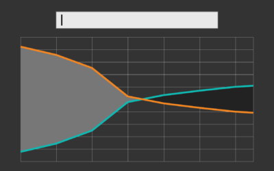
How I Made That: Searchable Time Series Chart
When there are too many options or categories, it can be helpful to make the data searchable.
How to Make Bivariate Area Charts in R
Quickly compare two time series variables with this line-area chart hybrid that originated in the 1700s. Also known as: difference chart.