Visualization
Showing the stories in data through statistics, design, aesthetics, and code.
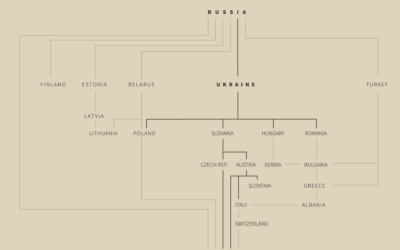
Russian gas supplies in Europe
For Reuters, Prasanta Kumar Dutta, Samuel Granados and Michael Ovaska detail Europe’s dependence…
Interactive traffic simulator
Traffic always seems so sensitive to the smallest disruptions. Someone pulls over to…
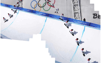
Snowboarding composite photos
If you watched the men’s halfpipe in the Olympics, you were probably impressed…
Premier League territory control
The Athletic charted territories on the field to show whether the team of…
Modernized version of a mid-19th century encylopedia
Between 1849 and 1851, J.G. Heck published a 10-part encyclopedia called Iconographic Encyclopædia…
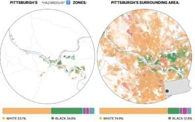
Past redlining still seen in the present
In the 1930s, a group called the Home Owners’ Loan Corporation went to…
Figure skating animated jumps
Figure skater Nathan Chen set a world record with his performance in the…
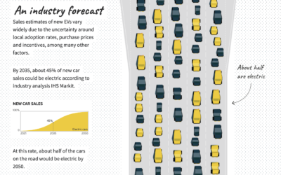
Improving electric vehicle adoption rates
Gas-powered vehicles contribute a big part of total carbon production, so to get…
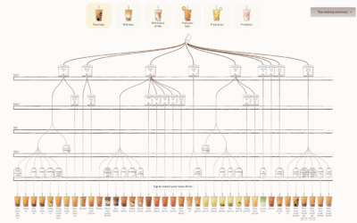
Bubble tea combinations, a visual breakdown
Walk into a boba shop and usually you’ll see a large menu that…
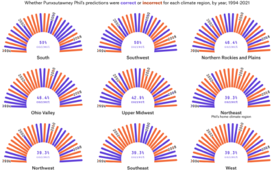
Accuracy of groundhog weather prediction
For FiveThirtyEight, Simran Parwani and Kaleigh Rogers compared Groundhog Day predictions against actual…
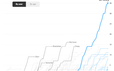
Charts showing Tom Brady’s standout career
Tom Brady announced his retirement from the National Football League, which ends a…
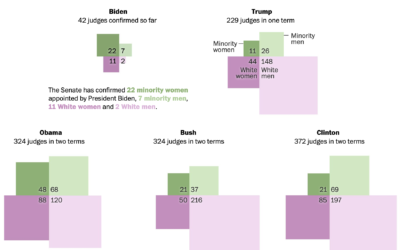
Diversity of federal judge picks, compared by president
Adrian Blanco for The Washington Post used squares connected at the corners to…
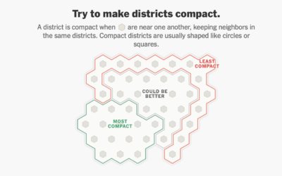
A game to gerrymander your party to power
Ella Koeze, Denise Lu, and Charlie Smart for The New York Times made…
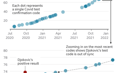
Questioning Novak Djokovic’s Covid tests, based on data
Tennis player Novak Djokovic is not vaccinated against the coronavirus, and as a…
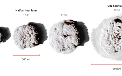
Scale of the Tonga eruption
Manas Sharma and Simon Scarr used satellite imagery to show the scale of…

