Visualization
Showing the stories in data through statistics, design, aesthetics, and code.
Using gaps in location data to track illegal fishing
Speaking of non-location in the seas, researchers at the University of California at…
Fake location signals from oil tankers avoiding oversight
The New York Times tracked oil tankers faking their location as they ignore…
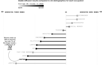
Generative AI exaggerates stereotypes
Perhaps to no one’s surprise, generative artificial intelligence models contain bias rooted in…
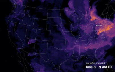
Smoke from Canada wildfires over the U.S.
Wildfires in one area means smoke and pollution travels to surrounding areas, even…
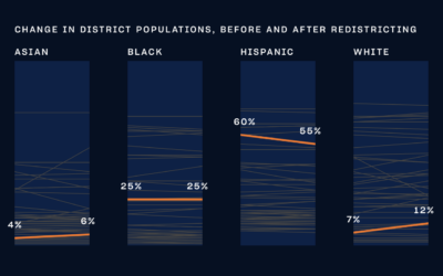
NYC city council district voting guide
With New York 2023 elections coming up, The City and NY1 put together…
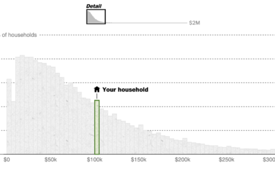
See if you are middle class
What counts as middle class depends on who and where you’re asking. Even…
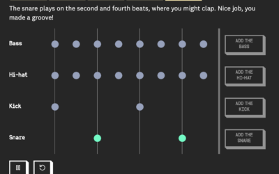
A moving drumbeat, explained visually
When you first learn to play music, a lot of the instruction is…
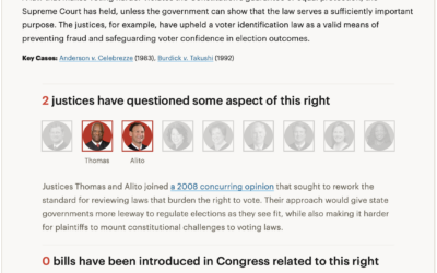
Rights at risk at the U.S. Supreme Court level
For ProPublica, Ian MacDougall and Sergio Hernandez evaluated records of sitting justices to…
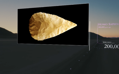
Scale model of the universe’s timeline
To better understand the scale of time and feed your existential dread, Wylie…
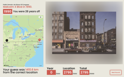
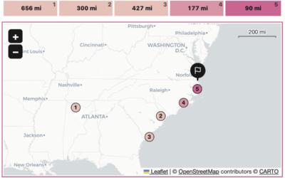
A guessing game for place and time
Add another geolocation guessing game that I am terrible at. TimeGuessr shows you…
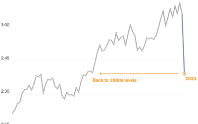
Shortening baseball games
Baseball games grew longer over the decades, with the average length well over…
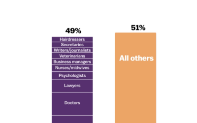
How teenagers’ job ambitions have changed
The Programme for International Student Assessment (PISA), run by the OECD since 2000,…
A geolocation game in the format of Wordle
With a cross between the games Wordle and GeoGuessr, Russell Samora for The…
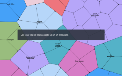
A portrait of your stolen identity in data breaches
You’ve probably heard about big data breaches over the years. They’re in the…
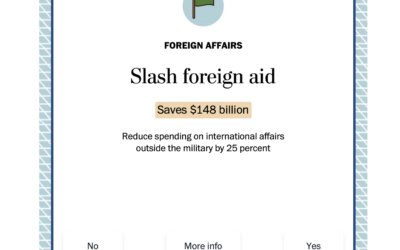
Swipe left or right to cut the national debt
Cutting the national debt is a complex process that involves a lot more…
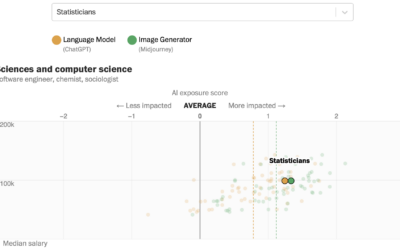
How much AI will affect your job
Research by Edward W. Felten, Manav Raj, and Robert Seamans provides estimates for…