Visualization
Showing the stories in data through statistics, design, aesthetics, and code.
Data-based journal of Pavement tour songs
Denise Lu, a superfan of Pavement, an indie rock band, examined the set…
Disney’s innovations in animation
As Disney and its stock price struggles with streaming, Reuters looks at how…
Getting a reservation at a busy restaurant, gamified
When you score a reservation at a busy restaurant, it can feel like…
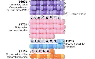
Taylor Swift earnings visualized with bracelet beads
Bloomberg estimates that Taylor Swift reached billionaire status with her recent touring and…
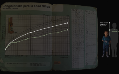
Food shortage in a height chart
There are food shortages in Guatemala. For Reuters, Cassandra Garrison, Clare Trainor and…
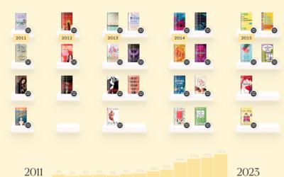
Analysis of romance novel covers
When I was a kid, I remember uncomfortably walking past the book section…
Google Maps and 3D experiments
The Google Maps API lets you access high-resolution 3D map tiles now. Robert…
Evolution of race categories in U.S. Census forms
For The New York Times, K.K. Rebecca Lai and Jennifer Medina show the…
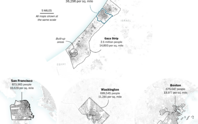
Gaza Strip size compared to U.S. cities
One of the most straightforward ways to help others better understand the scale…
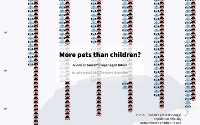
More pets than children in Taiwan
Julia Janicki, Daisy Chung, and Joyce Chou explore Taiwan’s aging population, where in…
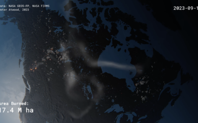
Realistic rendering of Canada’s wildfires
Peter Atwood used NASA data to depict the wildfires in Canada this year.…
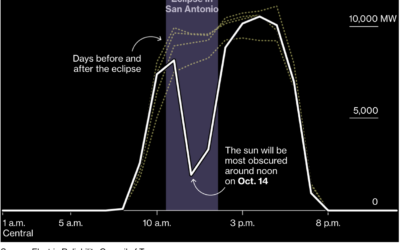
Dip in solar generation during the solar eclipse
Solar power is clean and all, but what happens when the sun is…
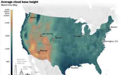
Where the clouds are the highest
Cloud formation depends on temperature and moisture levels, so in places of high…
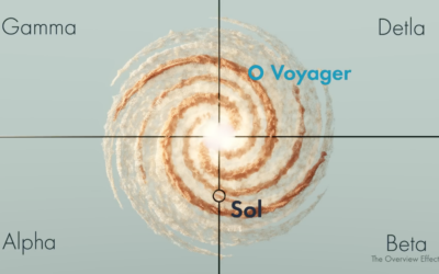
Real space location of Star Trek and other science fiction
Star Trek and related might be fictional, but they usually reference real stars,…
Mapping Israel and Gaza attacks
The New York Times is mapping rocket strikes, attacks, and ongoing conflict in…
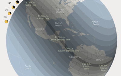
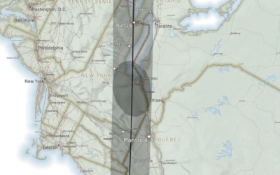
Following the path of the 2024 solar eclipse
There is going to be a solar eclipse on April 8, 2024. The…


