Visualization
Showing the stories in data through statistics, design, aesthetics, and code.
21 Ways to Visualize and Explore Your Email Inbox
Can we somehow tell a meaningful story with the thousands of emails we've sent, received, and deleted?
Interact With the Atlas of Electromagnetic Space
Jose Luis Vicente and Irma Vilà , in collaboration with Bestiario, have created…
17 Ways to Visualize the Twitter Universe
I just created a new Twitter account, and it got me to thinking…
A World of Information in Data-driven Art – Not Your Grandma’s Dashboard
Wired Magazine recently did a feature on data-driven art.
The above image is…
4 Data Visualizations That Inspired Me to Learn More
There was a time I didn't really know what I wanted to do, but since I saw these data visualization pieces, I haven't looked back.
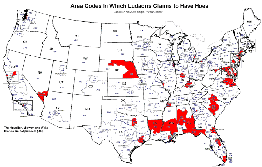
Area Codes in Which Ludacris Claims to Have Hoes
I thought this map was amusing. As you can see, Mr. Bridges prefers…

Weekend Minis – Globes, Maps, and Job Opportunity
New York Talk Exchange – Illustrates the global exchange of information in real…
Explore Your del.icio.us Tags and Bookmarks On 6pli
Santiago, who I met at the Visualizar workshop, forwarded me his work on…
Hope Floats in Online Dating – I Want You to Want Me By Harris and Kamvar
Jonathan Harris and Sep Kamvar collaborated again in their featured piece at New…
Can We Improve this Graphic Showing History of Bipartisan Senate?
Some thoughts on what I think would make this graphic on the U.S. senate's history of bipartisan politics a bit more useful.
Visual Website Analytics in Video Game Format
How can we use gaming to improve current data visualization techniques?
IBM Visual Communications Lab and Stamen Design Are at the NYC MoMA
Congratulations to two of my most favorite visualization / design groups – IBM…
Ebb and Flow of Box Office Receipts Over Past 20 Years
The New York Times puts out another good one in this graphic for the talkies.
What Impact Does Our Country Have on Climate Change?
BreathingEarth is an animated map that represents death rate data from September 2005…
Is an Animated Transition From a Scatter Plot to a Bar Graph Effective?
Jeffrey Heer and George G. Robertson investigate the benefits of using animation in statistical graphics.
Mapping Manhattan’s Skyscraper Districts Through Time
Manhattan Timeformations looks like a series of interactive schematics from a video game,…
Spamology From Visualizar is Available for Exploration
This spam visualization, by Irad Lee, was one of favorite projects at Visualizar.
Weekend Minis – Design Paradigms, Colbert Bump, and Bullet Graphs
For your long, relaxing weekend, enjoy some visualization treats.