Visualization
Showing the stories in data through statistics, design, aesthetics, and code.
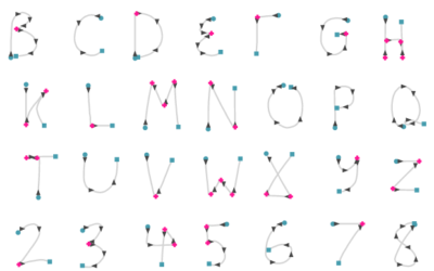
An interactive look at handwriting recognition from 1960s
In the 1960s, the RAND corporation developed a handwriting recognition system using, well,…
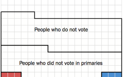
Small percentage of Americans actually picked Clinton and Trump
Alicia Parlapiano and Adam Pearce for the New York Times elegantly show a…
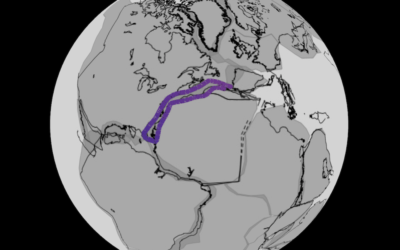
Continental drift, from 240 million years ago to present
Researchers modeled continental drift, going back 240 million years ago, on the scale…
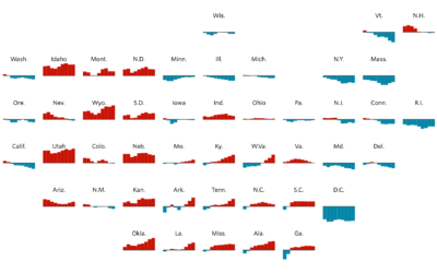
Grid map shows shifting states
You’re likely familiar with the state grid map form used these days. Instead…
Ride on the VR time series roller coaster
Speaking of virtual reality visualization, this Nasdaq roller coaster by Roger Kenny and…
Virtual reality map to show Google Trends
More of an experiment, this VR map, by the Google Trends Lab in…
Grace Hopper explains a nanosecond with a visual aid
A nanosecond is a billionth of a second, but we’re not very good…
Piecing together satellite images
You might think piecing together satellite imagery is a straightforward task of lining…
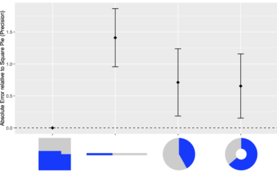
Square pie chart beats out the rest in perception study
Many hate pie charts. Others love them. I think they’re useful but have…
Cross-country road trip at a constant 70 degrees
Road trips are fun, but it can be hard to enjoy yourself when…
History lesson on data visualization
Clive Thompson for Smithsonian Magazine gives a quick history lesson on infographics.
[D]ata…
One year as a Data Scientist at Stack Overflow →
Detailed description of what it’s like for someone with a stat-heavy background.…
Charted history of music, from its origins to present
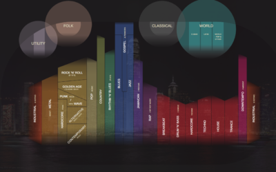
Musicmap is an attempt to show the history of music over time and…
Growth of cities, going back 6,000 years
Meredith Reba, Femke Reitsma and Karen C. Seto compiled a dataset of urban…

