Race and Origin in the United States, by State
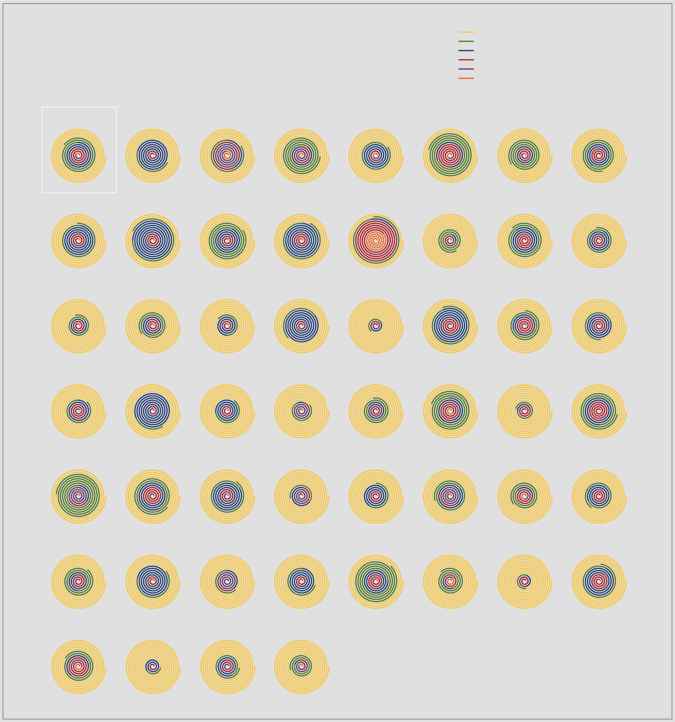
Here is the breakdown for each state in the United States, based on estimates from the American Community Survey.

CHARTS
EXPLANATION. Each spiral represents the percentage of those who identify with the race or origin listed. Segment length is proportional to the percentage of each group, as it relates to the full length of the spiral.
WHITE
HISPANIC OR LATINO
SHOWING THE
BLACK OR AFRICAN AMERICAN
RACE OR ORIGIN
ASIAN
AMERICAN INDIAN AND ALASKA NATIVE
PERCENTAGES OF EACH STATE
NATIVE HAWAIIAN AND PACIFIC ISLANDER
Compiled using estimates from the American Community Survey 2018
United States
Alabama
Alaska
Arizona
Arkansas
California
Colorado
Connecticut
Delaware
District of Columbia
Florida
Georgia
Hawaii
Idaho
Illinois
Indiana
Iowa
Kansas
Kentucky
Louisiana
Maine
Maryland
Massachusetts
Michigan
Minnesota
Mississippi
Missouri
Montana
Nebraska
Nevada
New Hampshire
New Jersey
New Mexico
New York
North Carolina
North Dakota
Ohio
Oklahoma
Oregon
Pennsylvania
Rhode Island
South Carolina
South Dakota
Tennessee
Texas
Utah
Vermont
Virginia
NOTE. Survey respondents are allowed to answer more than one race and can have Hispanic or Latino origin or not. For the sake of simplicity, the percentages shown for each race are for those who only selected a single race and are non-Hispanic. Hispanic or Latino is then shown separately for comparison.
Washington
West Virginia
Wisconsin
Wyoming

CHARTS
SHOWING THE
RACE OR ORIGIN
PERCENTAGES OF EACH STATE
Compiled using estimates from the American Community Survey 2018
WHITE
HISPANIC OR LATINO
BLACK OR AFRICAN AMERICAN
ASIAN
AMERICAN INDIAN AND ALASKA NATIVE
NATIVE HAWAIIAN AND PACIFIC ISLANDER
US
AL
AK
AZ
AR
CA
CO
CT
DE
DC
FL
GA
HI
ID
IL
IN
IA
KS
KY
LA
ME
MD
MA
MI
MN
MS
MO
MT
NE
NV
NH
NJ
NM
NY
NC
ND
OH
OK
OR
PA
RI
SC
SD
TN
TX
UT
VT
VA
WA
WV
WI
WY
EXPLANATION. Each spiral represents the percentage of those who identify with the race or origin listed. Segment length is proportional to the percentage of each group, as it relates to the full length of the spiral.
NOTE. Survey respondents are allowed to answer more than one race and can have Hispanic or Latino origin or not. For the sake of simplicity, the percentages shown for each race are for those who only selected a single race and are non-Hispanic. Hispanic or Latino is then shown separately for comparison.
Looking at percentages is a little tricky, because respondents can answer more than one race and whether or not they have Hispanic or Latino origins. So for simplicity, these charts represent those who answered one race or said they had Hispanic origins.
Become a member. Support an independent site. Get extra visualization goodness.
See What You Get


