Growth of Subreddits
Reddit started in 2005 as a single hub to discuss and share links. In early 2006, subreddits were introduced as topic-specific categories. Growing ever since, as of September 2018, there were 892 million comments for the year so far, spread out over 355,939 subreddits.
However, most of the subreddits aren’t very active. In the month of September, there were about 104 million comments. Ninety percent of these comments came from the top 3% of subreddits. Looking higher, 0.22% (250 of about 110,000 subreddits) accounted for half of all comments.
With that in mind, here’s a chart of the top 10 commented subreddits over the years for a look at “what the internet is talking about.”
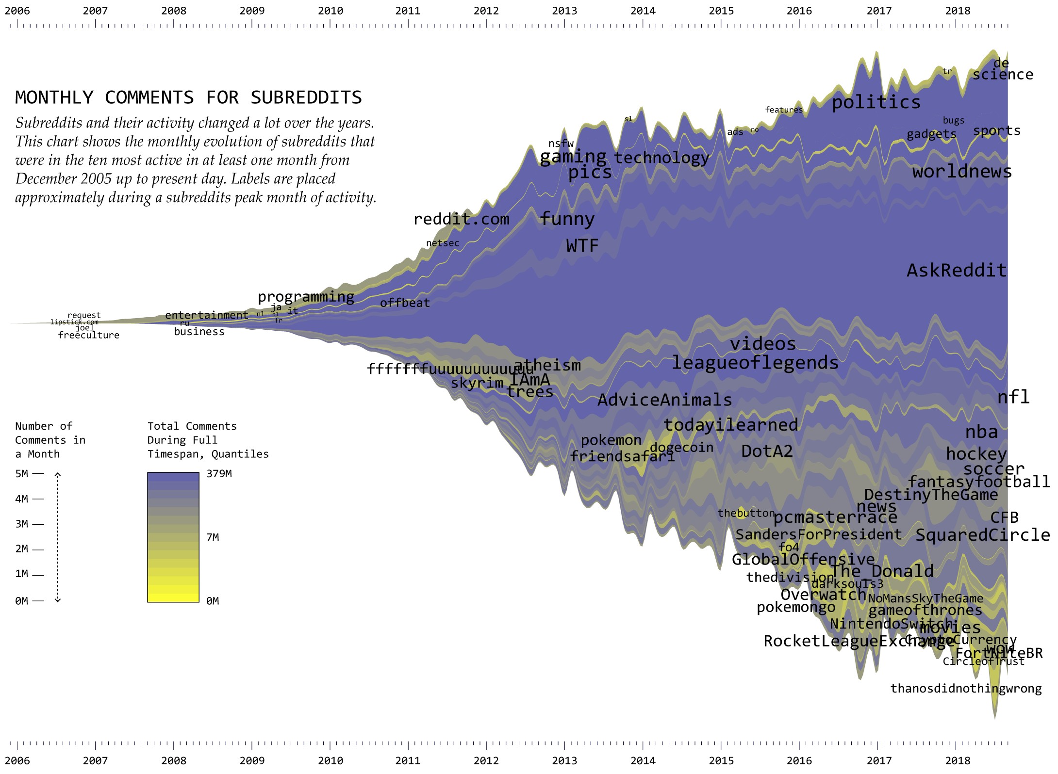
It’s easy to pick out the standouts in this view. AskReddit has the highest volume of comments, which makes sense because the whole premise is for people to ask questions for others to answer and discuss. Then there’s the politics subreddit, which swelled in recent years. Everything kind of pales in comparison to those two.
Label positions provide a rough idea of when each subreddit peaked. The subreddits farther to the right, such as the news- and sports-related ones, are more recently active. WTF and AdviceAnimals saw their heydays a few years ago.
So that’s the overview. You get a sense of how the discussion changed since 2005, but the trends of specific subreddits are more difficult to pick out. Here’s a split view:
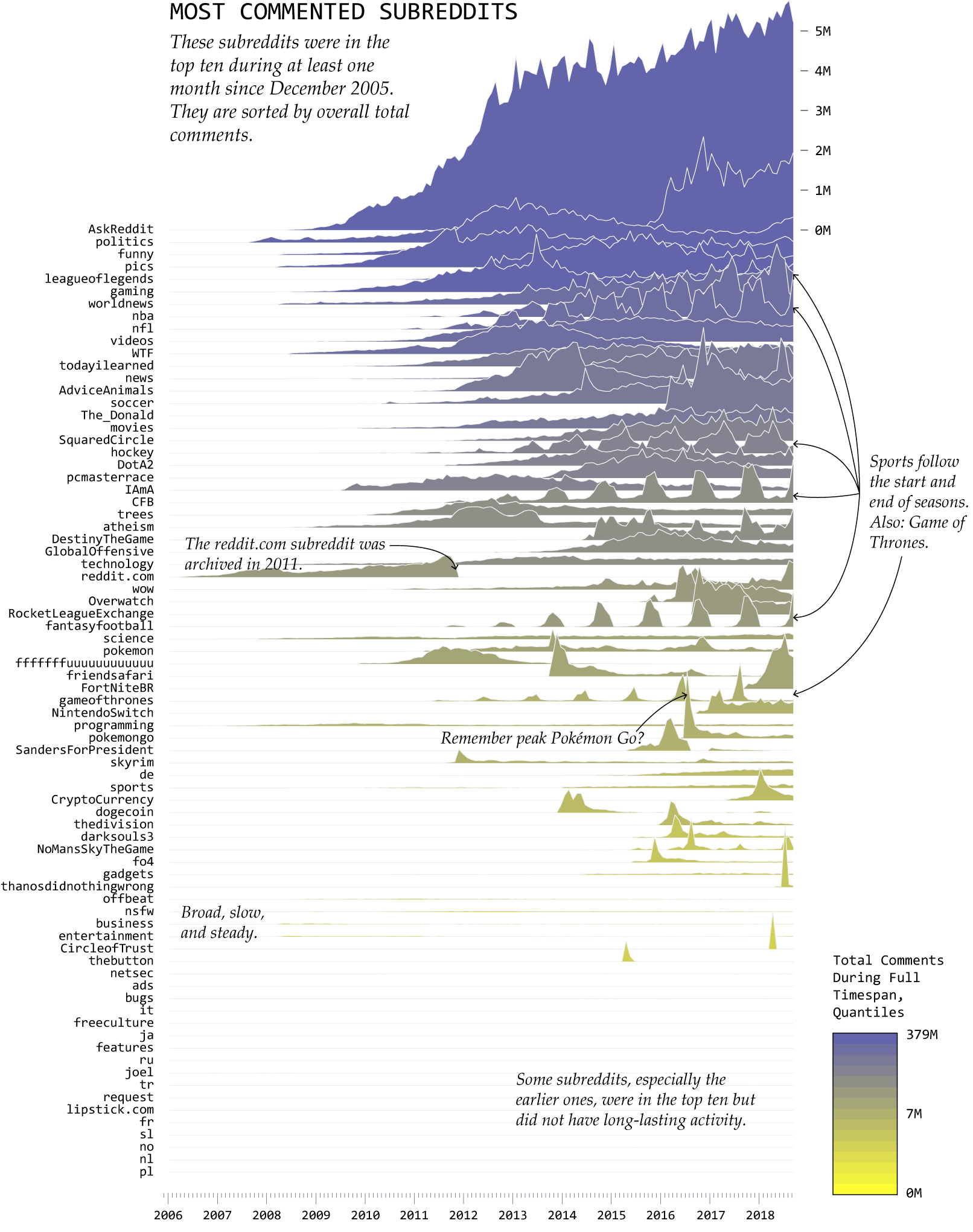
It’s a mix of patterns over time. AskReddit has big, steady growth; politics is more sudden; sports revolves around the seasons; games such as Fortnite: Battle Royale (FortNiteBR), Pokémon GO (pokemongo), and Pokémon X & Y (friendsafari), and No Man’s Sky (NoMansSkyTheGame) show near instant popularity, in line with releases.
These trends should also give you a good idea of the Reddit audience, which as you might expect, isn’t quite representative of the world population or all internet users and tends towards young and male.
That said, as points of comparison, some of these match up with my Twitter feed, anecdotally speaking. Certain topics have overtaken more fun ones. So, I’m rooting for the funny subreddit to continue its steady climb back up. I’d be okay with AdviceAnimals too.
Notes
- The raw comment data can be found on pushshift, which scrapes via the reddit API. I accessed the data via Google BigQuery, so I didn’t have to download and process everything. The dump is missing data for November and December 2007 though, so aggregated those myself with the pushshift scrape.
- I made the charts in R. I edited in Adobe Illustrator.
- Here’s a tutorial for the streamgraph. A tutorial for the frequency trails is on the way.
- This animated bubble chart of subreddit comments, which shows one month at a time got me thinking about the overall trends. See also Randal Olson’s analysis of post trends.
Chart Types Used


Become a member. Support an independent site. Get extra visualization goodness.
See What You Get