Guides for Visualizing Reality
We like to complain about how data is messy, not in the right format, and how parts don’t make sense. Reality is complicated though. Data comes from the realities. Here are several guides to help with visualizing these realities, which seem especially important these days.

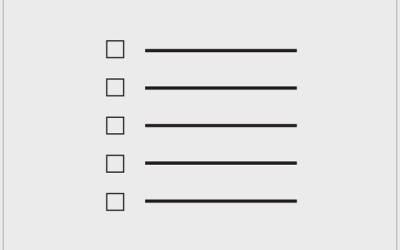
Visualizing Incomplete and Missing Data
We love complete and nicely formatted data. That’s not what we get a lot of the time.

Visualizing Outliers
Step 1: Figure out why the outlier exists in the first place. Step 2: Choose from these visualization options to show the outlier.
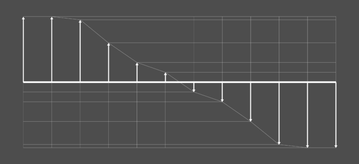
Visualizing Differences
Focus on finding or displaying contrasting points, and some visual methods are more helpful than others.

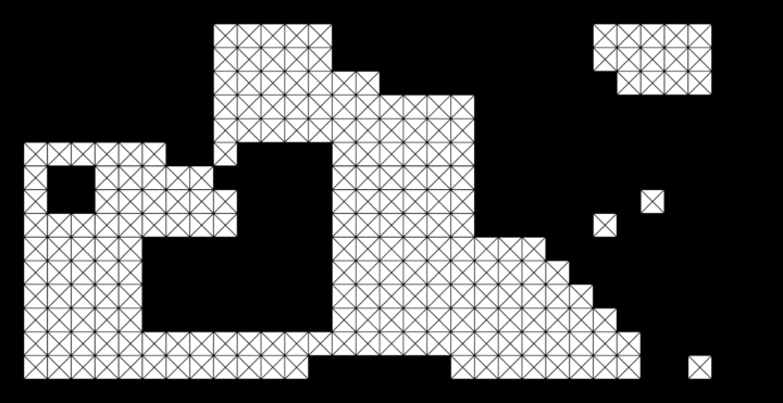
Visualizing Patterns on Repeat
Things have a way of repeating themselves, and it can be useful to highlight these patterns in data.
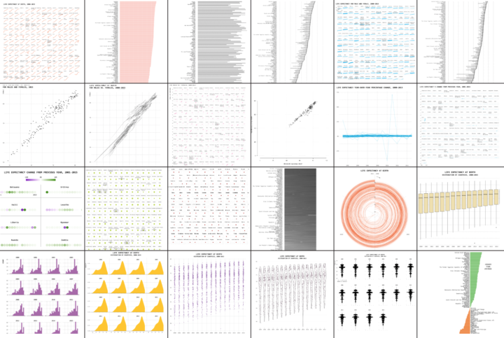
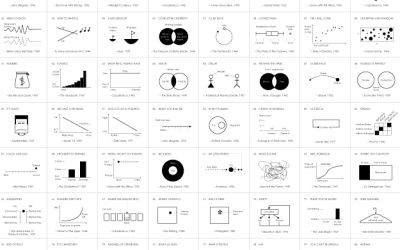
One Dataset, Visualized 25 Ways
A single dataset can tell you a lot of things. See also how questions can guide you.

How to Spot Visualization Lies
Chart ≠ fact.
Become a member. Support an independent site. Get extra visualization goodness.
See What You Get