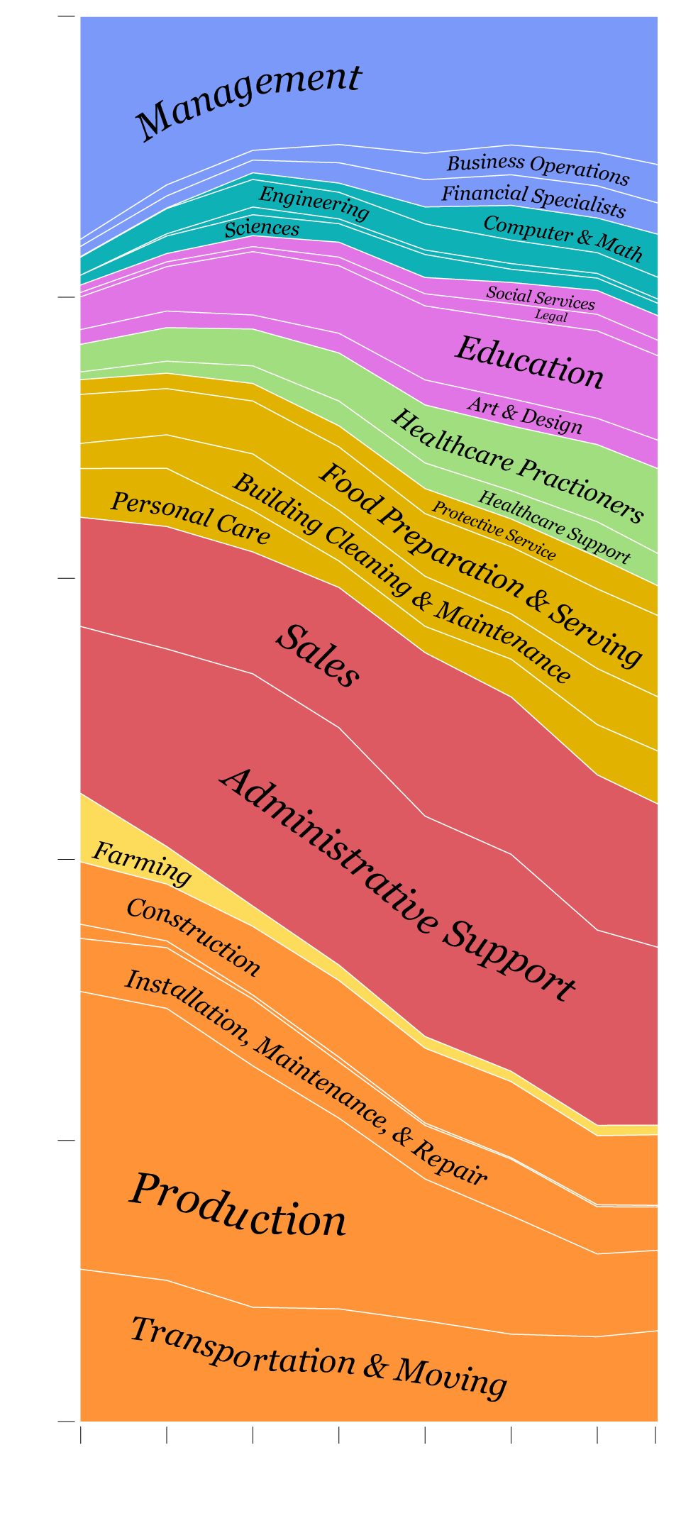
Shifts in Job Distribution
In the 1950s, almost half of all employed people were either in farming or manufacturing. As you can imagine, work changed a bit over the years. Here’s how the distribution of jobs across occupation groups shifted.
100%
80%
60%
40%
20%
0%
1950
’60
’70
’80
’90
2000
’10
’17
Source: Census Bureau
Notes
The data comes from a combination of the American Community Survey and the Decennial Census. I downloaded the data via IPUMS. They provide unified occupation classifications, which allows for comparison of jobs over time.
Chart Type Used

Become a member. Support an independent site. Get extra visualization goodness.
See What You Get