Visualizing Patterns on Repeat
Seasonality. Redundancy. Repetition. Things have a way of repeating themselves, and it can be useful to highlight these patterns in data. Here’s a guide for possible solutions, the pros and cons of each, and examples of the method in practice.
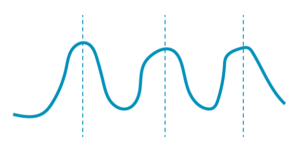
Using Markers
This is the most straightforward route, because you don’t have to change anything, geometrically speaking. Visualize the data how you normally would, and then annotate with lines, dots, words, etc.
Pros
If the patterns are clear enough, you can provide a familiar view that takes less effort for someone to decipher. This is probably the fastest way too since you can use what you already know and don’t have to reformat your data.
Cons
If the repeating patterns are more subtle, readers might miss the cycles you want them to see. Less emphasis means less visual attention.

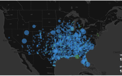
Overlaying Equal Time Frames or Layers
If you have enough data, try showing it all at once with categories or equal subsections placed one over the other. For example, if you have monthly data, try a monthly line for each year. This provides a somewhat aggregated view while still maintaining a view of individual data points.
Pros
Because time and/or space are aligned, a highlight on repeating patterns during/at the same time/space shows more obviously.
Cons
As you purposely overlap points or lines, areas obscure quickly, so you could end up with a blob or a jumbled mess if the data doesn’t work with the method.
Example
When dealing with running GPS data, I mapped paths one over the other, and the areas with more running appeared more prominent.

Similarly, Gregor Aisch and Kevin Quealy charted total touchdown passes for quarterbacks in the NFL. You see a rising path for all of them, and you can pick out the ones with steeper slopes.
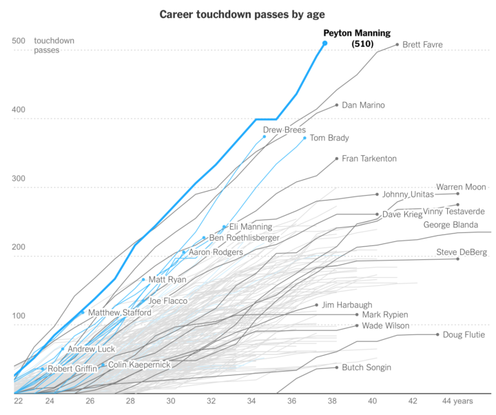
Mostly though, note the horizontal axis of age so that everyone gets the same starting point.
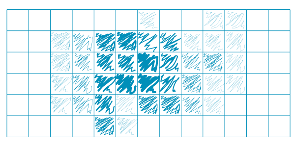
Aggregation
Instead of showing every point, you can aggregate, which places more emphasis on areas in a plot or map than on individual spots. Whether you choose this over the previously mentioned overlay depends on the data and what you want to focus on.
Pros
With aggregation, you can more easily adjust scale to include the full range, which in turn makes for a good overview.
Cons
You lose granularity. Sometimes this is a good thing to reduce noise. Sometimes it’s a bad thing when it clumps too many things together. Experiment with bin size and scale when you aggregate.
Example
Below is a calendar view that shows daily aggregates. The alignment of the weeks shows a repeated uptick in fatal crashes during the weekend.

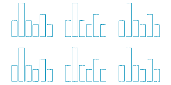
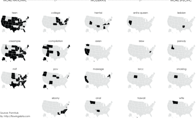
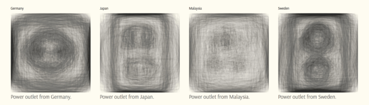
Small Multiples
Split up the data into categories and make a chart for each. This allows for equal comparisons across the same scale, while maintaining individual views.
Pros
Like most uses of small multiples, you get a quick overview of the data. Cut the data into equal pieces for each multiple, and it can provide some white space that you might not get by overlaying everything.
Cons
You have to look at each multiple to compare, so you don’t get a direct visual comparison. If there are a lot of multiples, you might end up with something visually daunting when all you wanted was an overview of a cyclical pattern.
Example
Mauro Martino overlaid sketches from Googles Quick Draw dataset and then split it up into small multiples, one for each country.
Or, check out the chart by Erin Ross, which divides the data by year, showing a repeating wildfire pattern during the hot summer months.
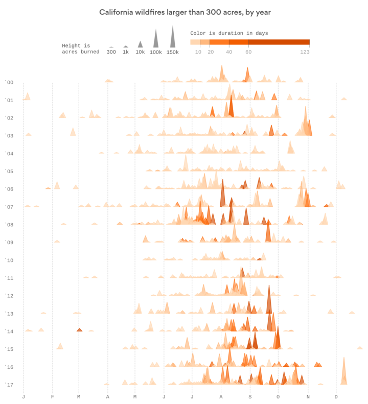
Again, the main point here is that things are aligned — the drawings in the same space and the seasonal timelines arranged vertically by year — to highlight repeated patterns.
Animation
Oh glorious movement, you provide so much entertainment and whimsy. Think of animation as a way to show another dimension of the data.
Pros
It’s fun to watch and can make the data “come alive” as some like to say.
Cons
Animation is fun, but it can also be a distraction. And remember that visualizing cyclical data is about showing something that happens over and over again. If you only show, say, one dot moving in a space, this requires the viewer remember where the dot has been.
Example
Tom Randall and Blacki Migliozzi visualized temperature deviation over 135 years. The hottest year on record highlights as each year passes on the animation.
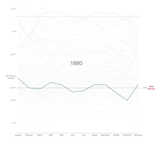
So you can see how a combination of overlay and markers can work together, while playing out like a video.
Wrapping Up
The theme here is highlighting with visual alignment. Cut and align a time series to compare like time frames against each other. Plot the data in the same space and the overlapping areas — the repeating parts — tend to reveal themselves.
Chart Types Used


Become a member. Support an independent site. Get extra visualization goodness.
See What You Get