Tutorials
Visualize your data like an expert with hundreds of practical how-tos for presentation, analysis, and understanding.
How to Map and Use GeoTIFF Files in R
It's like working with a bunch of tiny dots, and oh look, all of sudden patterns emerge.
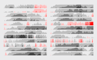
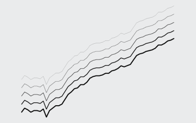
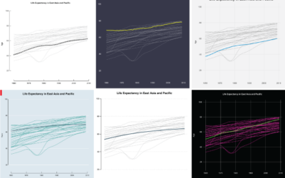
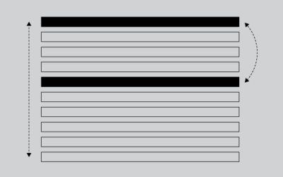
How to Make Horizon Graphs in R
The relatively new and lesser known time series visualization can be useful if you know what you're looking at, and they take up a lot less space.
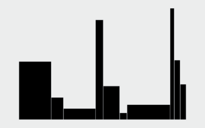
How to Make Variable Width Bar Charts in R
The code to create these bar chart variations is almost the same as if you were to make a standard bar chart. But make sure you get the math right.
A Course for Visualization in R, Taking You From Beginner to Advanced
Where to start? What to learn next? Here's a course to help take you from beginner to advanced.
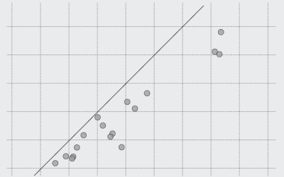
How to Make Dot Plots in R
It's easy to draw dots. The challenge is to make them meaningful and readable.
How to Make Line Charts in R
Learn to draw lines wherever and however you want, and you've got yourself some flexibility.
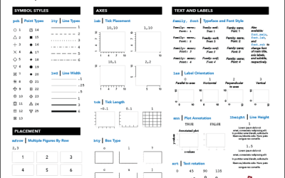
R Cheat Sheet and Guide for Graphical Parameters
You can customize graphics in R with
par(), but the docs are mostly text and just organized alphabetically. Here is a more visual reference, categorized by what you can change. Plus, a one-page printout. 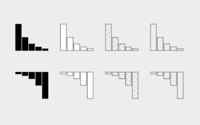
How to Make and Use Bar Charts in R
The chart type seems simple enough, but there sure are a lot of bad ones out there. Get yourself out of default mode.
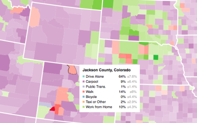
Making an Interactive Map with Category Filters
Let readers focus on the regions they care about to make their own comparisons and conclusions.
Loading Data and Basic Formatting in R
It might not be sexy, but you have to load your data and get it in the right format before you can visualize it. Here are the basics, which might be all you need.
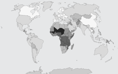
Choropleth Maps and Shapefiles in R
Fill those empty polygons with color, based on shapefile or external data.
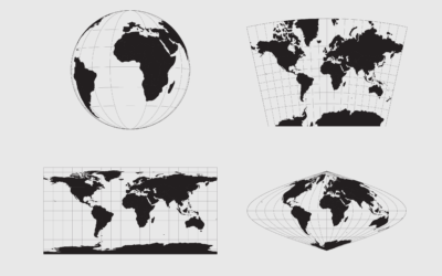
Working with Map Projections and Shapefiles in R
No need to settle for the mapping defaults in R. Apply map projections to show geographic data in a way most suitable for your work.
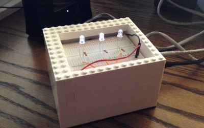
How to Download and Use Online Data with Arduino
Before you can do anything with data, you have to get it into the application. Working with an Arduino is no different. Although the process is changes, if you're used to working with desktop software.
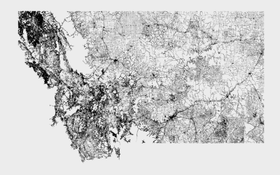
Mapping With Shapefiles in R – Getting Started
Geographic data is often available as a shapefile, and there's plenty of heavy software to get that data in a map. R is an open source option, and as a bonus, much of the work can be done in a few lines of code.
Moving Past Default R Charts
Customizing your charts doesn't have to be a time-intensive process. With just a teeny bit more effort, you can get something that fits your needs.
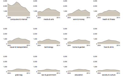
How to Make Interactive Linked Small Multiples
Small multiples are great, and the right interactions can make them even better. A primer and a how-to.
How to Make an Animated, Self-Sorting List
You have a list of things that can be ordered by different values. Let them sort themselves out.
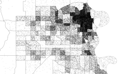
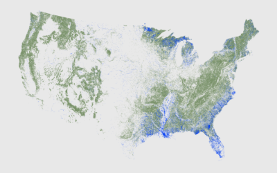
How to Make Dot Density Maps in R
Choropleth maps are useful to show values for areas on a map, but they can be limited. In contrast, dot density maps are sometimes better for showing distributions within regions.