Reviving the Statistical Atlas of the United States with New Data

Update: Now bigger and more complete.
Ever since I found out about the Statistical Atlas of the United States, historically produced by the Census Bureau, it annoyed me that there wasn’t one in the works for the 2010 Census due to cuts in funding. The last one was for 2000. Actually, the 2000 edition was called the Census Atlas, but whatever. With more data than ever, it seems like there should be one.
Maybe that’s why there’s isn’t one.
Too much data, too much of an undertaking, and too many bureaucratic decisions to make.
The first Atlas, by Francis A. Walker, was published in 1874 using the data from the prior 1870 Census. Counting cover, credits, and all that, it was 56 pages.
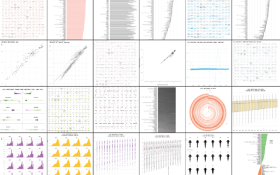
I got to thinking, hey, I could do that. And if I did, I wouldn’t have to be annoyed anymore. So I recreated the original Statistical Atlas of the United States with current data. I used similar styling, and had one main rule for myself. All the data had to be publicly available and come from government sites.
Here are my results.


GEOLOGY. The previous atlas used what I’m guessing estimates from ground surveys. These days, satellite data provides estimates at much higher granularity. I sure would hate to draw that stream and waterbodies map by hand.
Source: Geological Survey and the Department of Agriculture.


WEATHER. It’s really easy to find weather data for the past few days and forecasts for the next few, but it was kind of a pain to find historical weather data. The National Weather Service website is probably one of the more dated and unorganized ones out there. I expected more from an organization with so much data. NOAA is a bit better.
Source: National Weather Service and National Oceanic and Atmospheric Administration.


LAND COVER. The granularity, which offers more pixels than most computer screens allow, was fun to play with. The interface to actually pull out the data — a few gigabytes worth, which is kind of big for a government dataset — was of course horrible.
Source: Department of Agriculture.


POPULATION. Hey look, it’s everyone’s favorite population density map. I like to flip between the county density map and the developed area one. They match up as you would expect, but it’s just nice to toggle between the two levels of detail.
Source: American Community Survey and the Department of Agriculture National Agricultural Statistics Service Cropland Data Layer


FOREIGN POPULATION. I like how you can see counties around state borders with a higher percentage of residents who were born out of state. That’s totally what you’d expect of course. However, I didn’t expect some states to have so many out-of-state residents.
Source: American Community Survey.


AGE. Age doesn’t vary a whole lot across counties and states. There is a handful of counties with relatively low and high medians, but it’s nowhere near the same variation as the distributions from 1870.
Source: American Community Survey.


RACE. Walker seemed to be quite the fan of the mosaic plot to show groups and subgroups.
Source: American Community Survey.


ANCESTRY. I don’t totally understand this variable. It’s a fill-in-the-blank question on the American Community Survey, but there weren’t any Asian categories.
Source: American Community Survey.


EDUCATION. The original atlas charted illiteracy, but there isn’t much recent and detailed data. The best I could find were estimates from 2003 by the National Center for Education Statistics. So I mapped education levels instead.
Source: American Community Survey.


WORK AND INCOME. There’s that mosaic plot again. Plus, super fun taxes in the east and west. Woo woo.
Source: American Community Survey and the Internal Revenue Service.
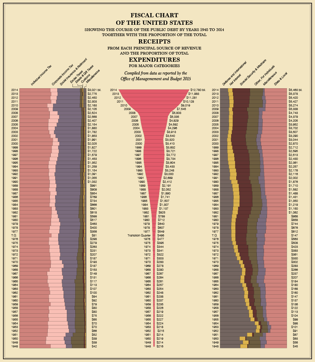
GOVERNMENT FINANCES. I had a little trouble finding the data for this at first, but once I did, the charting was straightforward.
Source: Office of Management and Budget.


DISABILITY. Probably the most interesting part here is the language used for the 1870 Atlas, namely idiocy and idiots. The proper term is now cognitive difficulty. I couldn’t find data that provided counts by decade, so I had to settle for the wider age groups, which is why I used variable width bar charts instead of fixed width. Also, Walker used pie chart small multiples, which I couldn’t bring myself to recreate.
Source: American Community Survey.


MORTALITY. Despite their relatively challenging ways to retrieve data, the Centers for Disease Control and Prevention provide ample data on mortality. However, geographic areas with fewer than 100 deaths in a selected year are obscured for privacy reasons (I’m guessing).
Source: Centers for Disease Control and Prevention.


TRANSPORTATION. The Census provides more detailed data on roads, but for the purposes of this recreation, just major roads seemed the better choice.
Source: Geological Survey.


CROPS. More detailed data from the Department of Agriculture, which also includes other types of land cover. I’m still trying to get over that fruits, nuts, and vegetables combined are only grown in a few main areas in the country. Compare with corn, soybeans, and wheat.
Source: Department of Agriculture.
Wrapping up
There it is. This was a fun project to work on, and I’m pretty sure I can take it further. For the 1880 Atlas, it looks like someone decided to get a bit creative. Would those visual forms work with larger, more detailed datasets? There are so many more subgroups and subpopulations to look at.
One thing’s for sure. The data is there. I came this far. Might as well keep on going.
P.S. With the exception of text, I made this all in R. It was just another limitation I set to keep things spicy.
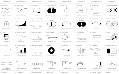
Chart Types Used


Become a member. Support an independent site. Get extra visualization goodness.
See What You Get