Multivariate Beer

Can you experience data? Sometimes visualization gets you part of the way there, putting data into context, serving as a trigger for your memory, and all that. But only so much can happen through the computer screen.
I want to feel data the way I want to taste the food in pictures. It’s one thing to see something good, and it’s another to be at a restaurant to taste a dish direct from the source.
Maybe we can use food to understand data. Instead of charts that use visual cues such as geometry and color, we can use ingredients at varying levels to represent variables in a dataset. Food has the potential to appeal to all the senses, rather than only sight.
Moritz Stefaner and prozessagenten have toyed around with the concept in their Data Cuisine workshops. Thomas Levine gave a talk not long ago on the gastronomification of data. Fish to represent emigration. Guacamole to represent test scores.
I’m curious. I like to cook. I like data. What do you get when you combine the two, and does the food help you understand data differently than you would from a bar graph?
Wait a second. I also like beer.
Data plus beer. Multivariate beer. Okay, gotta do it.
I’ve been playing around with the idea of an R package that spits out a beer recipe based on data from the latest American Community Survey release from the United States Census Bureau. The main function creates a recipe for each county. It takes into account the following:
- Percent of people with at least bachelor’s degree
- Percent of people who are employed
- Percent of people covered by health care
- Median household income
- Population density
- Percent of population that is white, black, hispanic, and Asian
It was important that I incorporate multiple variables, because I want to find out if I end up with relationships or just disparate taste notes. I think I know what single variable beer would be, and I have a hunch I’d miss out on potential complexities.
The great thing about beer is that it has plenty of dimensions to work with: body, bitterness, head retention, hop profile, color, aroma, alcohol by volume, and plenty more. The amount of various ingredients affects how beer looks, tastes, and smells.
Still a work in progress, here’s how a beer recipe is formed.
- Greater head retention should increase with higher education, so a grain called Carapils is added.
- More hop aroma represents higher employment. This comes from more hops at the end of a boil and dry hopping.
- Rye adds spice and complexity to the beer as health care coverage increases.
- A darker-colored and more full-bodied beer comes from higher median household income and Crystal Malt 40.
- More hop bitterness and flavor means more people per square mile, and the type of hops — Cascade, Centennial, Citra, Warrior, and Magnum — represents the races of the population.
For example, here is the recipe for Salt Lake County, Utah:
SALT LAKE COUNTY ALE
-----------------------------
This recipe is for a 5-gallon batch.

Hop addition times decided by brewer. Suggestion: Continuous hopping every 10 minutes during a 60-minute boil. That's 1.44 ounces per interval, which includes the hop addition at the beginning of the boil.

Add half of aroma hops at flameout. Use the rest for dry-hopping.

HOPS
-----------------------------
Cascade: 7.3oz
Centennial: 0.2oz
Citra: 0.4oz
Warrior: 1.8oz
Magnum: 0.4oz
Cascade (for aroma): 3.4oz

GRAINS
-----------------------------
American 2-row: 12lbs
Carapils: 0.7lbs
Rye: 0.6lbs
Crystal40: 0.6lbs
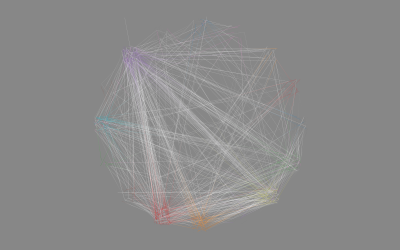
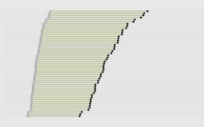
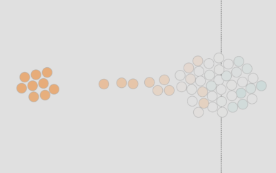
The recipe function also spits out some rough label sketches, as shown at the top of this post. Bar graphs show how the county compares to others, there’s a simple map, and another is a dot plot using multi-dimensional scaling.
Are there noticeable differences in look, aroma, and taste for various counties? Next step: brew county ales and see what happens. Stay tuned. Brewing takes about half a day and fermentation about a month. Maybe I should fix myself some data sandwiches in the meantime.
Update: I made the beers.
Become a member. Support an independent site. Get extra visualization goodness.
See What You Get