The Most Regional Names in US History

It was a challenge to choose a name for my son, someone who wasn’t born yet, because I didn’t know where to start amongst hundreds of thousands of choices. So I approached the decision the best way I knew how, through data. That brought me back to Hilary Parker’s analysis on the most poisoned name in history, which led me to the most trendy, and then the most unisex. I wanted a name that wasn’t automatically associated with a fad or gender ambiguous.
Here’s one more criteria I could’ve added: regionality. (My wife and I already named our son, but the data from the Social Security Administration continues as a source of entertainment.)
Reuben Fischer-Baum looked at the most popular name by state, which is fun, but I was more interested in names specific to regions. Most popular names by state pretty much match a nationwide trend. For example, even though Sophia was the most popular name in western states in 2012 and not the top ranked in the midwest, it’s still probably high up in the ranks. In other words, Sophia isn’t specific to California, etc.
So instead of the most popular, I looked for state outliers, based on name usage per babies born. For example, what names were popular in the west but less popular in the east? Then look at that by decade, and you get some interesting regional patterns.
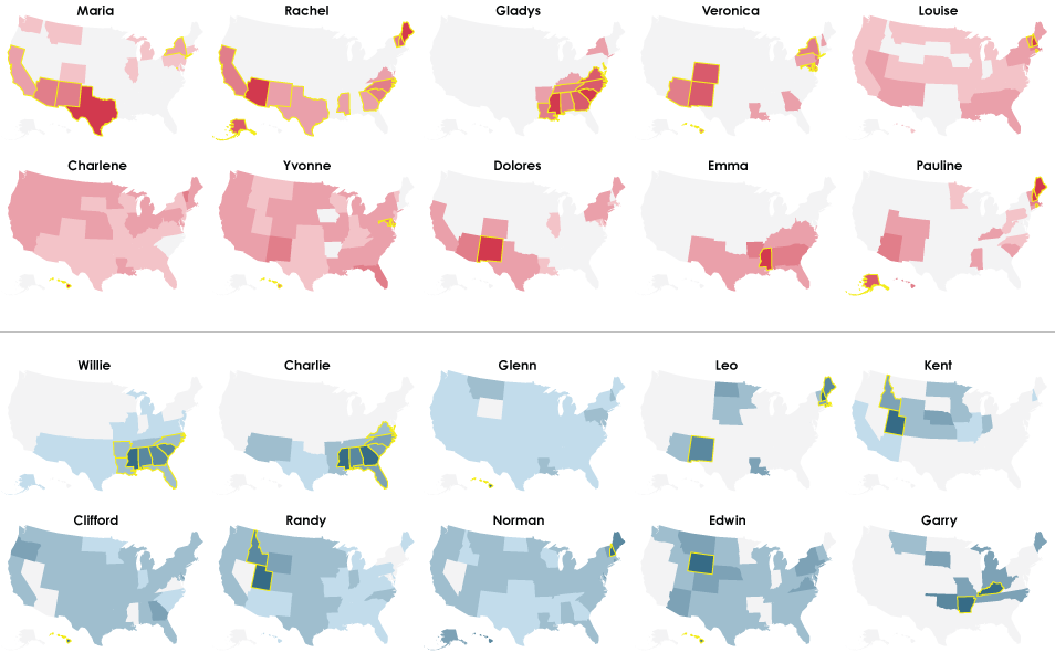
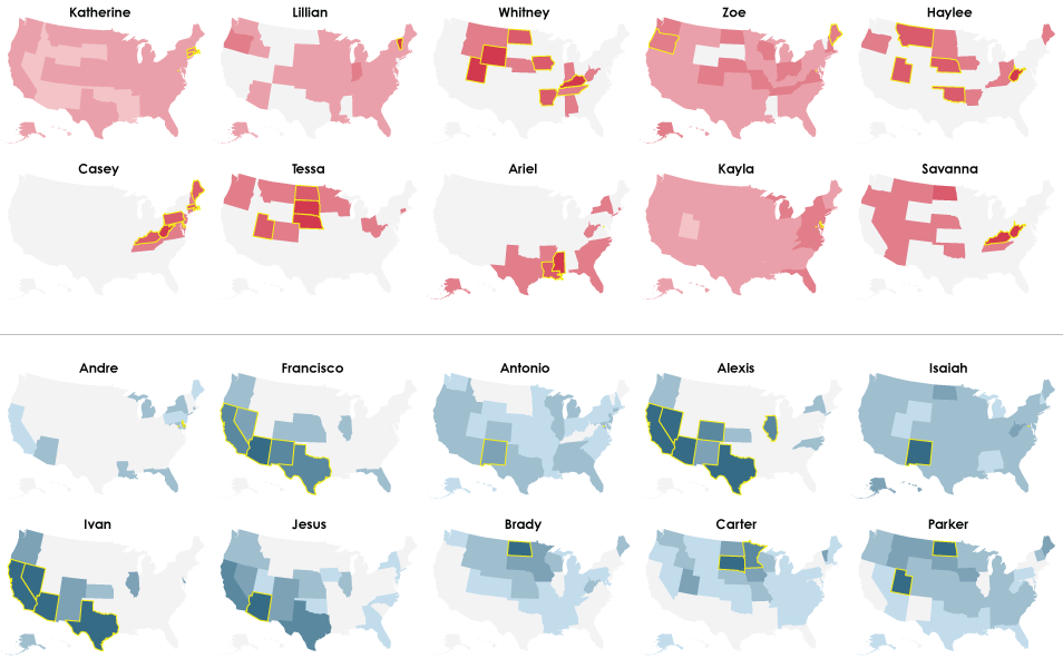
The by-decade maps (1950 through 2012) that follow show the ten most regional — or most outlier — baby names for girls (red on top half) and boys (blue on bottom half), and the outlier states are highlighted with yellow borders. Names are ordered by regional uniqueness. The table at the end shows the most outlier names since 1950.
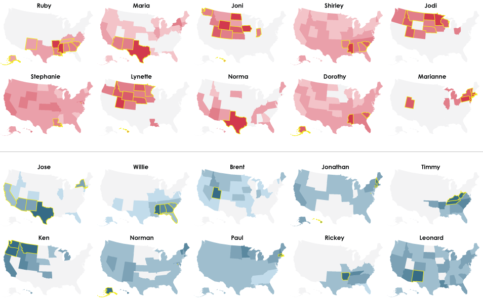
1950
Right off the bat, you get Maria in California and the southwest made popular by Mexican immigration. Although I’m surprised that we don’t see the same for boy names. That comes later. Instead, Willie and Charlie are dominant in the southeast, and the former has some lasting power with a place in the top ten through 1980. And how about that Randy in Idaho and Utah?
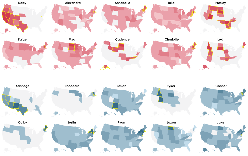
1960
Enter 1960, and Willie is still an outlier in the southeast, but it’s no longer number one. That spot is reserved for Jose. Maria is also high up, but is overtaken by Ruby. Joni, Jodi, and Lynette represent the midwest.
1970
A handful of new names crack their way into the top ten for both boys and girls. In particular, there are several single-state outliers with Kerry, Monique, Damon, Darren, and some amazing Nathans in Utah.
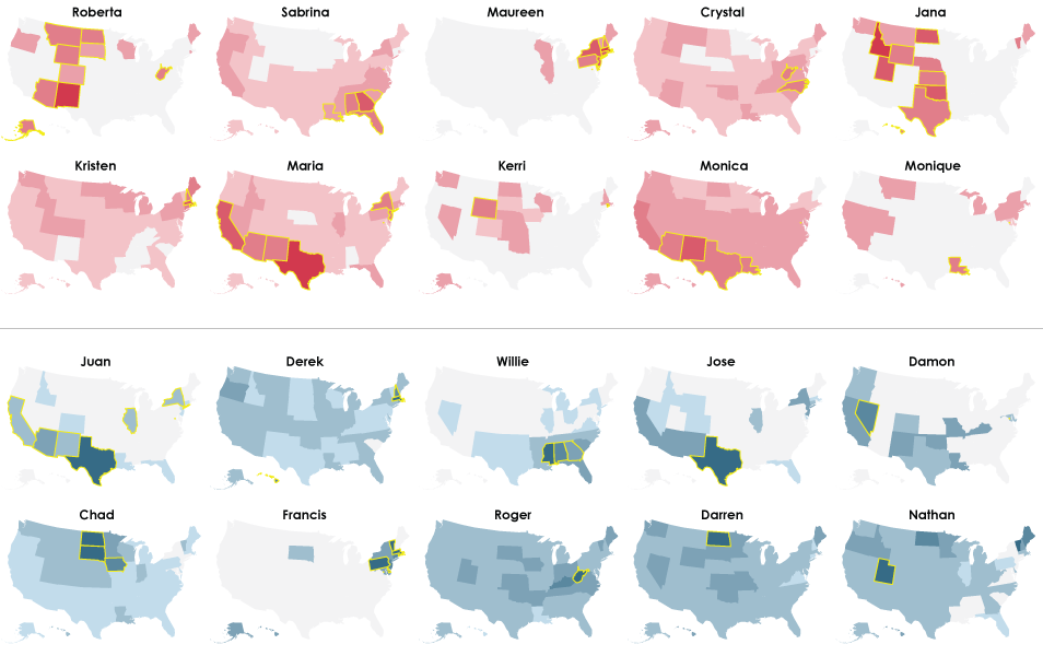
1980
By 1980, there are even more demographic-specific names. Ebony and Levi take the top spots for girls and boys, respectively. Willie still makes the top ten, but gets less popular.
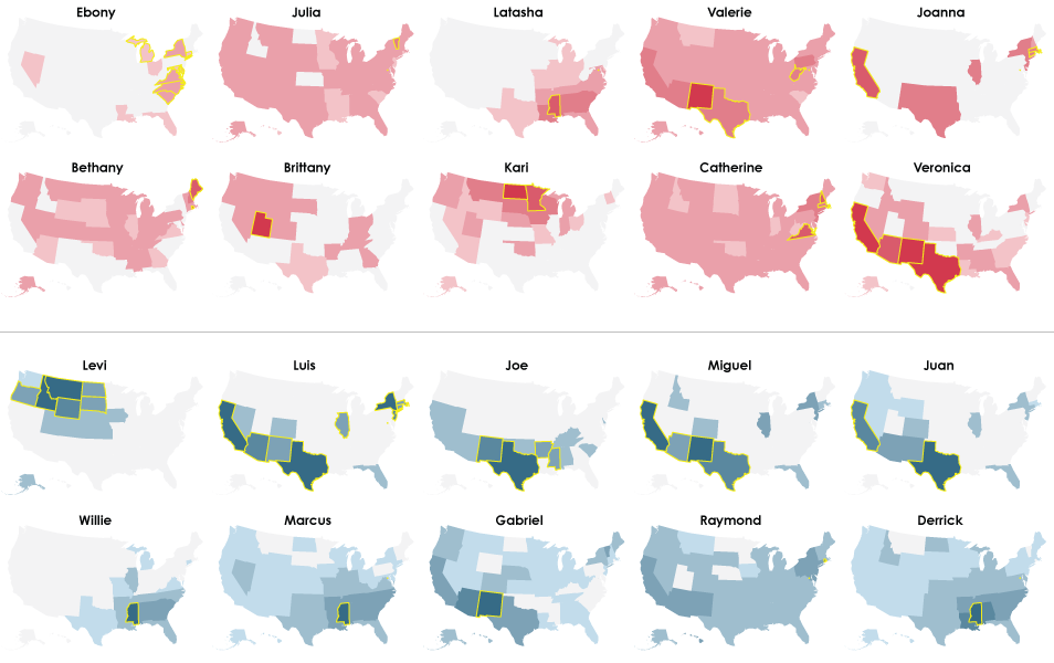
1990
The top ten is looking more like a hodgepodge of names geographically. Clusters still appear, such as Jaclyn and Meghan in the northeast (Is there a thing for spelling common names different over there?) and Cole in the north. If you recall from the most trendy names analysis, the uniqueness of names has been growing.
2000
The outliers seem to cover less area than in previous years.
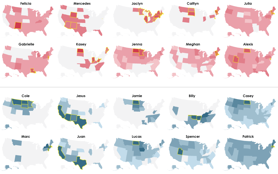
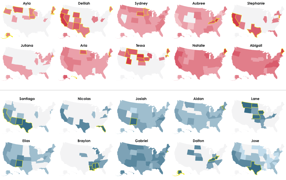
2010
Less area again, with the exception of Daisy, Santiago, and Presley.
2012
This brings us to present year. Braylon, Dalton, Lane, Tessa, and Ayla? As a Californian, I’ve never even heard of these names.
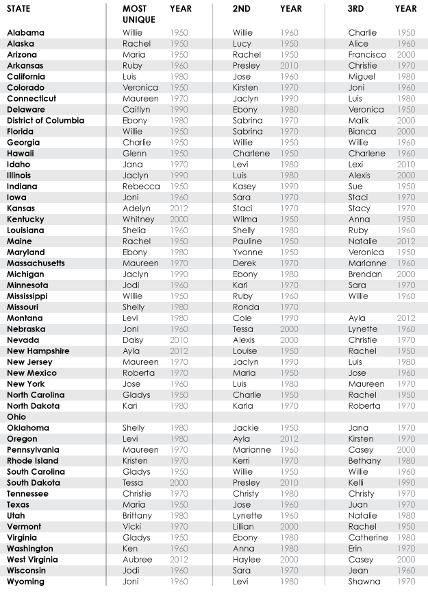
Finally, for reference, I present to you the three most outlier names by state and when they stuck out. Note that Ohio had zero outlier names from 1950 to 2012 during the years I looked at, which makes the state itself an outlier, and Missouri only had two. I’m not sure why that is, but there you go.
Okay, I think I’m all named out for a while. You can download the data from the Social Security Administration if you want to look yourself.
…Some process notes for nerds
The Social Security Administration provides a good amount of name data, but it’s still limited. They don’t provide the counts of names used five or fewer times during a year, and they don’t provide social security totals per state. So I had to find annual state birth totals somewhere else.
Fortunately, the Centers for Disease Control and Prevention produce estimated births each year in vital statistics reports, and they’ve been doing it for a while. The downside is that the data is in PDF form, so I had to do some manual data entry, which is always fun. Most of the reports listed crude birth rates per capita. (Here are the CSV fruits of my labor, in case you’re interested. I was holding a baby a good part of the data entry time, but I think I got all of the right numbers in there.) The report for 1970 listed total estimated births. Since I needed birth totals so that I could divide name totals and get name rates, I used state population estimates from the Census Bureau and multiplied.
At first this seems like an unnecessary hassle. Why not use the state totals by summing the names that the SSA does provide and cut your losses? Because you end up with skewed name rates that aren’t quite representative of reality. For example, a high-population state like New York makes a lot of babies per year. The more babies there are, the more likely there will be at least five of them with a specific name, so a greater number of unique names are listed by the SSA for states with more babies. On the other hand, a low-population state like Wyoming makes fewer babies, so it’s more likely that a name is obscured for privacy reasons. So you end up with a relatively lower denominator for low-population states, which provides higher rate estimates.
I know this because I tried. It was no coincidence that Wyoming, Vermont, and Alaska dominated the top outlier spots when crude totals were used to estimate rate. Proper rates were clearly important.
Once I had representative name rates, I used basic outlier detection for each year. A state’s rate was marked an outlier if it was at least one and a half times the interquartile range outside the upper quartile. There are many other outlier detection methods, but the basic approach seemed to work fine in this case.
Outliers were then ordered by how much greater they were than the upper quartile relative to the maximum rate that year. I also tried ordering simply by maximum rate, but that turned out to be less interesting, even though the names that ranked high were more prominent. The relative approach showed more regionality, which was what I was after. States are colored by these relative rates rather than a universal color scheme. Again, I was interested in the regional clusters rather than the absolute rates in each state.
Chart Type Used

Become a member. Support an independent site. Get extra visualization goodness.
See What You Get