One of my favorite data graphics is an interactive piece by The New York Times that shows how Americans spend their day, based on the American Time Use Survey (ATUS). I’ve also been wanting to play with Mike Bostock’s Data-Driven Documents, or D3 for short, for a while now. So put the two together, and this is what I got.
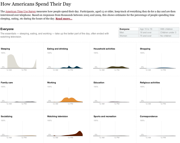
Main takeaway: we spend most of our time sleeping, eating, working, and watching television.
I followed the NYT aesthetic mostly for myself. I’ve found that a good way to learn is to try to copy something you like, and then use what you learn to do your own thing.
The NYT version was a stacked area chart with a number of interactions that made the data easier to read. I took a different route and split up some of the main activities, such as sleeping, eating, and working, into separate time series charts to see if it allowed you to see anything new. Showing separate charts at once places more focus on comparisons than on the distributions.
There was one challenge with the data that I didn’t anticipate. ATUS provides a table of percentages by hour, but you’ll notice with the NYT graphic the numbers are per ten minutes. You can actually calculate this with the ATUS microdata, which is basically the raw survey data from a few thousand respondents. I did this at first but lost patience, because I really just wanted to play with D3 rather than spend all my time building estimates.
I went with the hourly data which are averages for the sample population. The demographic breakdowns were only available in PDF, so I had some data entry fun, too. Luckily, I got my hands on Able2Extract (going off of Matthew Ericson’s advice) to ease some of the pain.
Once the graphic was done, I noticed that the transitions are actually a nice way to show differences. For example, if you look at the time use for men and then women, the differences are subtle, but because the change is animated it’s easier to spot. I think I knew this already, but probably never thought about it very deeply.
Anyways, it was fun playing around with D3. The beginning learning curve was kind of steep for me, but now that I know my way around a little better, I’m expecting more fun to come.
Mess around with the final graphic here. Let me know what you think.

 Visualize This: The FlowingData Guide to Design, Visualization, and Statistics (2nd Edition)
cool graphs, but I’d love to see a version where the axes were scaled to make the small graphs look higher. In that case you may want to also include a pie chart to compare all the activities’ frequencies.
-Andrew
Yeah, I thought about that since most the activities are so small, but I wanted to make it easy to compare all the way across. Maybe a “relative scales” option could work.
Hey there,
nice graph and I like you’re use of colors, but it looks like you’ve got a mistake: You should be able to select men who are 18 and over and have children under three. Currently you can select men or those who are 18+ or those who have children under three. Does that make sense?
Andrew
Makes sense. Multiple filters could be interesting (I’d have to look at the data more to see how it would work out with subcategories). I did really want to stay true to the NYT original though.
If you want a neat way to visualize your own week check out the iPhone app MiWeek
http://mi-week.weebly.com/
Nathan, it would be awesome if you’re post a follow-up on what was hard to learn and un-obvious about D3, for those of us who also want to give it a shot :)
@Lynn – I’ll keep that in mind. In the meantime, if you download D3, Mike provides an examples folder with a lot of working sample code, which I found really helpful.
Well, the first hurdle is figuring out which files to include. Did you find documentation of what the various d3.*.js files provide? I poked around the github site and the examples but didn’t see mention of it anywhere (or in the API).
@Clay The examples really are helpful, and fairly exhaustive. I’ve been looking for an example similar to what I want to do, and then using the same d3.*.js files. The API does have descriptions of for the methods inside each of the packages, so once you have an idea what you’re looking for you can figure out. A lot of them are up on the wiki: https://github.com/mbostock/d3/wiki, so you can see the resulting graphics as well.
@Clay – Take a look at the actual “examples” folder when you download D3. Those are working examples, so you can see what files are included. But yeah, I’m sure Mike is working on sprucing up the docs.
Cool, thanks. I wish I had thought of d3 a few weeks ago when I put together a visualization. I started with processing.js, but it was too slow, so I switched to Raphael. The performance is good, but I had a hard time hooking it in with jQuery (though, admittedly, I didn’t spend a lot of time trying).
Sad things education is getting replaced by television as we get old. Nice work Nathan.
Great work! By sheer coinkidink I’m learning D3 too and have just completed my first D3 visualization (for Aussie football tragics).
I agree with previous commenters that the best way to learn D3 is by starting with the examples – in my case I went with Edward Clement Lee’s Empires visualization Empires visualization.
I think D3 is a fantastic visualization toolkit, I’m seeing it being used more frequently with each passing month. It’s only drawback is that it’s “too advanced” for IE – that is, it typically uses HTML5/CSS3/SVG elements that IE is yet to support…