Scatter Plot
Dots are placed in an x-y coordinate system, based on two variables. The plot is often used when it is thought that the variables are correlated.
Working on Tips, by State
What percentage of a waiter and waitress's income comes from tips and what comes from salary? The calculation isn't straightforward but we can try.
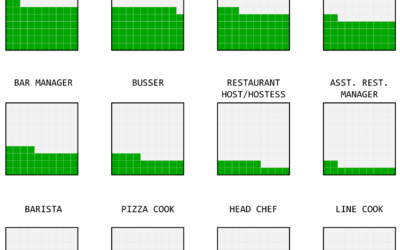
Divorce and Occupation
Some jobs tend towards higher divorce rates. Some towards lower. Salary also probably plays a role.
Finding the craft beer capital of America
You had me at craft beer. Russell Goldenberg for The Pudding looks for…
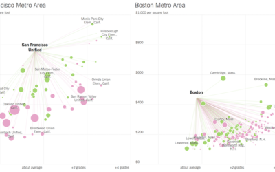
Looking for more affordable homes and better schools in the suburbs
Families often move out of the city to the suburbs for more affordable…
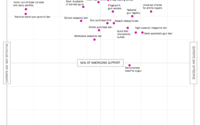
Public versus experts, gun control
With this scatterplot, Quoctrung Bui and Margo Sanger-Katz for The Upshot describe where…
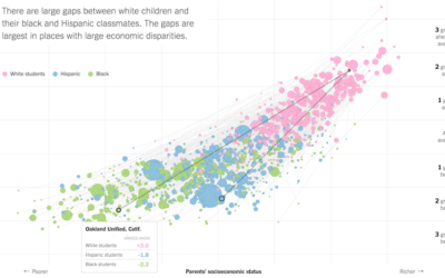
Lower socioeconomic status linked to lower education attainment
The Upshot highlights research from the Stanford Center for Education Policy Analysis that…
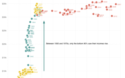
Top 1% earners versus bottom 90%
Quoctrung Bui for Planet Money plotted average income for the top one percent…
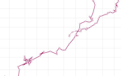
How to Make a Connected Scatter Plot
The combination of a time series chart and a scatter plot lets you compare two variables along with temporal changes.
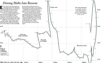
Driving habits and gas prices shift into reverse
Hannah Fairfield of the New York Times looks at driving habits and gas…
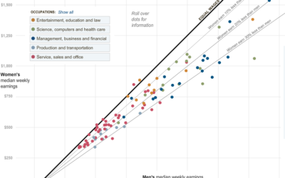
Paycheck Gap Between Men and Women – Guess Who Makes Less
Hannah Fairfield and Graham Roberts from The New York Times show the disparity…

