Dot Density Map

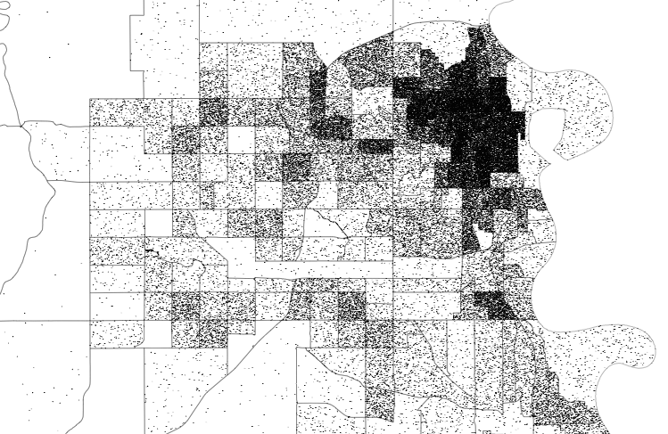
Dots are placed randomly within regions to show the density of populations. The dots and spacing allow for multiple groups to be shown at once.
Tutorials and Guides

Examples

Dot density map for election results

With what is now a common mapping method, The Economist used a dot…

Maps showing migration out of cities

Mira Rojanasakul and Nadja Popovich, for The New York Times, mapped migration out…

Past redlining still seen in the present

In the 1930s, a group called the Home Owners’ Loan Corporation went to…

Bees use social distancing

Research by M. Pusceddu et al. shows that honeybees use social distancing when…

Where Americans Live

Everyone gets a dot. You get a dot. And you get a dot. And you.

Diversity within the Asian population

Robert Gebeloff, Denise Lu and Miriam Jordan for The New York Times looked…

Race and ethnicity map of dots

CNN goes with the dot density map for their first pass on the…

Pandemic timeline as animated dot density map

As a lead-in and backdrop to a timeline of the past year by…

Dot density to show Covid-19 deaths over time

The United States passed 425,000 coronavirus deaths this week. For The New York…

1 in 5 prisoners had Covid-19, a grid map

The Marshall Project and The Associated Press report on the Covid-19 rates in…

If We All Left to “Go Back Where We Came From”

Imagine that those with immigrants in their family tree left the country. Almost everyone, basically.

Mapping a diverse but segregated America

Aaron Williams and Armand Emamdjomeh for The Washington Post delve into diversity and…

Immigrant America

A dot density map showing one dot for every 20 immigrants.

High-detail maps with Disser

Open data consultancy Conveyal released Disser, a command-line tool to disaggregate geographic data…

Racial dot map

Dustin Cable, a demographer at the University of Virginia’s Weldon Cooper Center for…

Map of every person counted in 2010 US Census

In the 2010 United States Census, 308,745,538 were counted, and Brandon Martin-Anderson from…