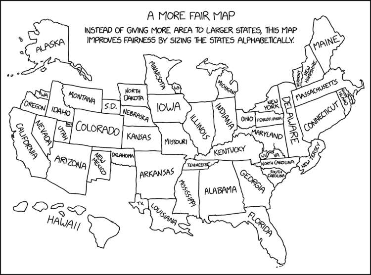
A deeply insightful map from xkcd.
See also: 19 maps that will blow your mind and change the way you see the world.
Become a member. Support an independent site. Make great charts.
See what you get →
It’s a wide range, based on data from the National Center for Health Statistics.
Here’s the breakdown by age for American adults in 2021, based on data from the Pew Research Center.
What percentage of households fall into lower-, middle-, and upper-income levels when you adjust for household size?
It’s gotten more difficult to get into top colleges over the years, but most schools have either admitted students at the same rate or increased admission rates since 2001.