Area Chart
The space between the data and the baseline is filled with a color or a pattern, usually emphasizing counts or percentages for a single variable.
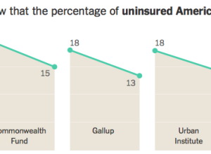
Affordable Care Act progress report
The New York Times takes a data-centric look at the progress of the…
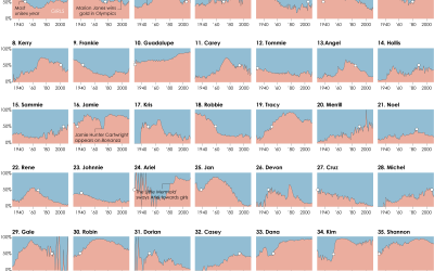
The Most Unisex Names in US History
Moving on from the most trendy names in US history, let’s look at…
How to Animate Transitions Between Multiple Charts
Animated transitioning between chart types can add depth to your data display. Find out how to achieve this effect using JavaScript and D3.js.
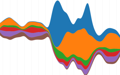
How to Make Stacked Area Charts in R
From the basic area chart, to the stacked version, to the streamgraph, the geometry is similar. Once you know how to do one, you can do them all.
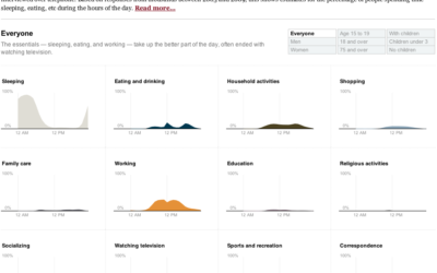
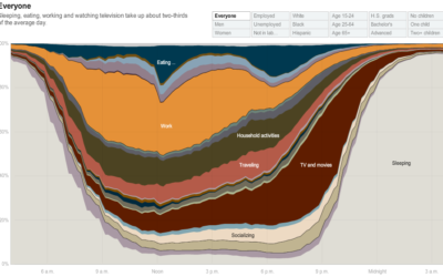
How do Americans spend their days?
One of my favorite data graphics is an interactive piece by The New…
How People in America Spend Their Day
From Shan Carter, Amanda Cox, Kevin Quealy, and Amy Schoenfeld of The New…
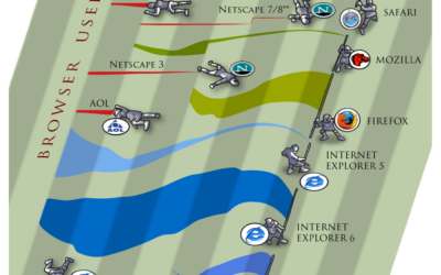
Browser Wars – A New Take on Streamgraphs
Because it’s Friday – PixelLabs puts a cartoon-ish spin on streamgraphs. Who will…
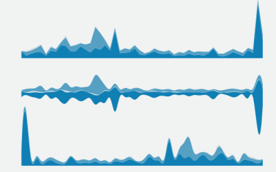
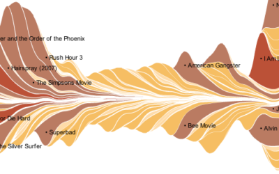
Ebb and Flow of Box Office Receipts Over Past 20 Years
The New York Times puts out another good one in this graphic for the talkies.

