Visualization
Showing the stories in data through statistics, design, aesthetics, and code.
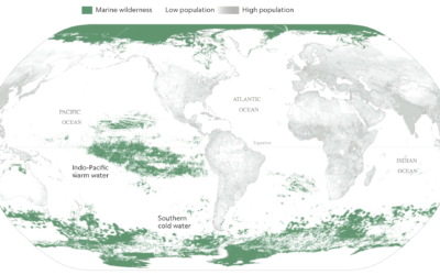
Mapping the ocean undisturbed by humans
Researchers recently published estimates for the amount of area undisturbed by humans —…
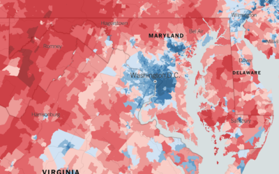
Extremely detailed election map
The Upshot returns to 2016 election results mapped at the precinct level. Because…
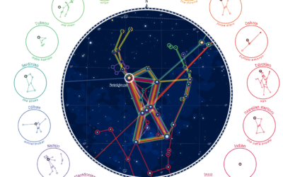
Same stars, different constellations
Cultures have formed different stories and pieced together different constellations from the stars,…
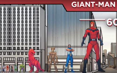
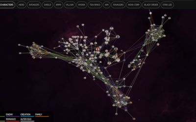
Marvel Cinematic Universe as a 3-D network
The Straits Times visualized the Marvel Cinematic Universe with a 3-D browsable network.…
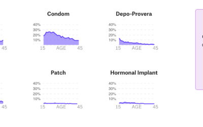
Data-centric view of birth control
Birth control is one of those topics often saved for private conversations, so…
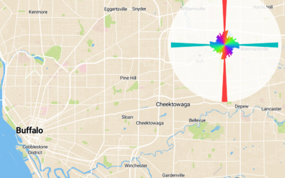
Interactive to see street orientation everywhere
After seeing polar charts of street orientation in major cities, Vladimir Agafonkin, an…
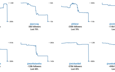
Twitter bot purge
With Twitter cracking down, some users are experiencing bigger dips in follower count…
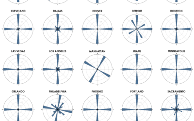
Street network orientation in major cities
Using OpenStreetMap data, Geoff Boeing charted the orientation distributions of major cities:
Each…
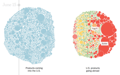
Products with tariffs in the trade war
The trade war started in January of this year when the administration imposed…
Composite image of a spider building its web
Christian Fröschlin combined 2,800 frames of a spider building its web for this…
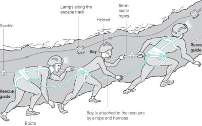
Graphics explaining Thai boys rescue
The eighth Thai boy was rescued from the flooded cave recently. Great news.…
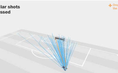
Expected versus actual goals in the World Cup
Benjamin Pavard from France made a low-probability goal the other day. Seth Blanchard…
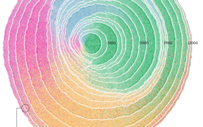
Immigration in the United States visualized as rings of tree trunk
Pedro M. Cruz, John Wihbey, Avni Ghael and Felipe Shibuya from Northeastern University…
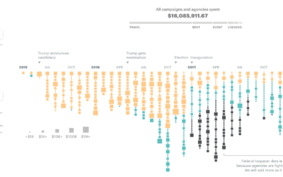
$16.1m in political and taxpayer spending at Trump properties
ProPublica compiled spending data from a wide range of sources to calculate the…
Visual introduction to bias in machine learning
A few years ago, Stephanie Yee and Tony Chu explained the introductory facets…
Little League baseball analytics that would change the game forever
Oh. So that’s why I was always placed in right field that one…

