Visualization
Showing the stories in data through statistics, design, aesthetics, and code.
Defining visualization literacy
Michael Correll on the use of “visualization literacy” in research:
If people (and,…
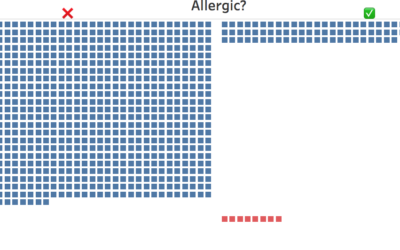
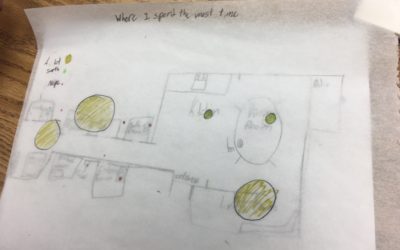
Teaching kids data visualization
Jonathan Schwabish gave his fourth-grade son’s class a lesson on data visualization. He…
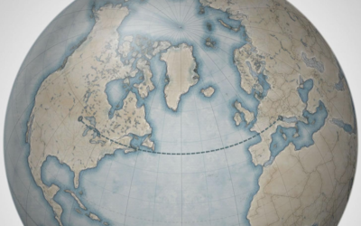
Skewed mental map of the world’s geography
The maps that we imagine as we think about locations around the world…
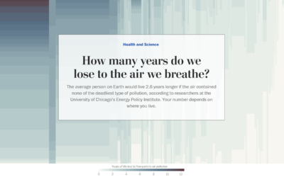
Years of life lost due to breathing bad air
Researchers at the University of Chicago’s Energy Policy Institute estimated the number of…
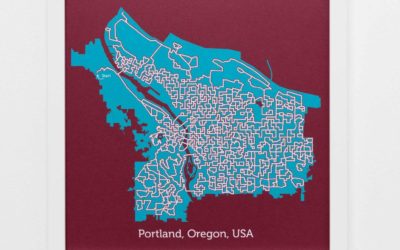
City road maps made into solvable mazes
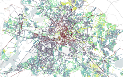
Michelle Chandra uses street data as a base for solvable mazes:
I draw…
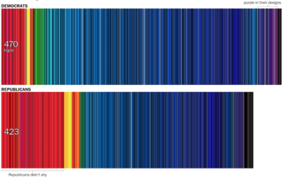
Color distribution in campaign logos
In news graphics, blue typically represents Democrat and red represents Republican. However, the…
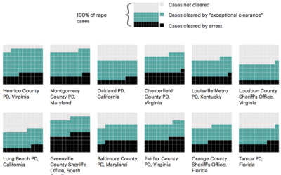
Inflated counts for cleared rape cases
Newsy, Reveal and ProPublica look into rape cases in the U.S. and law…
Street names as a proxy for history and culture
From Streetscapes by Zeit:
Street names are stories of life. They tell us…
Visualization research for non-researchers
Reading visualization research papers can often feel like a slog. As a necessity,…
A collection of Charles-Joseph Minard’s statistical graphics
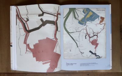
Charles-Joseph Minard, best known for a graphic he made (during retirement, one year…
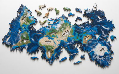
Earth puzzle without borders
The Earth Puzzle by generative design studio Nervous System has no defined borders.…
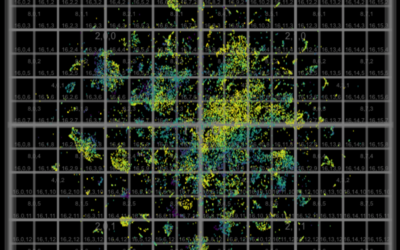
Millions of data points with deep scatterplots
Ben Schmidt uses deep scatterplots to visualize millions of data points. It’s a…
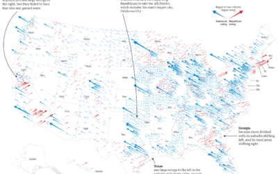
Midterm shifts versus the 2016 election
The Guardian goes with scaled, angled arrows to show the Republican and Democrat…
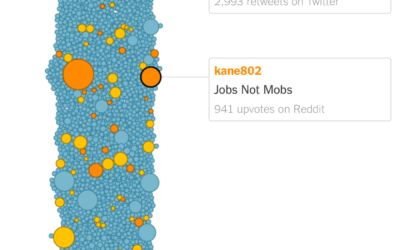
How a meme grew into a campaign slogan
A meme that cried “jobs not mobs” began modestly, but a couple of…
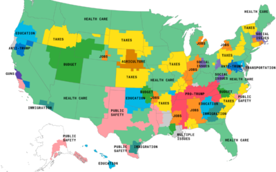
Maps of the issues mentioned most in election advertising
As the midterm elections loom, the ads focusing on key issues are running…
Faces of diverse midterms
As one might expect, many women, people of color, and L.G.B.T. candidates are…

