Visualization
Showing the stories in data through statistics, design, aesthetics, and code.
Inverse map of the United States
I’m thoroughly enjoying the work coming from graphic designer Scott Reinhard as of…
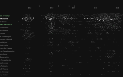
Connections and patterns in the Mueller investigation
While we’re on the subject of distributions, Fathom used a collection of beeswarm…
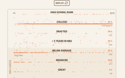
High school basketball players who make it to the NBA
Right in my wheelhouse, Russell Goldenberg and Amber Thomas for The Pudding looked…
Light installation shows future water lines against existing structures
Timo Aho and Pekka Niittyvirta used sensors, LED lights, and timers to display…
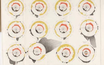
Charting cholera, beyond John Snow
John Snow, who often gets the credit for showing the geographical patterns of…
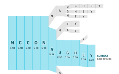
Celebrity name spelling test
Colin Morris culled common misspellings on Reddit and made the data available on…
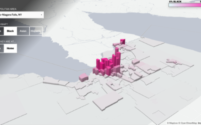
Segregation compared during work and at home
Based on commuting data from the Census Bureau, researchers Matthew Hall, John Iceland,…
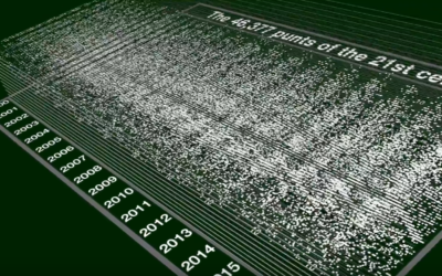
Searching for the saddest punt ever, with statistics
For SB Nation, Jon Bois takes a statistical deep dive in the search…
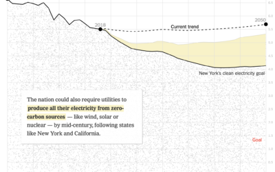
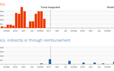
How fast emissions would reduce if other plans were adopted
The United States is doing pretty poorly in reducing emissions. For The New…
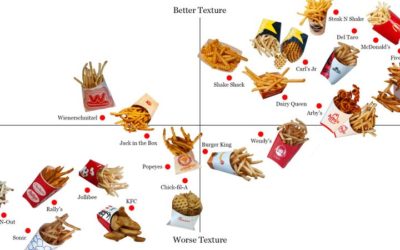
French fry power rankings
Lucas Kwan Peterson for the Los Angeles Times ranked fast food french fries.…
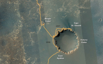
Opportunity rover’s path on Mars
After a most unforgiving dust storm on Mars, NASA ended the 14-year mission…
Generate a noise field from an image
Kjetil Golid made an interactive that lets you generate a noise field using…

