Inside out map of the Grand Canyon
Jan 17, 2019

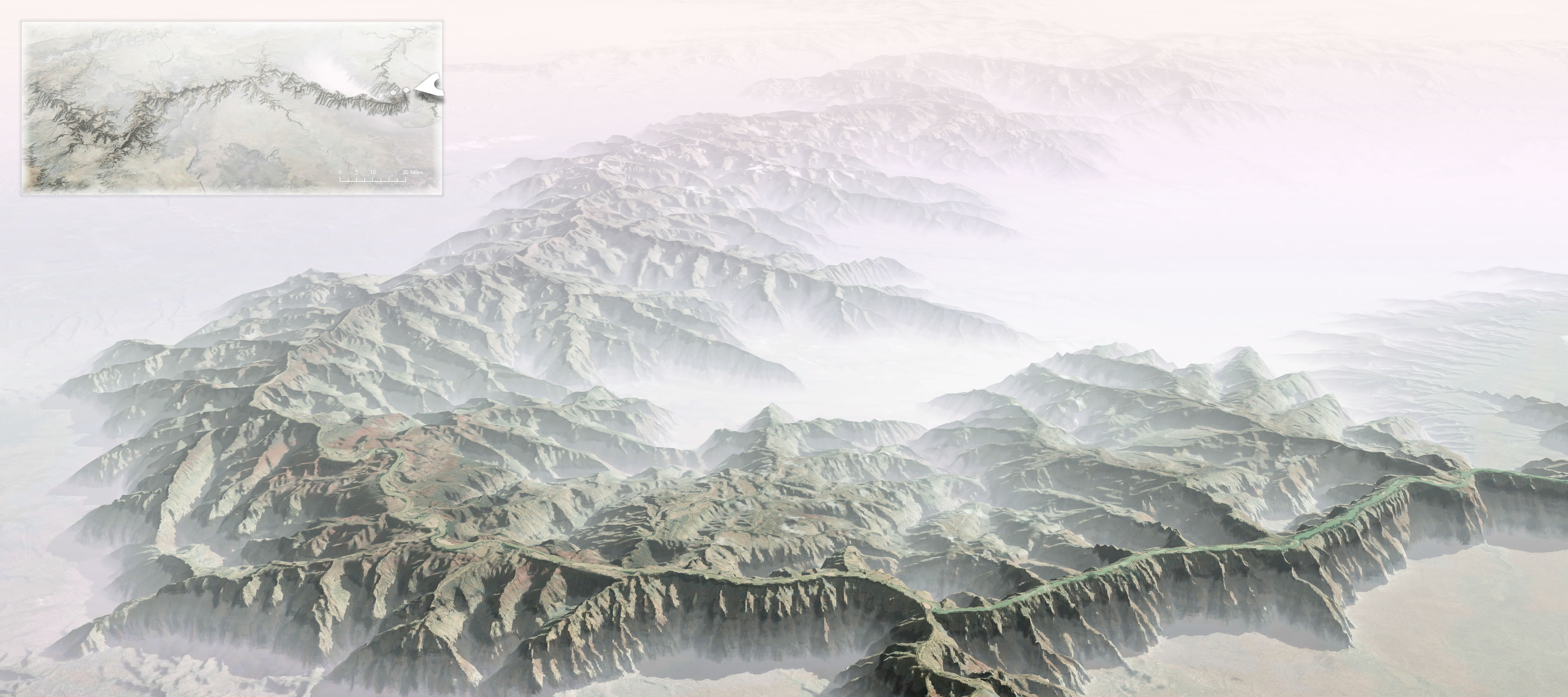
John Nelson turned the Grand Canyon inside out to understand the magnitude better:

Some of my earliest memories of the place had to do with the trippy feeling of my eyes and mind trying to make sense of the scale. I had seen many mountain ranges and vistas, including some on the way, but the vast negative space played havoc with my perception of magnitude. I’ve felt it a few times since, but never like that first Grand Canyon overlook.

Instructions included on how to do this in ArcGIS Pro.

Become a member. Support an independent site. Make great charts.

See What You Get
Learn to Visualize Data See All →

Drawing Circles and Ellipses in R

Whether you use circles as visual encodings or as a way to highlight areas of a plot, there are functions at your disposal.

How to Make an Interactive Choropleth Map

When presented with a static graphic, it can be useful to see specific values after you see overall patterns. This tutorial shows you how to add simple interactions to a choropleth map so you can get specifics for regions.

How to Make a Semicircle Plot in R

It’s the half cousin of the bubble plot with less overlap and more straight edges.

How to Make Symbol-based Glyph Charts, with R Examples

Using geometric shapes as an encoding can provide another dimension to your charts.

Favorites

Causes of Death

There are many ways to die. Cancer. Infection. Mental. External. This is how different groups of people died over the past 10 years, visualized by age.

Reviving the Statistical Atlas of the United States with New Data

Due to budget cuts, there is no plan for an updated atlas. So I recreated the original 1870 Atlas using today’s publicly available data.

What Qualifies as Middle-Income in Each State

The meaning of “middle-income” changes a lot depending on where you live and your household size.

Pizza Place Geography

Most of the major pizza chains are within a 5-mile …