Visualization
Showing the stories in data through statistics, design, aesthetics, and code.
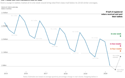
Vote-by-mail volume compared against years past
The volume of mail-in ballots will likely be higher than usual this year,…
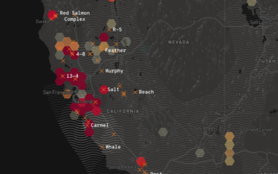
California wildfires map
Los Angeles Times provides a California-specific map of the current wildfires to stay…
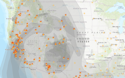
Fire and smoke map
With the rush of wildfires in California, governor Gavin Newsom declared (another) state…

Scale of the explosion in Beirut
There was an explosion in Beirut. It was big. How big? Marco Hernandez…
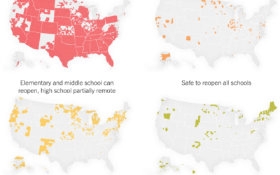
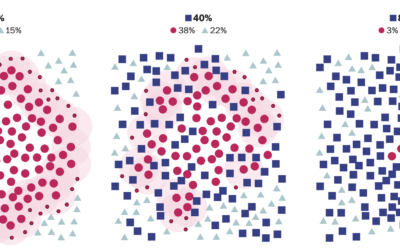
Where schools are ready to reopen
For NYT Opinion, Yaryna Serkez and Stuart A. Thompson estimated where we’re ready:…

Stock market mountains
After seeing stoxart, I was reminded of Michael Najjar’s project High Altitude from…
Stock market charts turned into illustrated landscapes
stoxart is a project by Gladys where she turns stock market charts to…
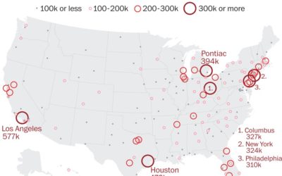
Reduced mail sorting capacity
The United States Postal Service is losing mail sorting machines — as an…

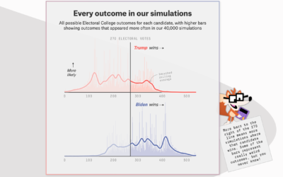
FiveThirtyEight launches 2020 election forecast
The election is coming. FiveThirtyEight just launched their forecast with a look at…
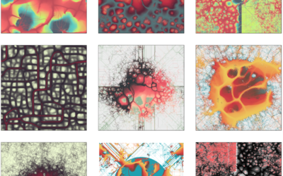
Using a slime mold simulation for generative art
Slime mold are single-celled organisms that can work together to form multicellular structures.…
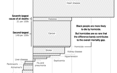
Gaps between mortality rates for black and white Americans
For NYT Opinion, Gus Wezerek charted the gaps between white and black mortality…

Visual explanation for how herd immunity works
Herd immunity works when you have enough people who are immune to a…
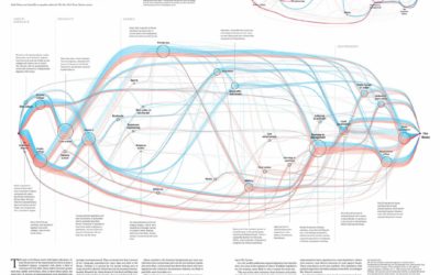
Malofiej winners announced for 2019
Malofiej, which in the visual journalism sphere is a high-tier honor to win…
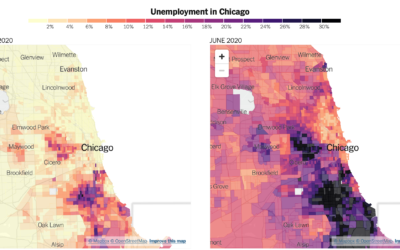
Distribution of unemployment at the tract level
We’ve been hearing a lot about national unemployment rate, but it’s not uniformly…
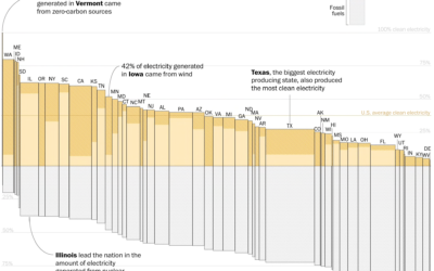
Electricity sources by state
With Joe Biden calling for 100% clean electricity, John Muyskens and Juliet Eilperin…