Visualization
Showing the stories in data through statistics, design, aesthetics, and code.
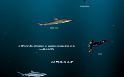
Scroll, scroll, scroll through the depths of the ocean
The oceans are deep. But how deep and what’s down there? Neal Agarwal…
Compare your city’s air pollution to the rest of the world
High air pollution can lead to serious health risks, but you can’t usually…

Fashion runway color palette
From Google Arts & Culture:
We came together with The Business of Fashion…

Traveling Salesman art
Robert Bosch likes to use the Traveling Salesman Problem to draw famous portraits…
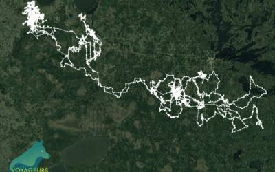
2,774 miles traveled by a lone wolf
From the Voyageurs Wolf Project, a map shows the travels of a lone…
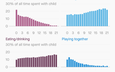
How parents spend time with their kids
For Quartz, Dan Kopf and Jenny Anderson on how time spent with kids…
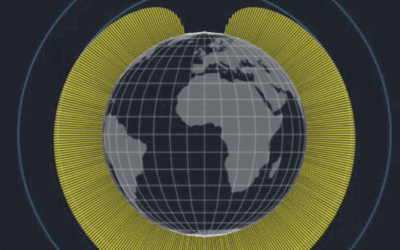
Hours of daylight mapped as a function of latitude and time of year
Reddit user harpalss animated hours of day light by latitude and day of…
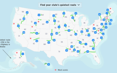
Quietest highway route in each state
Geotab made a rough estimate of the quietest route in each state, based…
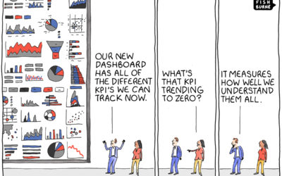
KPI overload
From Tom Fishburne, the Marketoonist. Maybe a dashboard isn’t the answer you’re looking…
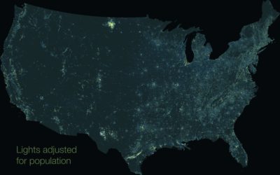
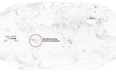
Map of nighttime lights normalized by population
You’ve probably seen the composite map of lights at night from NASA. It…
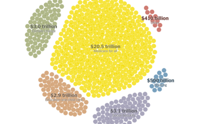
Paying for Elizabeth Warren’s proposed policies
Elizabeth Warren has big plans, and they would cost a lot with a…
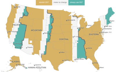
Daylight Saving Time gripe assistant tool
In a follow-up to a map from a few years back, Andy Woodruff…
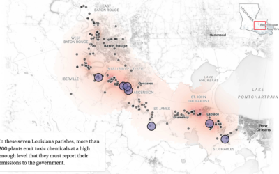
Mapping chemical plants, the pollution around them, and more chemical plants
ProPublica, with The Advocate and The Times-Picayune, estimated chemical concentrations in a highly…
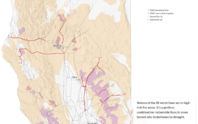
Worst performing circuits mapped with fire risk
This month PG&E has been shutting down power to thousands of households in…
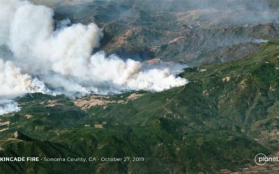
High-resolution satellite image of Kincade fire, up close from far away
I feel like satellite imagery has upped its skillset in recent years. According…
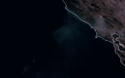
Kincade fire in Sonoma County via satellite imagery
You can see the time-lapsed imagery with this browser. [via @weatherdak]…