Visualization
Showing the stories in data through statistics, design, aesthetics, and code.
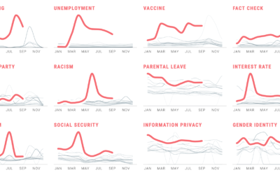
Political search interest in 2020
In Waves of Interest, a collaboration between the Google News Initiative and Truth…
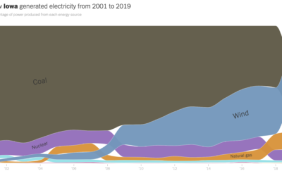
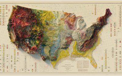
How your state makes electricity
The way we make electricity in America is changing. For The New York…
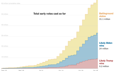
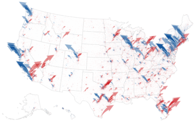
Money raised for the presidential election – by geography, time, and demographic
The New York Times analyzed campaign finance data from April to October, mapping…
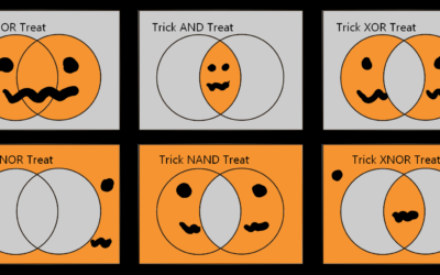
Halloween logicals
From Kaz Miyamol, these Venn diagrams present very important information about Halloween.…
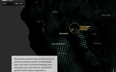
Fires in the west and climate change
This is some advanced mapping and scrollytelling from the Washington Post. The piece…
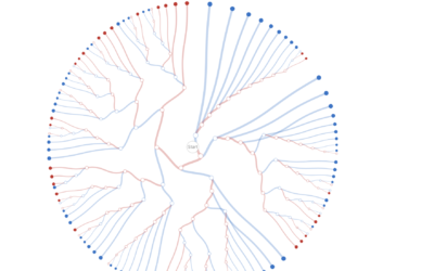
Decision tree for the presidential election result
While we’re on the topic of election scenarios, Kerry Rodden provides a radial…
Interactive data essays on climate change
In their second issue, Parametric Press focuses on climate change with a set…
Data visualization in virtual reality
Virtual reality puts you in a digital world that can feel like a…
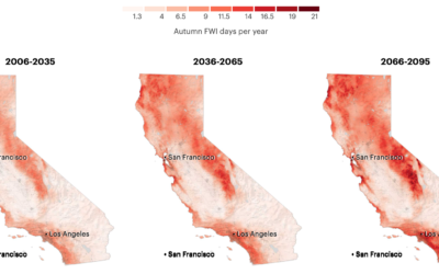
More fire weather days coming
It’s been smoky this season. Based on research from Michael Goss et al.,…

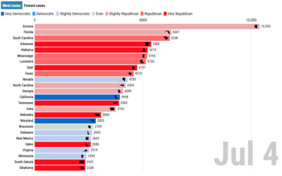
Covid-19 cases and state partisanship
From Dan Goodspeed, the bar chart race is back. The length of the…

Visual tour through the technology hype cycle
The Gartner hype cycle is a graphical representation of where certain technologies are…

Exploration of 12 timelines along Sunset Boulevard
In 1966, artist Ed Ruscha published Every Building on the Sunset Strip, which…
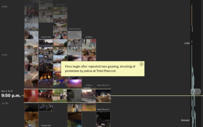
Reconstructing protests in Minneapolis using hundreds of livestreams
From a distance, it’s difficult to build an understanding of the scale and…
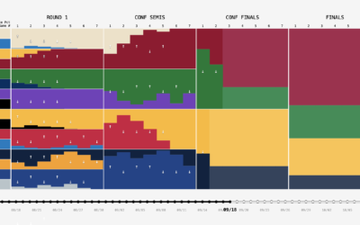
NBA playoff win probabilities, animated over time
FiveThirtyEight publishes win probabilities for NBA games throughout the season. During the playoffs,…