Visualization
Showing the stories in data through statistics, design, aesthetics, and code.
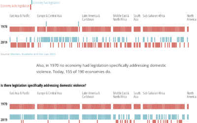
An atlas for the world’s development indicators
The World Bank tracks global development through a number of indicators. (You can…
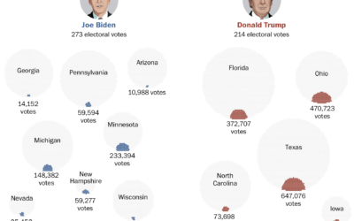
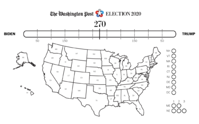
Votes that won the presidency
Voter turnout this election was higher than it’s been in a long time,…
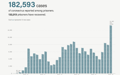
Coronavirus cases rising in prisons
Coronavirus cases are rising (again), which includes prisoners and prison staff. The Marshall…
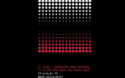
Minimalist creative coding environment
tixy.land is a minimalist coding environment by Martin Kleppe:
Control the size and…
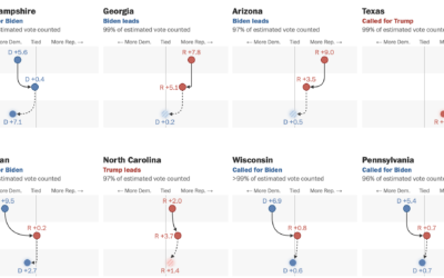
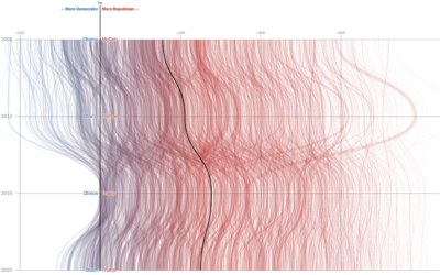
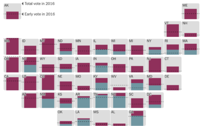
Swings in the battleground states
For The Washington Post, Ashlyn Still and Ted Mellnik show the shifts in…
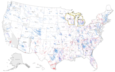
Wind map to show change in vote shares and participation
The Washington Post goes with a wind metaphor to show the change in…
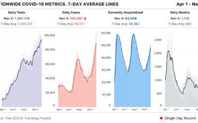
Spike past 100k Covid-19 cases in a day
Meanwhile… based on estimates from The COVID Tracking Project, the United States had…
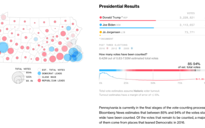
Watch the election percentages for votes counted so far
Still waiting for those results? Bloomberg’s election page for each state shows the…
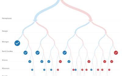
Testing voting scenarios while we wait for the counts
As we wait for the votes to be counted in the remaining states,…
Election needles are back
The NYT election needles of uncertainty are back, and they’re about to go…
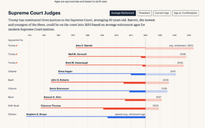
Long-term timelines for judicial appointments
Federal judge appointments are for a lifetime, so the younger a judge is…

How masks work to filter out particles
Masks are effective in slowing down the spread of the coronavirus. The New…
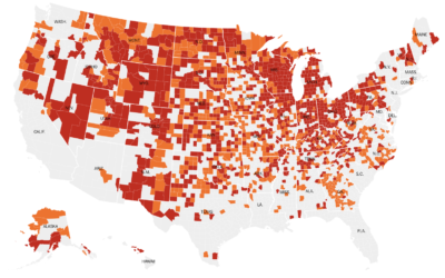
Where coronavirus cases are peaking
With this simple choropleth map, Lauren Leatherby for The New York Times shows…
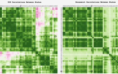
Comparing correlation in the FiveThirtyEight and Economist election forecasts
FiveThirtyEight and The Economist take similar inputs but output different forecasts. Adam Pearce…
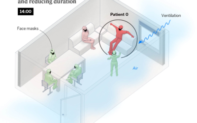
Illustrations show how to reduce risk at small gatherings
Risk of coronavirus infection changes depending on the amount of contagious particles you…