Visualization
Showing the stories in data through statistics, design, aesthetics, and code.

Procedurally generated fish drawings
Lingdong Huang’s project fishdraw seems straightforward on the surface. You go to the…
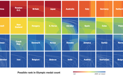
How countries ranked by Olympic medal counts
Ranking countries by medal count change depending on how much value you place…
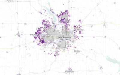
Where America is expanding in developed areas
Zach Levitt and Jess Eng for The Washington Post mapped newly developed areas…
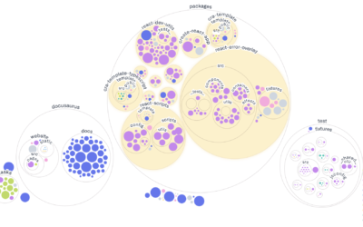
Visualizing GitHub repos
Most people are familiar with the file-and-folder view. Sort alphabetically, date, or file…
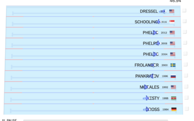
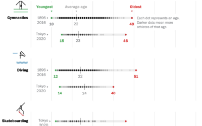
Olympic champions versus past Olympians
With the 2020 Olympics wrapped up, The New York Times raced this year’s…
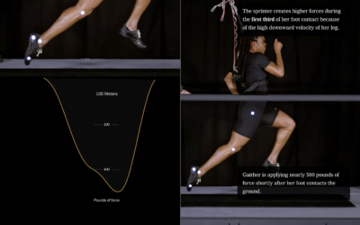
Science behind running fast vs. running far
From The New York Times, the combination of video, motion graphics, and charts,…
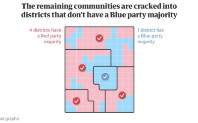
Visual guide to redistricting
Gerrymandering continues to be an important thread that I think many people still…
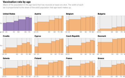
Decline of U.S. vaccination rate compared against Europe’s
Elian Peltier and Josh Holder for The New York Times highlight the vaccination…
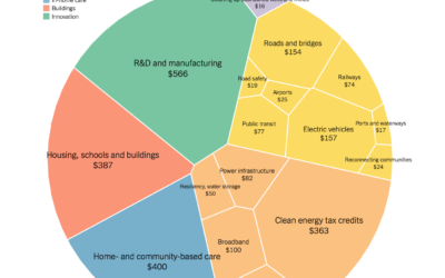
Comparison of Biden infrastructure plan and updated bipartisan plan
Aatish Bhatia and Quoctrung Bui for NYT’s The Upshot made the comparison using…
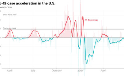
Rate of change in Covid-19 cases
We’re all familiar with the Covid-19 line charts that show cases over time,…
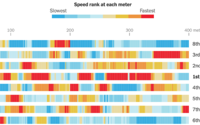
Calculating swim speeds
The New York Times charted speed ranks during the women’s 4×100 freestyle relay.…

New Olympic sports explained
The 2020 Summer Olympics are here, so ’tis the season for experimental visual…

Olympic event visual explainers
With the Olympics starting on Friday, The New York Times started their coverage…
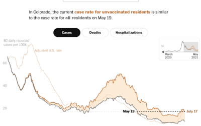
Case rates adjusted for the unvaccinated
Covid-19 cases in the United States were down, but they’re moving up again,…
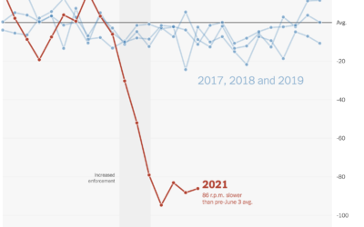
Falling spin rates in baseball after rule enforcement
NYT’s The Upshot analyzed spin rate on pitches before and after enforcing a…