Visualization
Showing the stories in data through statistics, design, aesthetics, and code.
Visualizing Delaunay Triangulation
Delaunay triangulations have applications in computer graphics, spatial analysis, and visualization. They “maximize…
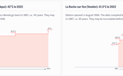
Timelines for record temperatures
Speaking of the heat wave in Europe, Pierre Breteau for Le Monde charted…
Melting popsicles to visualize a heat wave
Many European countries are experience record high temperatures, so The Washington Post used…
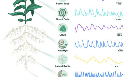
Rhythm in plant cells
Researchers are studying the electrical rhythms in plant cells. I’m not sure what…
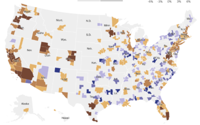
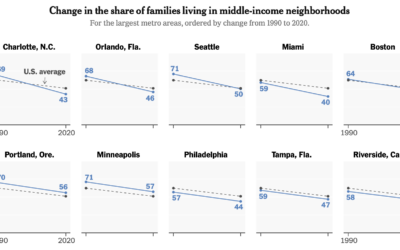
Country-wide housing shortage
Emily Badger and Eve Washington for NYT’s The Upshot show how the housing…
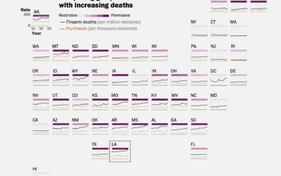
Full scope of gun deaths in the U.S.
As I’m sure you know, mass shootings, which gain attention because the scale…
Empty school buses as a representation of student lives lost
The NRA Children’s Museum from Change the Ref is a mile-long convoy of…
Data Visualization Humble Bundle
There’s a data visualization book bundle on Humble Bundle this month. Get twenty-two…
Why the galaxy pictures from the Webb telescope are pretty cool
The first public picture from the James Webb telescope is kind of cool…
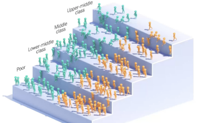
Income ladder for the children of immigrants
You’ve probably seen the moving bubbles that show how something changes over time.…
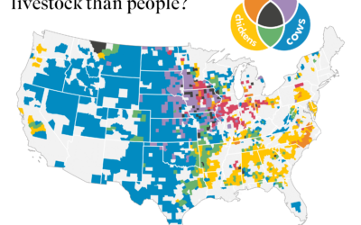
Where there is more livestock than people in the United States
The United States Department of Agriculture provides annual inventory data on livestock, crops,…
Money distribution for streaming music
From the listener perspective, we pay our monthly or annual fees and just…
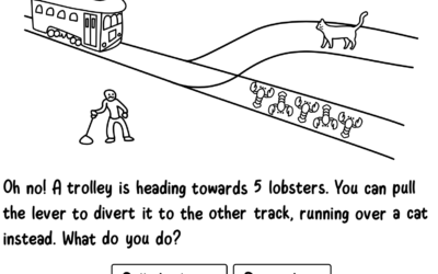
Absurd trolly problems
You’ve probably heard of the trolley problem, a thought experiment that imagines a…
Imagining carbon food labels
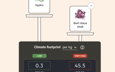
By purchasing certain foods, we make decisions about the carbon footprint from the…
Wildfires caused by fireworks
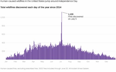
It’s Independence Day here in the United States, which means there will be…
Analysis of compound curse words used on Reddit
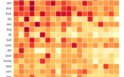
As you know, Reddit is typically a sophisticated place of kind and pleasant…


