Visualization
Showing the stories in data through statistics, design, aesthetics, and code.
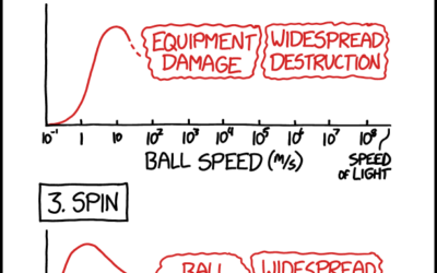
xkcd on optimal bowling metrics
xkcd charted optimal bowling in terms of aim, speed, spin, and weight. This…
Conway’s Game of Life in infinite space
Conway’s Game of Life is a zero-person game where cells in a grid…
Information Graphic Visionaries delivered
Visualization still seems like a relatively new thing, but it has a history…
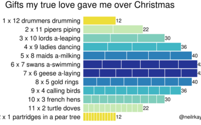
Gifts my true love gave to me over the 12 days of Christmas
From Reddit user neilrkaye. This is very important.…
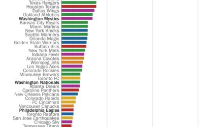
Perfect seasons needed to get over .500 overall
Here’s a fun one from Philip Bump for The Washington Post. Bump simply…

Life cycle of coronavirus at the molecular level
From Maastricht University:
What happens if a SARS-CoV-2 coronavirus enters your lung? This…
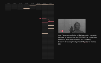
Tour through the greatest movies of all time
Every ten years since 1952, Sight and Sound, a British film magazine, has…

Asteroid simulator for before the big one hits
Knowing the impact of an asteroid falling in your city might not seem…
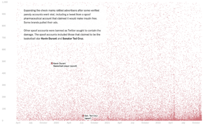
Who pays for Twitter
Twitter Blue is a subscription service from Twitter that primarily provided premium features…
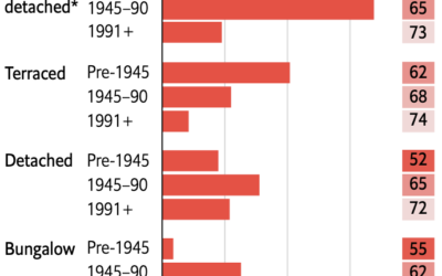
Retrofitting old British homes to improve energy efficiency
Speaking of old homes and energy efficiency in the UK, The Economist describes…
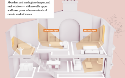
Managing temperature fluctuations through UK architecture
Philip Kennicott, Simon Ducroquet, Frank Hulley-Jones and Aaron Steckelberg, for The Washington Post,…
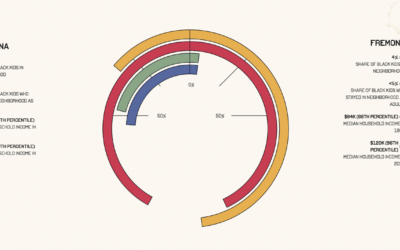
Upward mobility through a personal lens
Aaron Williams, for The Pudding, shows upward mobility through his own experiences, moving…
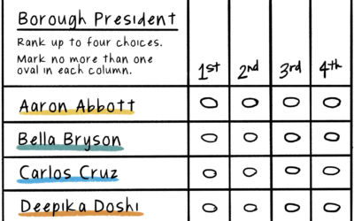
Illustration of ranked-choice voting
Connie Hanzhang Jin and Kaitlyn Radde, for NPR, used illustrations to explain how…
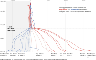
Republican and Democrat follower counts on Twitter
You might have heard that Elon Musk bought Twitter, and among the many…
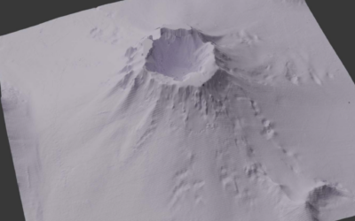
Depth of the underwater Tonga volcano
Mark Doman and Alex Palmer, for ABC News, show the depth of the…
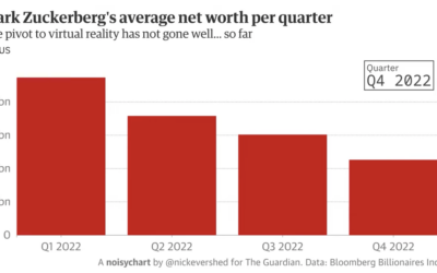
Experimental Noisycharts sonifies data for improved accessibility
Nick Evershed, for The Guardian, describes Noisycharts, an experimental component for their in-house…
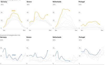
Shifts in European energy sources
Mira Rojanasakul, for The New York Times, dug into current and historical energy…