Visualization
Showing the stories in data through statistics, design, aesthetics, and code.
Local neighborhood infographics
Good Mag put on an infographic contest not too long ago that asked…
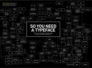
A flowchart to decide what typeface to use
A typeface can make or break your graphic. Use Comic Sans, and no…
Clothing color palette
Jacobo Zanella makes a color palette every day, based on the clothes he’s…
Cartographies of Time: A History of the Timeline
I don’t often give in to impulse buys, but I just ordered Cartographies…
The Ash Cloud and Airport Shutdowns
In case you’re following the craziness going on over Europe due to that…

Explorations of real-world traffic
We don't often get to see how cars, trains, airplanes, etc move in physical space, because, well, we're usually in them.
Crowdsourcing Johnny Cash
Aaron Koblin (along with Chris Milk) is up to his crowdsourcing mischief again.…
Data visualization tutorial in Processing
If you absolutely refuse to touch any code, I suggest Many Eyes or…
The making of wine – in motion graphics
Designer Tiago Cabaco explains the conception of wine in this short animated infographic.…
Viegas+Wattenberg announce visualization startup
Big news. Former IBMers Fernanda Viegas and Martin Wattenberg just announced their new…
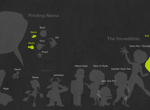
100 Pixar characters drawn to scale
Designer Juan Pablo Bravo illustrates 100 Pixar characters to scale, from Wally B.…
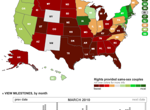
Swing vote effects explored with swingometer
With the 2010 UK elections coming up, the Guardian explores possible outcomes, given…
Best place to catch a cab? Try Bloomingdale’s
Matthew Bloch, Ford Fessenden, and Shan Carter continue the New York Times geographic…
Edward Tufte on his White House appointment
Edward Tufte was officially appointed to a White House advisory role a few…
Location check-ins during South by Southwest
Location-aware apps are the hot topic nowadays, and with all the tech-oriented people…
Map and report data with InstantAtlas
As you know, there’s this big wave of transparency going on right now,…
Mapping GitHub – a network of collaborative coders
GitHub is a large community where coders can collaborate on software development projects.…