Visualization
Showing the stories in data through statistics, design, aesthetics, and code.
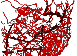
City traffic visualized as blood vessels
Pedro Cruz puts a twist on the traditional map approach to visualize traffic…
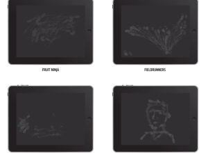
A study of iPad usage via fingerprints
As we all know, the iPad has changed how many people interact with…
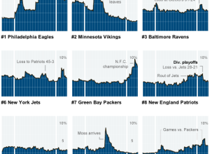
Gamers mimic the real life football season
As you might expect, people who play sports video games tend to play…
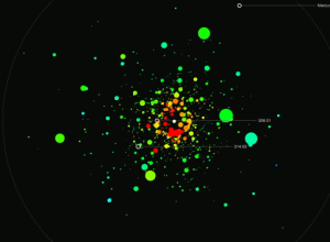
Looking for other livable planets
Jer Thorp, who has a knack for creating stuff that’s both useful and…
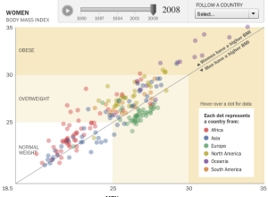
Watch the world get fatter over the past three decades
People are getting fatter everywhere. You know this. But there’s nothing like the…
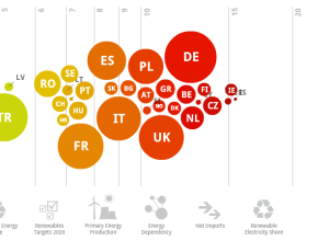
Europe’s energy targets in perspective
Designer Gregor Aisch has a look at energy usage in Europe. Click on…
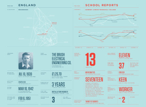
Annual Feltron report is up – this time with dad
I think we’ve all grown accustomed to this by now. Designer Nicholas Felton,…
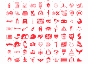
Most viewed YouTube videos of all time iconified
Designer Ibraheem Youssef iconifies the most viewed YouTube videos of all time. Do…
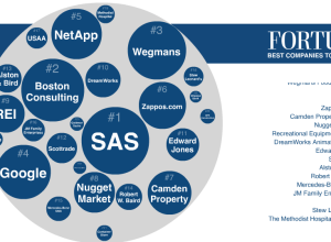
Best companies to work for and what employees say
Fortune Magazine recently published their annual list of top companies to work for,…
Bill Gates’ infographics section from annual letter
Even Bill Gates has an infographics section. In his 2011 annual letter, Gates…
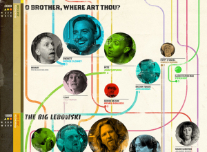
A history of Coen brothers filmography
I post this graphic by Muller on the Coen brothers filmography mostly because,…
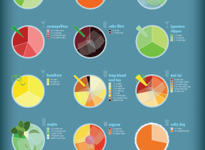
Charted guide to fancy drinks
I’m partial to all things food and drink related, so naturally my eyes…
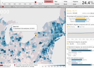
Adults with college degrees, over time
The Chronicle of Higher Education lets you explore the percentage of adults with…
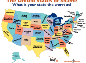
What your state is the worst at – United States of shame
In a survey of rankings from a variety of sources, Pleated Jeans maps…
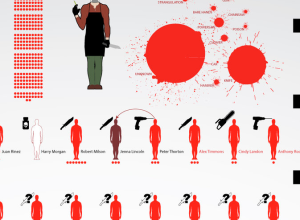
Dexter’s victims through season five
DeviantArt user dehahs, who seems to enjoy making graphics based on fiction (see…
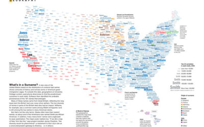
Map: United States of surnames
Mina Liu and Oliver Uberti for National Geographic examine the most common surnames…
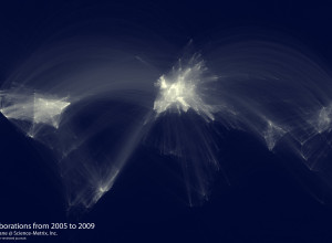
Map of scientific collaboration between researchers
In the spirit of the well-circulated Facebook friendship map by Paul Butler, research…
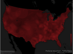
Where people swear in the United States
Cartographer Daniel Huffman has a look at swearing in the United States, according…