Visualization
Showing the stories in data through statistics, design, aesthetics, and code.
Browse street-side with Microsoft Street Slide
When street view came out on all the the popular online map applications,…
Inception dream levels explained in flowchart
You knew this was coming. I’d call spoiler alert for those who haven’t…
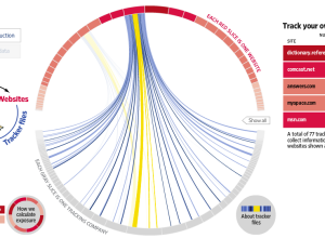
What online marketers know about you
Andrew Garcia Philips and Sarah Slobin (plus five data gatherers) of The Wall…
Inside the Glenn Beck/Goldline scheme
Jess Bachman and Barry Ritholtz take a look at the Glenn Beck/Goldline scheme…
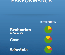
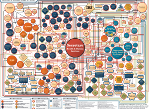
Redesign of the Federal IT Dashboard
About a year after the launch of the Federal IT Dashboard, business intelligence…
How to win Rock-paper-scissors every time
I admit it. When I first heard there are actual tournaments for Rock-paper-scissors,…
Two-minute journey through the history of cinema
35mm, a short film by Sarah Biermann, Torsten Strer, Felix Meyer, and Pascal…
Ugly chart used to confuse readers
Charles Blow on this unnecessarily complex chart used to show the network of…
Brief history of data visualization
Shawn Allen of Stamen Design provides a brief history of data visualization, starting…
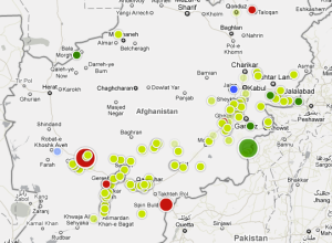
Afghanistan war logs revealed and mapped
This past Sunday, well-known whistle-blower site Wikileaks released over 91,000 secret US military…
Where all the BP oil could end up
Now that the oil flow has finally stopped, for now, the attention has…
Military budget contextualized with CGI tanks
It’s no secret. The US military gets a lot of funding for manpower,…
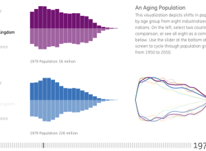
Exploration of our aging world
From Ben Fry’s newly established Fathom Information Design, is a visualization for GE…
Field guide to typographic moustaches
Sure, why not, let’s make it a hairy Friday. From Tor Weeks: a…
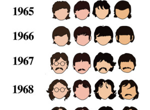
History of The Beatles as told by their hair
The Beatles were famously known for their mop-top haircuts in the early 1960s,…


