Visualization
Showing the stories in data through statistics, design, aesthetics, and code.
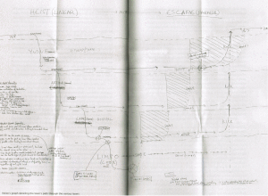
The real Inception flowchart by Nolan
Inception was a complex film, so there was understandably some confusion over the…
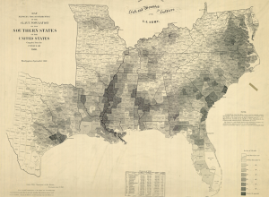
Old map shows slavery in the United States
In 1864, drawing on the most recent 1860 Census data, the United States…

Dynamic sculpture brings weather into airport
eCLOUD, conceived by Aaron Koblin, Nik Hafermaas, and Dan Goods, displays weather data…
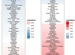
Facebook status updates: young people are self-centered and old ramble
The Facebook Data Team had a quantitative look at status updates by age…
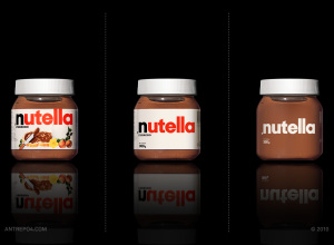
Minimalised consumer products
Antrepo wonders what it might be like if the labels on consumer products…
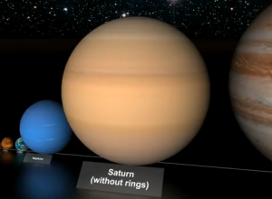
Comparison of the largest stars
You’ve most likely seen a couple of views of the universe to provide…

Choreography of the skies shows flight paths
We’ve all seen Aaron Koblin’s Flight Patterns, so we know that there’s a…

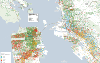
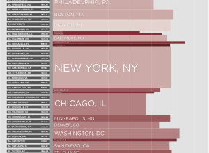
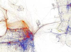
Mapping demographics of every block and city in America
Government data technology has felt behind the times the past few years with…
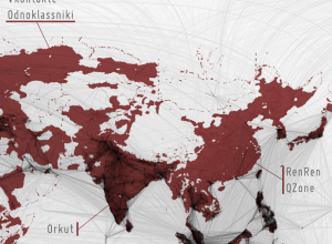
Filling in the black holes of the Facebook friendship map
While it was fun looking at the worldwide connections on Facebook, I thought…
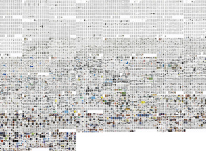
Growth in visual culture via science magazine pages
William Huber, Tara Zepel, and Lev Manovich compare magazine pages of Science and…
10 Best Data Visualization Projects of the Year – 2010
Data visualization and all things related continued its ascent this year with projects…
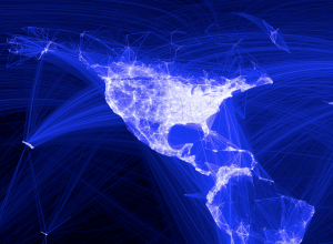
Facebook worldwide friendships mapped
As we all know, people all over the world use Facebook to stay…
How the world searched in 2010
Google recaps search trends for the year in Google Zeitgeist 2010, from the…
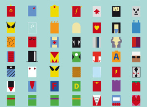
Superheroes minimalized
Fabian Gonzalez goes minimalistic on superheroes. I like the Teenage Mutant Ninja Turtles.…
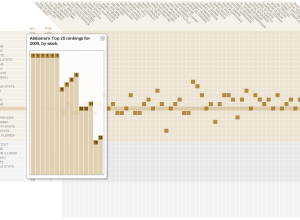
College football coaches’ ballots
Brett Coffman and Juan Thomassie for USA Today have a look at how…
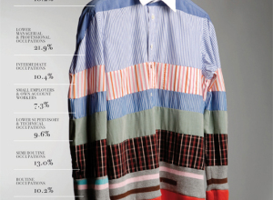
Picturing social order
Gareth Holt designed several charts and graphs for Rank: picturing the social order…