Visualization
Showing the stories in data through statistics, design, aesthetics, and code.
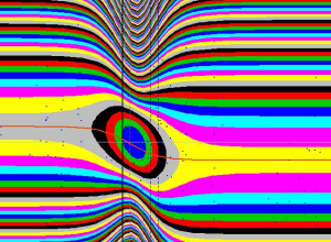
Beauty of mathematics
Betrand Russell: “Mathematics, rightly viewed, possesses not only truth, but supreme beauty —…
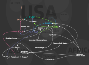
Evolution of western dance music
A quick animated look on the evolution of western dance music, a mixture…
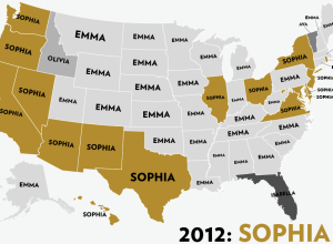
Most popular girl names by state
Reuben Fischer-Baum looks at the most popular girl names by state, over the…
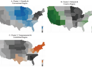
Regional personality
Peter J. Rentfrow, et al. studied personality clusters across states using data from…
Super duper full-featured paper map
Check out this awesome new thing called MAP. It’s made of 100% sustainable…
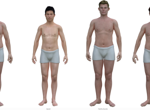
Average man graphic renderings
James Hamblin for The Atlantic rendered the average American man based on BMI…
Maritime traffic in the Baltic Sea, animated
Digital artist Lauri Vanhala animated a day of maritime traffic in the Baltic…
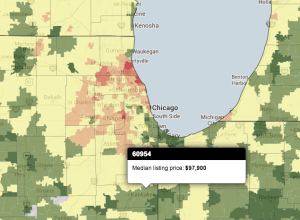
Map of median home listing prices
In their continued efforts to help potential home buyers find out all they…
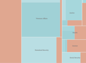
Furloughed employees during shutdown
Dan Delany took a simple look at furloughed employees due to the government…
Real-time media consumption
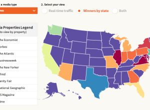
Last year, URL shortening service bitly and Forbes made a map that showed…
10 seconds of extreme trading
The video below shows ten seconds of trading on Blackberry on October 2,…
Most visited site by country
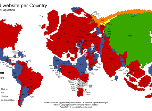
Mark Graham and Stefano De Sabbata for Information Geographies mapped the most visited…
Greco-Roman mapmaking
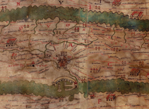
Measuring and Mapping Space: Geographic Knowledge in Greco-Roman Antiquity opens at Institute for…
Cities pulse via Foursquare check-ins
Foursquare check-ins can be self-encapsulated and personal to the individual, where each dot…
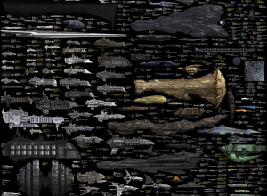
Science fiction starships, an extensive size comparison
A while back we saw a size comparison of random spaceships. That one…

