Visualization
Showing the stories in data through statistics, design, aesthetics, and code.
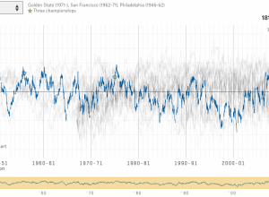
Every NBA team rated over several decades
Which NBA basketball team is the greatest ever? Instead of a circular debate…
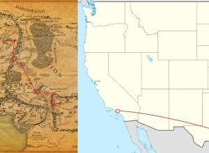
How far Frodo and Sam walked compared to real geography
If you read the books or watched the movies, you get the sense…
Rise of data art
Data art is on the rise. Jacoba Urist for the Atlantic gets into…
Satellite time-lapse shows changes on the ground
Since the 1970s, NASA has used satellites to take pictures of the Earth’s…
Running through digital particles
Force of Nature by FIELD is a running installation commissioned by Nike. It…
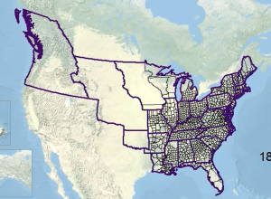
Animated history of US county boundaries
Here’s a straightforward animation that shows US county boundaries change between 1629 and…
Estimated age based on your name
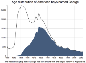
A while back, Nate Silver and Allison McCann for FiveThirtyEight estimated age based…
A year of earthquakes
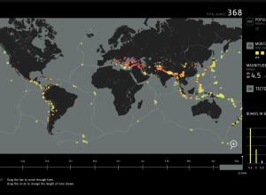
Fathom provides an interactive browser for a year of earthquakes, based on data…
The Great Grid Map Debate of 2015
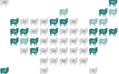
There’s been a sudden bump in grid maps lately taking the place of…
The big companies behind organic food brands
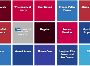
When you walk down the aisles of the grocery store, there are probably…
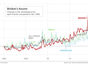
Rising beef prices and cattle theft
Eric Benson for FiveThirtyEight delves into cattle theft, which can cost an owner…
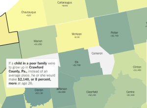
Upward mobility and the potential for a better life
An analysis by Raj Chetty of Harvard University and Nathaniel Hendren of NBER…
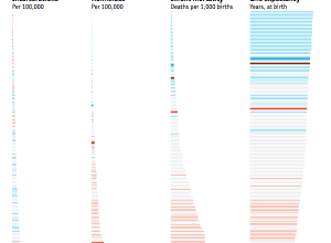
Black and White America compared as if they were countries
The Economist made a simple yet effective comparison of Black America and White…
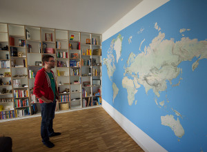
Self-printing a wall-sized world map
Dominik Schwarz wanted a big world map. A really big one that covered…
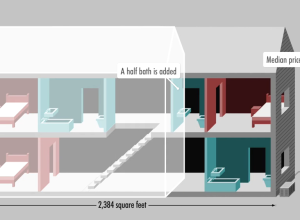
Median home in America, over 40 years
The median home in America has changed in a variety of ways. Square…

