Projects
Graphics by Nathan Yau, borne out of everyday curiosities, learning experiments, and mild insomnia.

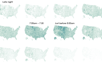
Interactive: When Do Americans Leave For Work?
We don't all start our work days at the same time, despite what morning rush hour might have you think.
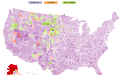
Interactive: How Americans Get to Work
The way that people get around can say a lot about how a place is made up. Here's an interactive map that shows how people get to work in America.
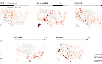
Relationship Status Geography
Some places attract young singles, whereas others attract married couples and families. I was curious how this varied across the country, so I mapped it.
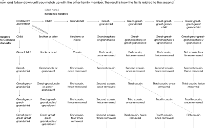
Chart of Cousins
For every family get-together I go to, it seems there are more kids running around. I know that they are related to me somehow, but what do I call them? Maybe this chart will help next time.

Data Fluency is Out Now
Data Fluency: Empowering Your Organization with Effective Data Communication, by Zach and Chris…

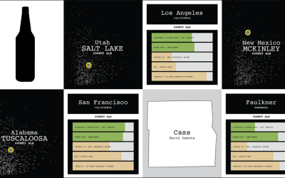
Multivariate Beer
Can you experience data? Sometimes visualization gets you part of the way there, putting data into context, serving as a trigger for your memory, and all that. But only so much can happen through the computer screen.
Chart-Topping Songs as Graphs and Diagrams →
Dreams, hope, and most importantly, love, mixed with some parties and dranking.
Looking For the Closest Casino
Casinos are everywhere. This interactive map tells you how close the nearest one is in sampled areas of the United States.
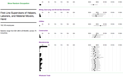
Where People Work and How Much They Make
Salaries for occupations with the same job title can vary across industries. This interactive shows you by how much and who works where.
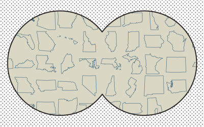
19 Maps That Will Blow Your Mind and Change the Way You See the World. Top All-time. You Won’t Believe Your Eyes. Watch.
Many lists of maps promise to change the way you see the world, but this one actually does.
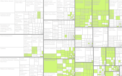
Jobs Charted by State and Salary
Jobs and pay can vary a lot depending on where you live, based on 2013 data from the Bureau of Labor Statistics. Here's an interactive to look.
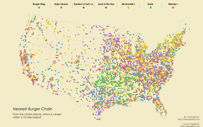
Burger Place Geography
After looking at pizza places, coffee, and grocery stores, I had to look at burger chains across the country. The data was just sitting there.