Projects
Graphics by Nathan Yau, borne out of everyday curiosities, learning experiments, and mild insomnia.
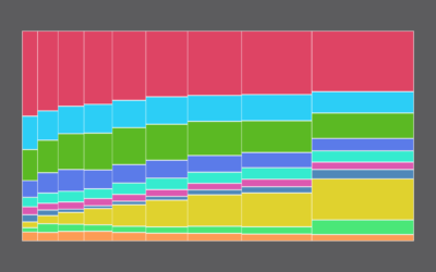
How Different Income Groups Spend Money
After living expenses, where does the money go, and how does it change when you have more cash available?

Visualizing Incomplete and Missing Data
We love complete and nicely formatted data. That's not what we get a lot of the time.
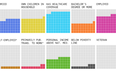
The Demographics of Others
I think we can all benefit from knowing a little more about others these days. This is a glimpse of how different groups live.

Visualizing the Uncertainty in Data
Data is an abstraction, and it's impossible to encapsulate everything it represents in real life. So there is uncertainty. Here are ways to visualize the uncertainty.

12 Days of ChaRt-mas
As everyone has already checked out for the rest of the year, I'm going to mess around with R to the tune of The Twelve Days of Christmas and nobody can stop me.
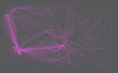
Constructed Career Paths from Job Switching Data
Shifting from one occupation to another can take a swing in the career path. Given your current job, what paths could you take? Here are some constructed possibilities.

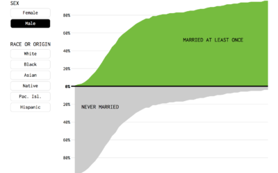
Percentage of People Who Married, Given Your Age
Or, given your age, the percentage of fish left in the sea. Here's a chart.
4 Tools to Pick Your Chart Colors
These are the quick and simple tools I use to pick colors to represent data.
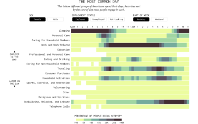
American Daily Routine
Sleep. Work. Play. The times and everything in between change depending on who you talk to.
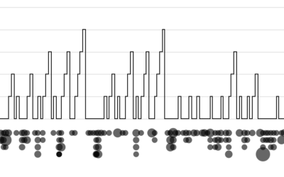
Days Without a Mass Shooting
Unfortunately, while of varying magnitude, mass shootings are somewhat regular in the United States.

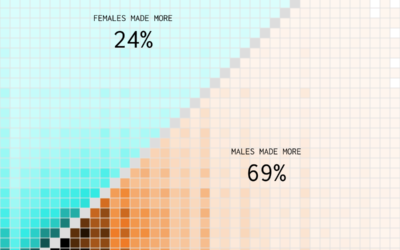
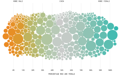
Who Earns More Income in American Households?
Compared to 1970, a shift towards women making the higher income.