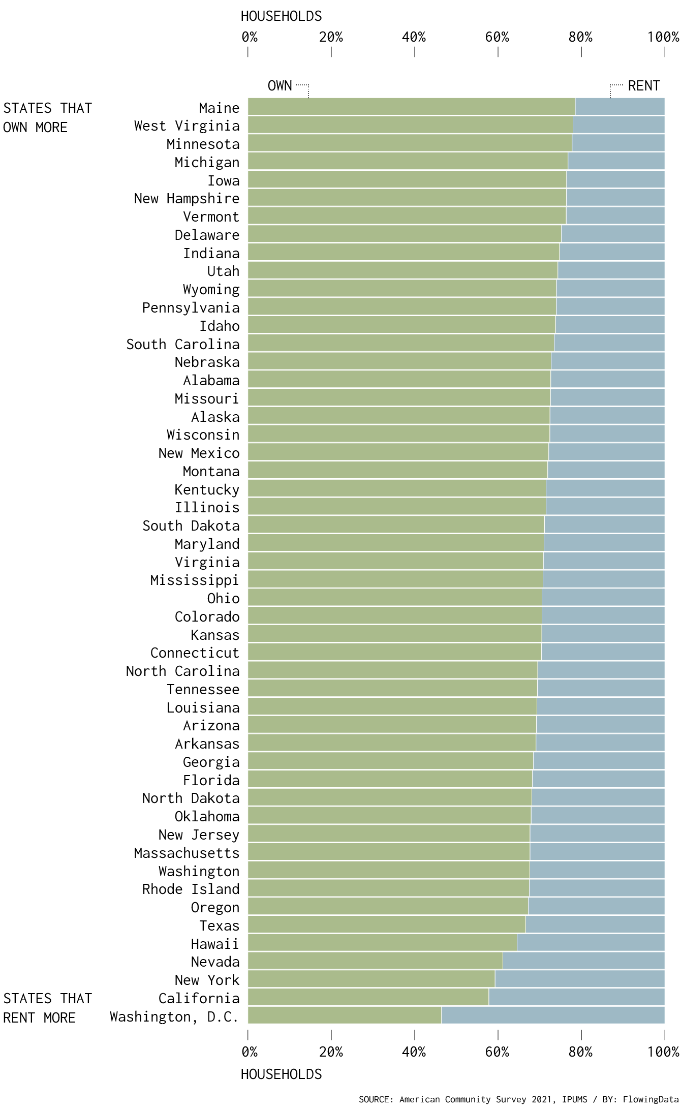
Renting vs. Owning a Home, by State
Among households in the United States, 68% are owned and 32% are rented, based on estimates from the American Community Survey in 2021. That breakdown isn’t uniform across the country though. In Maine, almost 80% of households are owned, whereas in California, less than 60% is owned. In Washington, D.C., it’s less than half. Here are the splits for each state.
Households that are owned and rented
Maine has the lowest renting rate. Washington, D.C. has the highest.
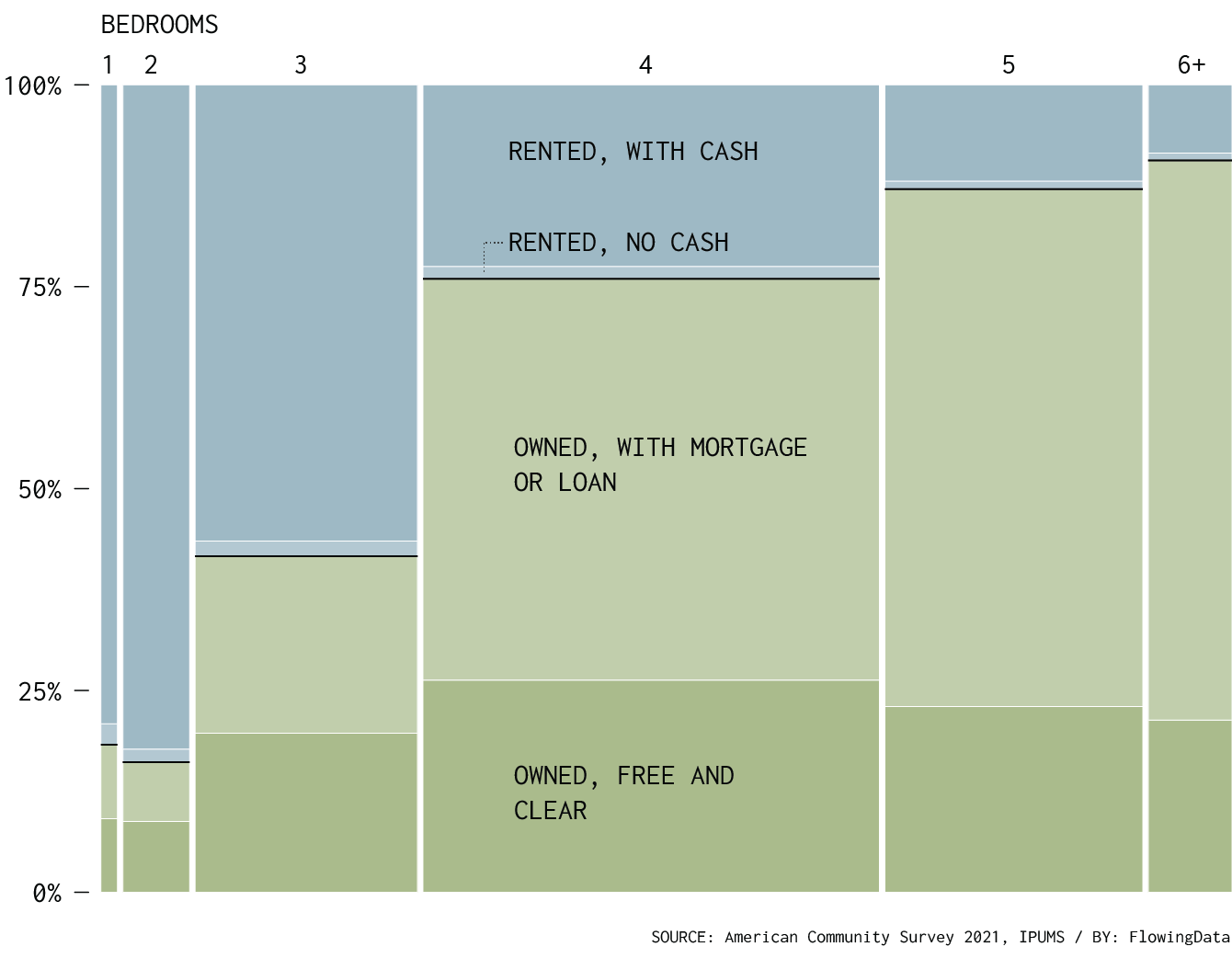
There’s a difference between owning a home outright and paying down a mortgage. The data offers sub-categories for renting and owning. The chart below also splits up households by number of bedrooms.
By Number of Bedrooms
Most people who “own” a home are paying down a mortgage or loan, and households with more rooms are less likely to have been paid off.
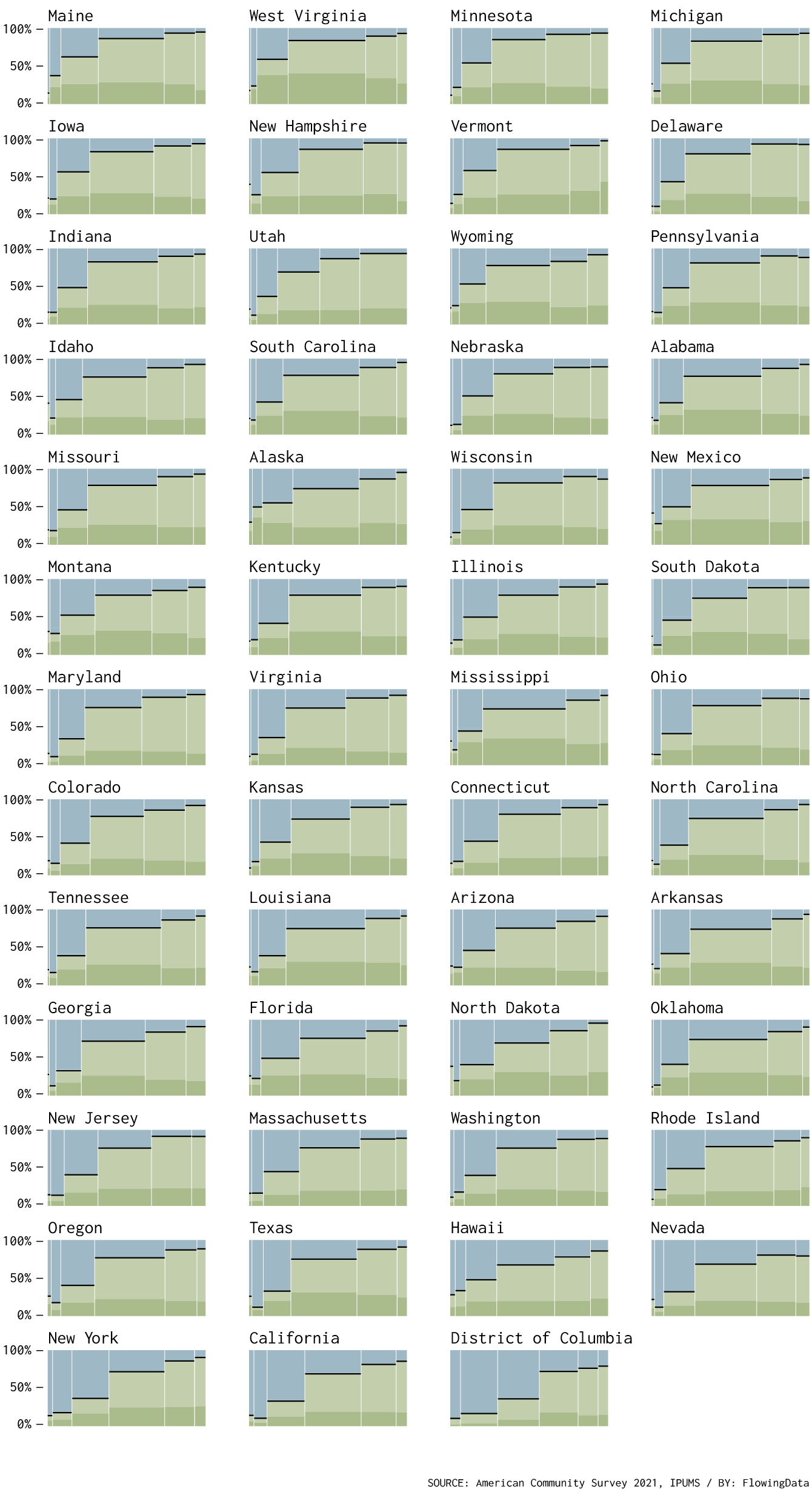
The above varies by state (of course), albeit more subtle.
By Number of Bedrooms, by State
I think there’s something in the predominant four-bedroom in places like Vermont and Oklahoma versus the more evenly distributed room counts in places like Colorado and Washington.
It’ll be interesting to see how these distributions change with more recent data. Sitting here in California, the current mortgage rates are looking painful, which I’m guessing is going to increase the share of renting.
Chart Types Used


Become a member. Support an independent site. Get extra visualization goodness.
See What You Get