Where Americans Live
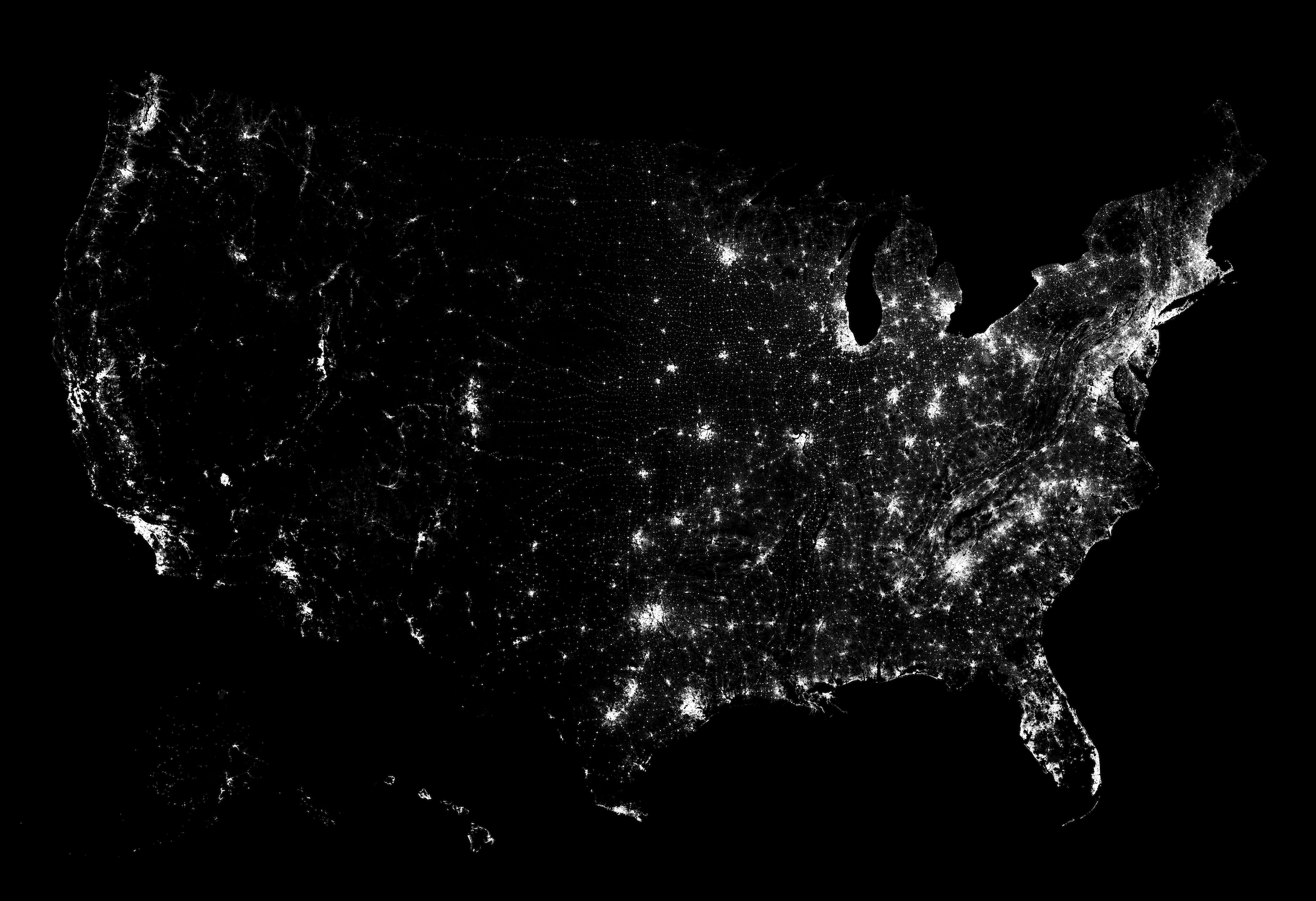
The Census Bureau released block-level data for the 2020 count, so I had to check out this oldie-but-goodie view of population. Each dot represents a person — 331,449,281 of them — and is randomly placed within their block. So you get a highly granular map of population density.
The geography reveals itself without drawing any other spatial features, which never fails to amaze me no matter how many times I see it.
Views get better as you zoom in. Below are the individual states, so you can better see the details of the blocks and the spread of population.
Click to embiggen.
In some cities, population concentrates tightly whereas in other places, the population looks more sprawling. In the less densely populated areas, where there is a lot of open space, you can see the small dots at regular intervals along a highway. Some states have a clear city center with smaller towns sputtered around it. In the coastal states, people concentrate around the water.
We’re all just a bunch of ants trying to find our place.
Notes
I downloaded the data from the Census Bureau and made the dot density maps in R.
The state maps have boundaries, but you might notice that the coastal boundaries don’t quite match up with the dot densities. TIGER/Line shapefiles, which I used for the block and state boundaries, draw coastal boundaries a mile off the coast. The Bureau also offers Cartographic Boundary Files, which clip at the coastline, but they are less detailed than TIGER/Line.
Become a member. Support an independent site. Get extra visualization goodness.
See What You Get


