Borne out of everyday curiosities, learning experiments, and mild insomnia.
An ongoing series about looking at the everyday through the eyes of data and charts.
Reviving the currently defunct Census-produced publication with current data.
Not everything has to be visualized. I do it anyway.
The individual data points of life are much less predictable than the average. Here’s a simulation that shows you how much time is left on the clock.
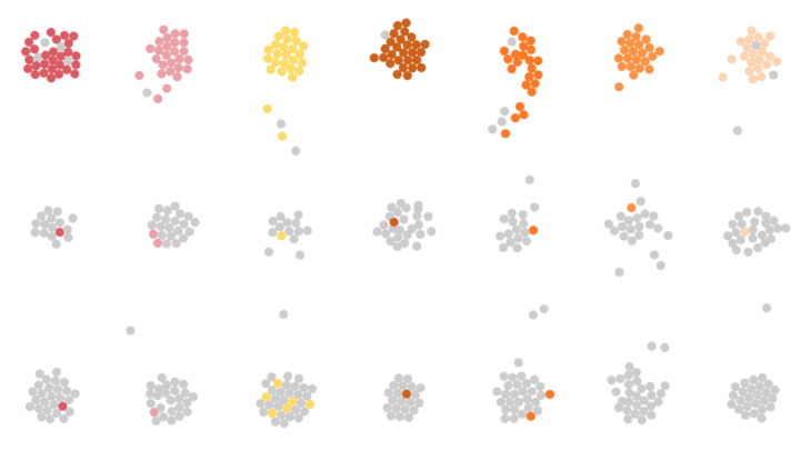
So far we’ve seen when you will die and how other people tend to die. Now let’s put the two together to see how and when you will die, given your sex, race, and age.
How long will chicken reign supreme? Who wins between lemon and lime? Is nonfat ice cream really ice cream? Does grapefruit ever make a comeback? Find out in these charts.
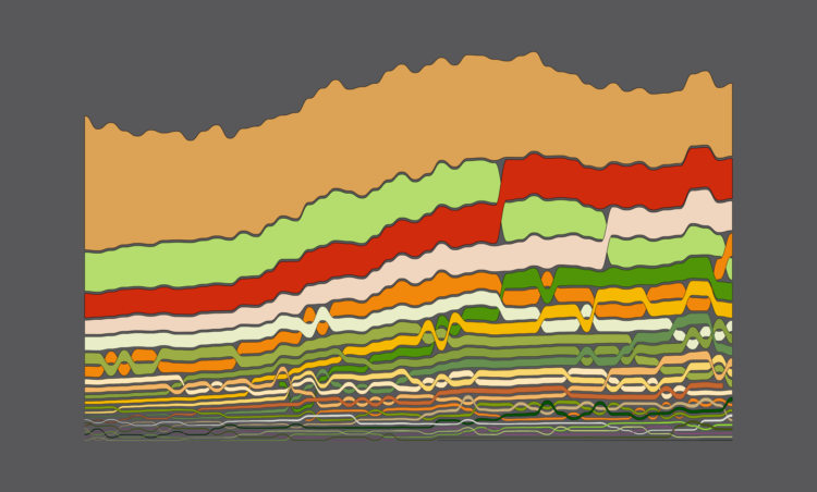
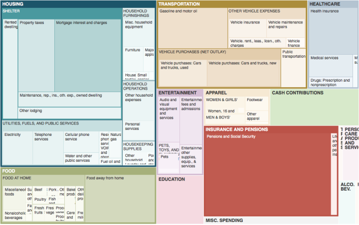
We know spending changes when you have more money. Here’s by how much.
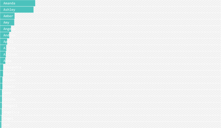
I’m terrible at names, but maybe data can help. Put in your sex, the decade when you were born, and start putting in your name. I’ll try to guess before you’re done.
I simulated a day for employed Americans to see when and where they work.
Some jobs tend towards higher divorce rates and some lower.
Some occupations have more turnover than others. See how it varies for your occupation and others.
It seems like people don’t stick with the same job for as long as they used to, but maybe that’s not the case.
Why Americans are unemployed varies across groups.
A practical resource for beginners who want to visualize data for humans.