I almost didn’t make a best-of list this year, but as I clicked through the year’s post, it was hard not to. If last year (and maybe the year before) was the year of the gigantic graphic, this was the year of big data. Or maybe we’ve gotten better at filtering to the good stuff. (Fancy that.) In any case, data graphics continue to thrive and designers are putting more thought into what the data are about, and that’s a very good thing.
So here are my favorites from 2011, ordered by preference. The order could easily scramble depending when you ask me.
1. Data-Driven Documents
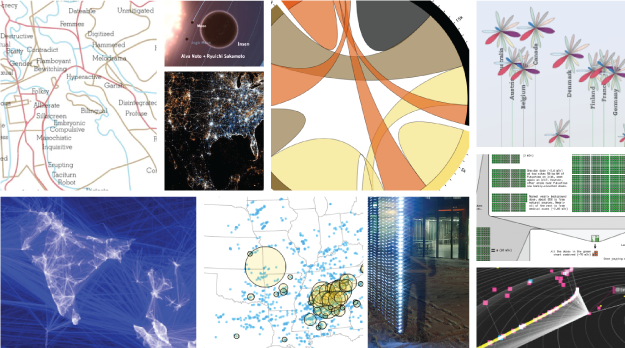
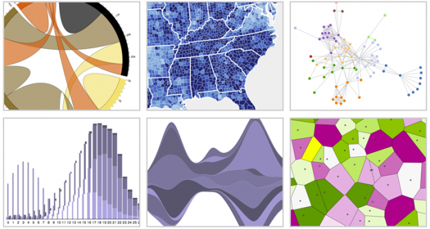
While creator Mike Bostock made the initial commit to GitHub in late 2010, D3 hit its stride in 2011. With Flash becoming less prevalent and HTML5 becoming more so, the lightweight JavaScript library is becoming many developers’ choice when it comes to visualization on the Web. (I played around some, too.) This library is only going to get better come 2012.
2. Immaterials: Light Painting WiFi
Who knew carrying around a stick that detects WiFi vertically could be so informative? Mix in long-exposure photography, and the invisible networks all around look tangible. I feel silly putting this project so high on the list because it is so simple, but its simplicity is also part of why I like it so much.
3. A More Perfect Union
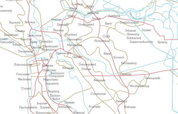
Media artist Roger Luke DuBois used online dating data to show the uniqueness of cities in America. In place of city names are the words that people in those cities used more often in their online dating profiles than anywhere else. The result was an exhibit mostly on paper, showing what set cities apart. It’s not often that we get to see how geographic regions are unique at such a personal level.
4. Planetary
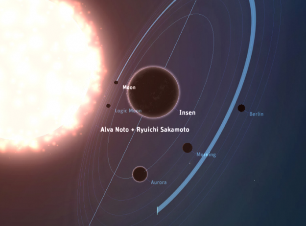
From Bloom, Planetary is an iPad app that visualizes your iTunes music as a solar system, bringing your data into a more playful and exploratory context. The solar system is your music collection, stars are artists, and planets are songs. Planetary was a hit at launch, and it’s only a small sample of things to come I am sure.
5. Better Life Index
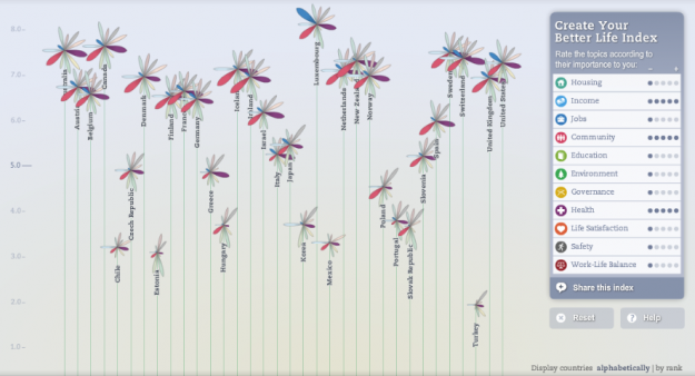
The OECD has a lot of data about countries, and it can be hard to make all of data accessible at once. Moritz Stefaner and Raureif, in collaboration with the OECD, did this with the Better Life Index. You’re even able to pick metrics to build an index yourself.
6. Whose Size 8 Are You Wearing?
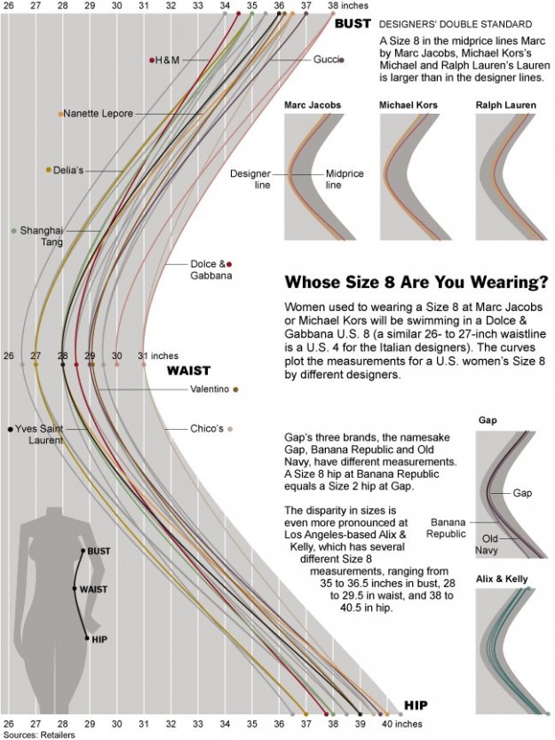
This one from The New York Times amused me. My wife always has to try on so many jeans and once she finds a brand, she tends to stick with it for years. Now I get it. Sizes on women’s clothing makes no sense.
7. Radiation Dose Chart
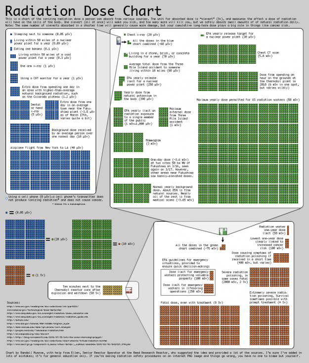
With the troubles in Japan caused by mother nature, possible radiation hazards were in the news. Most accounts were anecdotal though, and a lot of numbers were thrown around. Randall Munroe of xkcd put together this chart to put it into perspective. What Munroe lacks in design tech he makes up with rigor.
8. The Deadliest Years
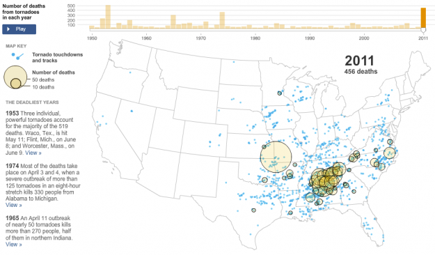
Similarly, after the tornado in Joplin, Missouri killed more than 100 people, The New York Times put things into perspective. An animated and interactive map showed tornados and where they touched down, starting in 1950.
9. See Something or Say Something
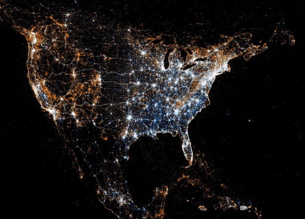
The way that people use web services has gotten a lot more interesting with the growth of mobile tech. People aren’t just interacting via a standing desktop anymore. Eric Fischer compared Flickr and Twitter usage in this series of maps. White indicates where people used both, blue is just Twitter, and orange is Flickr.
10. Visualizing Friendships
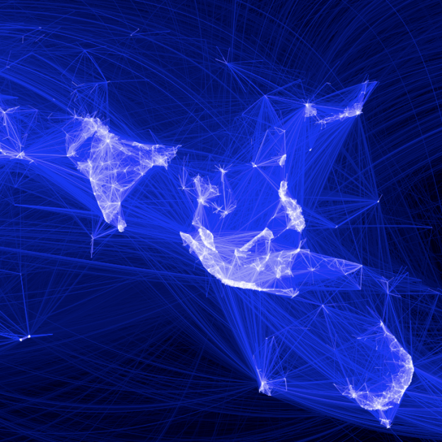
Facebook intern Paul Butler’s map came out in 2010 just after I made my top picks for that year. The map shows the reach of Facebook, and more interestingly, I think, where Facebook isn’t used. A number of follow-up maps came out of it. I also wrote a tutorial on how to do the same with your data.
11. Global Fire Observations
NASA mapped tens of millions of fires worldwide over the course of a decade. Fires come, and forestry goes, and then comes back again. I was surprised the animation wasn’t more popular when it came out. Probably would’ve spread a lot more with a little more production.
12. All Roads Lead to Philosophy
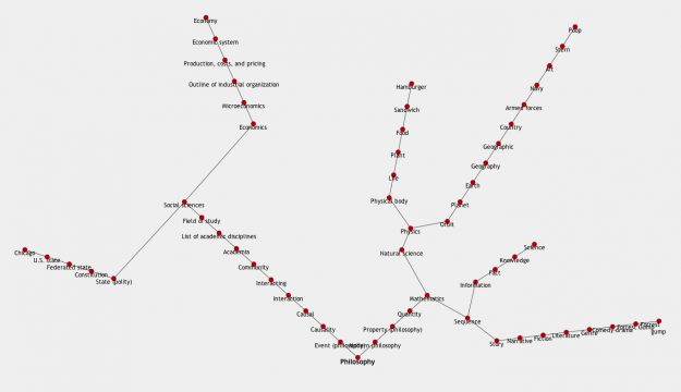
There was an idea floating around that if you continuously follow the first link on Wikipedia pages, you will always end up at philosophy. Jeffrey Winter put together a mashup to try out the idea, and whattaya know, everything does lead to philosophy. Well, almost everything.
13. Address is Approximate
While the short film about a lonely desk toy traveling cross-country via Google Streetview isn’t exactly a data visualization, it deserves a shout. I mean, it uses maps, so that’s enough. Just watch it.
14. History of the World
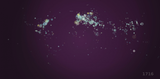
Gareth Lloyd showed the history of the world in 100 seconds, using geotagged entries on Wikipedia. Because of that, the data has a slant towards Europe and the US, but it’s interesting to watch nevertheless.
15. Project Cascade
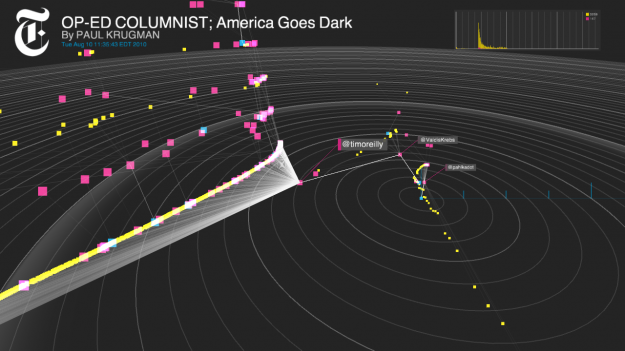
Sharing on the Web is often depicted as time series charts and bar graphs, and measured by number of retweets and likes. There’s more to it than that. The spread of a story is organic, a lot like how things spread in the physical world. Mark Hansen, Jer Thorp, and Jake Porway, as parts of the New York Times R&D Lab created Project Cascade to visualize how people share New York Times Stories.
Those are my picks for 2011. Your turn.


 Visualize This: The FlowingData Guide to Design, Visualization, and Statistics (2nd Edition)

Hi Nathan, I also agree with your selection of Mike Bostock’s D3 as the most significant development and think it will have an even more prominent 2012 as the take up cascades deeper and wider (myself included).
Many of the other projects you have listed are also in my top 20 developments of the year – January to June http://www.visualisingdata.com/index.php/2011/07/10-significant-visualisation-developments-january-to-june-2011/ and July to December http://www.visualisingdata.com/index.php/2011/12/10-significant-visualisation-developments-july-to-december-2011/
Note that these focus more broadly on ‘developments’ in the field and not just projects, but include several of the ones you have listed here.
I thought Munroe’s “Money” was even better.
Hans Rosling’s “The Joy of Stats”, produced by the BBC in 2011, presented some wonderful animated visualizations. Here’s a particularly interesting one: http://www.youtube.com/watch?v=jbkSRLYSojo
So this list begs the question; What seperates a data visualization from an infographic?
I love that comment. I’ve asked myself the same question recently and have no good answer. Seems to me like the working definition is simply, an infographic is an especially entertaining data visualization.
I think ideally they are synonymous (at least in wikipedia), but it seems like I’ve seen the term infographic applied to things that strictly speaking don’t meet the criteria.
The term infographic to me implies something broader e.g. a graphic showing the different parts of the brain or a cut away of a tank or the a diagram of the layout of military complex are all information graphics whos primary concern is not data.
There was some chatter about this:
https://flowingdata.com/2011/09/29/the-many-words-for-visualization/
Interestingly, nuclear engineers I know considered Monroe’s graphic a horribly confusing and useless mess.
I would have to agree with them
Yeah, very good list.
My prediction for 2012: One of the best data viz projects will be a physical object.
I like the Immaterials: Light Painting WiFi. One of the best data viz projects will be a physical object.
Why not an infographic of the most popular infographics of 2011?
Don’t forget the Russian physicist Sergei Shpilkin, who published statistical methods to check whether or not elections are fair (and in Russia they are not). The original article (in Russian, use translator) http://esquire.ru/elections. Follow-up articles (in Russian, use translator) http://lenta.ru/articles/2011/12/06/elections/ and http://eugenyboger.livejournal.com/4514.html.
Great list! What about this visualización bases on ofrece about the Spanish Revolution in twitter? It’s pretty amazing too
I think the We Feel Fine project by Jonathan Harris is worthy of mention. I really enjoyed it.
We Feel Fine was from 2006 (which makes it more awesome).
Wikipedia’s #wikiviz winner was: http://www.datatelling.com/wikipediaglobalreach
Graphic technology+imagination+play=new visualización
There’s a data visualization tool for your computer (Win and Linux) called Eagle Mode that I find to be a little revolutionary: http://youtu.be/G6yPQKt3mBA
Such a great line up of visuals, art, data and information – a creation quadfecta.